Borussia Dortmund (Away 2012/13)

I pretty much covered all the jerseys worn by this year’s UCL semi-finalists, except for this one (technically, I still have to cover Bayern‘s European jersey). I already said that there is a lot to like about Dortmund in principle. Still, if the referee would not have been absent for the last 15 minutes, they would not be in the semifinal. Still, I hope that there will be a way that we will see this quite nice away jersey – although given the possible opponents, I doubt it.


Unlike the European home jersey, Dortmund’s away jersey actually looks quite well. It has the same design as Austria‘s and Uruguay‘s away jersey, but in black and yellow, thus making a truly contrasting jersey to the home look (traditionally Dortmund has mostly worn white shirts). I only wish that the pink of the sponsor was in yellow to give it an overall “corporate” look. Also, I already mentioned that the second star seems to drop off the crest, which is probably riding a bit high.

bvb 2012 awaybvb 2012 away goetze

I won’t lose more words on Puma‘s font, but having the letters applied in yellow really makes them stand out.

This shirt is really nice and makes for a quite unique look when worn with the yellow shorts. There are few things where I have to be picky (position of crest and stars, color of sponsor and font on the back), but this is still miles better than the European home jersey!

My rating: 7/10 stars.

How do you rate this shirt?

Galatasaray SK (Away 2012/13)

The previous two posts were my make-up for Flashback Friday. This is the one for today – although I had earmarked it for Thursday. Having just posted Galatasaray‘s current home jersey, I wanted to also comment on their away jersey.

Nike does not have too many general designs lately. Most clubs get their own customized version. However, the design of Cimbom‘s away jersey is the exception. Shakhtar Donetsk uses a very similar one and the current Australia jersey also has it. In this case, we have a white jersey, with a vertical yellow stripe on the left side which is bordered by two thin red bands. Within the yellow stripe, we find the club’s crest. In order to make the sponsor stand out, the stripe is broken which in this case looks a bit odd, since the two-lined sponsor barely penetrates the stripe, but forces a rather large gap. However, sponsor, swoosh and crest are in the perfect positions. Where the shirt starts looking a bit odd is on the right sleeve, where we see a repetition of the vertical stripe. It being the sleeve, the band is now horizontal creating an odd visual. I am also not big on the sleeve sponsors.

galatasaray-away-2012galatasaray-away-2012-sneijder

The back is all white and you can only see the sleeve band. Name and number are applied in red in a nice font. Again, as with the home jersey the sponsor on the back makes things look too crowded.

Honestly, I always like jerseys where a stripe in the club’s colors runs down the left side through the club’s crest. Some of my favorite jerseys feature that pattern. But for some reason it does not work here quite that well. First of all, the crest has a white background and is somewhat squeezed between the red bands. Add to it that the three stars are in red and it almost disappears. Also, with the huge sponsor a huge gap is necessary. But mostly, I wish the band on the arm were left off. I think a thinner stripe on the front and an otherwise plain look would have made this into a great jersey, but like this it seems half-baked. An attempt to be original, but more trying than actually achieving it. Add to it the multitude of sponsors and it is a bit too much. I am sorry, I really would love to like this one …

My rating: 6/10 stars.

How do you rate this shirt?

FC Barcelona (Home 2010/11)

Now to the winning jersey of the 2011 Champions League final: FC Barcelona. What an impressive display! What goals! The 2009 side may have won more trophies, but it was in this final that Barca cemented their reputation as the best team of the 2000s and one of the best (if not THE best) of all time. Fortunately for us jersey aficionados they also played in one of the best Barcelona shirts of recent memory. Sadly enough it was the last one featuring the UNICEF logo on the front.

The 2010-11 design returned to a classic Barcelona look that was only slightly tainted by wearing it with red shorts (I am not a big fan of this variant – but it is definitely a successful one). I always say, Barcelona should either play in their original jersey (one half blue, the other red) or in a broadly striped one with the blue stripe in the center. For this reason, I love this shirt. The only point that may be debatable is the inclusion of the yellow round collar and the yellow patches on the sleeves. To be honest, I’d rather have both in red or blue, but since yellow is Barca’s accent color it doesn’t stick out as too terrible. Swoosh and crest are perfectly placed and (I repeat myself) I love that Barca was wearing the UNICEF logo for 5 seasons. It truly makes them live up to their motto “mes que un club” (more than a club).

barcelona-home-2010-messi

The back is like the front and note that the striped pattern is not broken since name and number stick out nicely without any excessive blue or red areas. I do like the inclusion of the Catalan flag below the collar, but it might have looked better if it was applied horizontally. The font for the yellow names and numbers is unique but acceptable.

This is a great jersey and I wish that Nike would have based their recent designs on that one. What would have made it a perfect 10? Well, give that shirt a shirt collar in red or blue (or both?) and play in blue shorts. For purists: drop the sponsor. Since I only rate the shirt and not the entire outfit, my rating is accordingly high.

My rating: 9/10 stars.

How do you rate this shirt?

Manchester United (Away 2010/11)

Man, over the past few days I did not have much time for my blog. I even missed Flashback Friday! Since things won’t get less busy over the next weeks, I decided I have to tone down the frequency of my posts (at least temporarily) to one per day. I still want to keep Flashback Friday as the exception.

Now, so far I have looked only back at national team jerseys and somewhat disregarded the club game. After all, the most memorable matches usually happen at the World Cup. But, not this week. I decided to look back at probably one of the best demonstrations of modern football in a final over the past 10 years and ended up at the 2011 Champions League final at Wembley. Granted, that final was not a nail biter and was pretty much decided early in the second half, but the way Barcelona disposed of Manchester United in their native England was nevertheless awe-inspiring. Such domination happens rarely in a European Cup final and arguably only Real Madrid in 1960, Ajax Amsterdam from 1971-73 and AC Milan in 1989 and 1994 were as dominant.

So, let’s first have a look at the losing jersey that evening at Wembley: as two year’s before, Manchester United played in white. Unlike the 2009 final, they did not have to specifically create a white jersey and they were also playing in black pants. The jersey itself is an interesting way of incorporating ManU‘s club colors onto a white jersey. Given that most of my favorite clubs play in black-white-red in some way, I do like that one in principle. But to me it does not look too much like a ManU jersey – I’d expect a plain white jersey in some form. On this one the red and black accents on the sleeve are very strong and it makes the sleeves look like wings. I wish the collar was black or red instead of white to make it stand out. Also, a shirt collar would have been preferred. Logo, crest and sponsor are perfectly placed.

ManU 2010 AwayManU 2010 Away Nani

The back is much like the front with the font of names and numbers quite pleasing.

Although I prefer a plain-white jersey for ManU away, this one looks actually quite nice, but is lacking a certain United feel. Still, good job Nike.

My rating: 7/10 stars.

How do you rate this shirt?

Galatasaray SK (Home 2012/13)

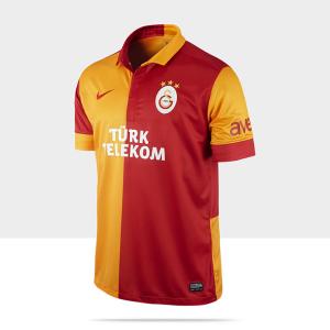
The last, but definitely the least team featuring in this year’s Champions League quarterfinals is Turkey’s champion Galatasaray SK. Together with their eternal rival Fenerbahce SK, Cimbom is the most successful club in the Turkish Süper Lig. However, what sets them apart from their Turkish peers is their better track record in Europe. Not only do they reach the latter stages of the Champions League or Europa League more frequently, they also have their UEFA Cup victory 2000 to boast. It is for this fact that I heard about Galatasaray much sooner than about other Turkish teams. The great roar from the much-feared Ali-Sami-Yen stadium was one of the highlights in Europe and that stadium will certainly be missed since the club now has their own modern ground. While this is as sad point for soccer traditionalists like myself, I do like that with their current home jersey Galatasaray near return to their very own classic design.

Traditionally, the Galatasaray home kit is an 8 piece shirt in red and yellow with white shorts and red socks. This means that on the front, the shirt is split in half with the right side being yellow and the left one red. The sleeves are then added in contrasting colors to their adjacent piece. The alternating pattern is also applied to the nice and classic collar as well as the sleeve trims – which actually is not part of the traditional design. I do like the idea for the collar, although it does look a bit funny, but would probably have preferred the sleeves to be in one color. Also, I am not a big fan of the sponsor on the sleeves. Crest and swoosh are nicely placed on the shirt as is the two-lined sponsor. As the Bundesliga, the Turkish Süper Lig has its own way of assigning stars to their most successful cubs. But unlike the Bundesliga, it is a rather straightforward system: one star for 5 titles. With 18 championships, Galatasaray is entitled to three stars. Still, I prefer the Italian system (1 star for 10 titles) more – a star should only be handed out for a World Championship or 10 league titles IMHO.

galatasaray-home-2012galatasaray-home-2012-drogba

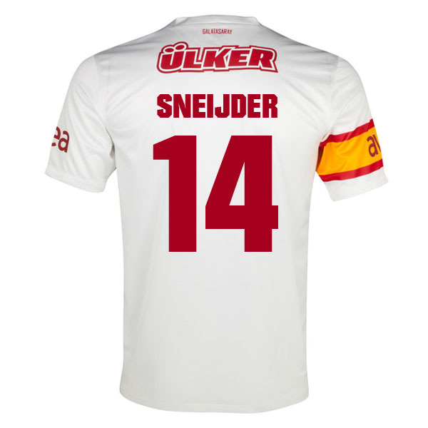
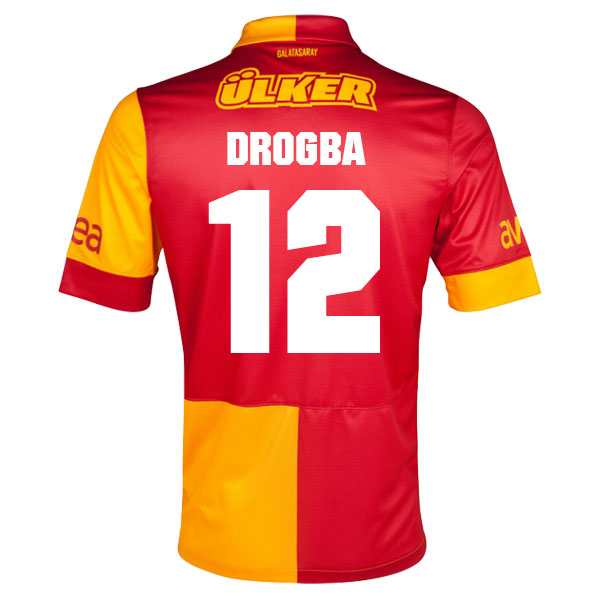
While the front looks very classic, the back unfortunately breaks a bit with that pattern: First of all the sleeves should have a different color on the back than on the front (i.e. the right sleeve is red on front and yellow on back). This way, the shirt has the opposite look on the back. So that did not happen. Second, while the big red back probably does make name and number more legible, it probably would have shown just fine without it since they are applied in white (I guess UEFA had a say in that one). I would have preferred if the shirt was also evenly split between red and yellow on the back to form the classic pattern. The additional sponsor makes the back loo crowded. I am not particularly fond of the font, but it is fine.

The attempt of returning to a classic design should always be lauded and I really want to do so. However, the back does not totally comply. Still, for many Galatasaray fans all around the world this should be a very welcome return to the old days.

My rating: 8/10 stars.

How do you rate this shirt?

Malaga CF (Home 2012/13)

Now we turn to one of the scarier stories in modern football: Malaga. Traditionally, Malaga was a classic elevator team frequently being relegated from the Primera Division only to be promoted shortly thereafter. Then came Sheikh Al Thani with all his promised millions and wanted to turn the little team from Malaga into the third force in Spanish football. Initially, everything seemed to go well. They were slowly and steadily building a great team the smart way, hired an experienced and respected coach and ended the 2011-12 season in fourth place to qualify for the Champions League. And then it all fell apart: Al Thani disappeared and so did his millions. The club was forced to sell their best players to avoid bankruptcy and ealrier this year, they were banned from European competitions for the next season due to violations of UEFA‘s Financial Fairplay regulations. Somehow, it is a miracle that the team managed to reach the quarterfinal of this year’s Champions League. And they reached that in some style …

Malaga’s home jersey is one of the better ones this season, although it does break with classic club colors. As far as I can remember, Malaga played in blue and white. Very often the shirt was striped, sometimes one half was blue the other white. For the current season, the striped pattern was retained, but the blue is very light. You almost have the feeling this is an Argentina jersey and indeed it would be a very fine one at that. The stripes are exactly the width that I prefer most and they are also featured on the sleeves. Crest and logo are very well placed and I love the UNESCO sponsorship (yes, we want to copy Barca’s UNICEF sponsorship as well). I also love the shirt collar a lot. In my opinion, soccer jerseys look best with a shirt collar and this one is one of the finest I have seen lately.

Malaga-Home-2012Malaga-Home-2012-cazorla

I do regret that the back is forced to be white for most of the shirt, but we know UEFA demands that. The font for name and number look well, but I do wonder why they are in dark blue and not in black like the printing on the front. I also like the little Spanish flag below the collar.

Except for the lighter shade of blue, this is an excellent and very classic looking jersey. As I said, it is a highight of the season – well done Nike! Let’s hope that Malaga’s fortunes turn around and they can avoid most of the trouble.

My rating: 8/10 stars.

How do you rate this shirt?

Borussia Dortmund (UCL Home 2012/13)

After a lengthy excursion to national teams, let’s get back to club teams for a change and look at two teams playing each other in the Champions League today: German champion Borussia Dortmund and Spanish wannabes Malaga. And we will start with a visit to the Westfalenstadion in Dortmund – undoubtedly among the top 3 in atmosphere to watch a soccer game. For the current season, Puma took over as a kit supplier and has already issued 4 (!!!) jerseys: the regular home and away jerseys for the league, a home jersey for the Champions League and (a very classic looking) home jersey worn during Christmas seasons. There is a lot to like about Dortmund in principle, but wearing four jerseys in one season is one of the worst marketing scams I have ever seen. Unfortunately, the Borussen-fans are so dedicated that they probably bought all four jerseys in raw quantities instead of showing their team that this in NOT the way to go.

Well, since I am looking at the Champions League teams, let’s look at Dortmund’s home jersey in that competition. Unlike the regular home jersey it is a yellow-black striped jersey. But looking at the lower half of the jerseys, these are not “regular” stripes, since there are some added patterns in there. In my opinion they are unnecessary since on one side they are not really noticeable and on the other they remind me of striped wallpaper coming off. I understand that the sponsor needs a “clean” spot to be displayed so I can somewhat live with the break in the pattern. But don’t get me started on the color! Replace the purple with black and it would look proper. This way it is just too much! The collar used is similar in style to the one on the Italy 2012 home jersey with a button opening on the front. But I think it would have been better to make it stand out more – that is make it black and not yellow. Lastly, the Puma is nicely placed, but the BVB crest is a little but off. Add to it that the two stars (for 5 championships, not 20!) seem to “slide off” the crest and it just looks poor.

bvb 2012 home UCLbvb 2012 home UCL Lewandowski

The back breaks the striped pattern to properly display name, number and the Dortmund signage. Again, this is necessary by UEFA regulations and probably there would not be a better way with two such contrasting colors to display these. Note also that the transition of the stripes from front to back is everything but smooth. Puma’s font is abominable, but note that the name is applied in capital letters instead of lower-case ones. Still, get a more “classic” font.

While writing this post, I have to say that one word came into mind: decrepit look. This jersey seems to “fall apart” instead of looking aggressive. This is so much in contradiction to the current Dortmund team, that features so many young and exciting talents that I seriously have to question the designers. If I had a say to the designer “back to the drawing board.” For now, it is a new entry to the Hall of Shame.

My rating: 3/10 stars.

How do you rate this shirt?

FC Porto (Home 2012/13)

Let’s go to yet another country and have a look at Portugal’s power house team FC Porto. As such, Porto has a very recognizable uniform: white-blue striped shirt (I like the version with a white central stripe and two bold blue stripes), blue shorts and socks. The striping changes from season to season, so we always get something new to look at.

It seems for this season, Nike ran out of ideas and tried a somewhat new look. The current home shirt follows the Ajax pattern with a blue shirt that has a bold white center stripe In somewhat of a break with the Ajax style, though, the sleeves are also white. To me this makes the whole shirt a bit unbalanced with the shirt having too little blue. It is also an unusual style for Porto. I also find the dark blue collar and sleeve trims a bit out of place, but they do at least tie in with the sponsor.

Image

Seemingly to make up for the missing blue on the front, the back features an all blue shield for names, numbers and (unfortunately) another sponsor. Given the bold white stripe on the front this seems unnecessary and using another color for the font (in ’87 the numbers were in red) it could easily be accomplished. I don’t mind though that name and numbers are printed in white that much – after all it preserves the club’s colors. On the other side, I totally dislike the font used. It looks too squeezed, with angles where we should see curves and vice versa.

Image

I am sorry, but this is another blunder. I did like the Porto shirts of previous seasons much better than this one. Well, at least we don’t have to see this shirt in the Champions League anymore …

My rating: 4/10 stars.

How do you rate this shirt?

Arsenal FC (Away 2012/13)

Oh Arsenal! So close to have a major comeback in Munich. Well at least they looked stylish – or did they? Arsenal is also one of the few teams with an established away jersey – although over the past decade Nike mixed it up a bit. The classic away shirt is yellow with dark blue/black and red accents. Well, not this season …

This season we have a hooped jersey with alternating purple and black hoops. You don’t think this is appropriate? Me neither! Both colors are very un-Arsenal! The design was supposedly inspired by the club’s royal roots (how is this related to the colors?) and modern fashion. Well, parade on the catwalk then, but don’t pretend to be Arsenal on the pitch. While the color choice is already contentious, it really looks odd that the hoops on the sleeves are thinner than for the rest of the shirt. Don’t do that. The only thing that recalls Arsenal’s identity is the (modernized) crest and the red trim on the sleeves.

Image

The back features more of the same. In the Premier League we get at least to see the nice EPL font and the print is in white. In the Champions League though, a somewhat futuristic font in red is used making it even worse.

Image

I do get the idea that sometimes away jerseys need to be freshened up. But this one completely has no connection to Arsenal whatsoever.

My rating: 3/10 stars.

How do you rate this shirt?

FC Bayern München (Home 2011/13)

Let’s have a look at two German teams today. So far, the Bundesliga has been auspiciously absent from my blog. Well, while I think that the Bundesliga is one of the healthiest and probably best soccer products out there, it does not have the star power of the other European leagues. Well, the most well-known German team is without doubt FC Bayern from Munich. Perennial contenders since the 70s and probably the best managed club in Europe. Love ’em or hate ’em (I am in the latter category), they are always a force to be reckoned with. They are also Adidas‘s main team and always get specially designs for their jerseys which usually no other team wears. This way, Bayern manages to stand out even more than usual.

The current home jersey has already been in use last season – most prominently in the 2012 Champions League Final which they somehow managed to lose to Chelsea on penalties. Despite their financial prowess, Bayern still only presents a new home jersey every other year. As it should be, the jersey is red, but missing white accents. Instead, they opted (in typically presumptuous manner) for gold. It is maybe not the most popular choice, but it does not look too bad either since it is very understated. Still, the golden stripe on the front collar should have gone all around the neck and the stripes on the sleeves could have been a tad lower. The vertical inlays give the jersey a retro look, but it does not feel retro at all. The sponsor is kept in an appropriate white color, for the sake of overall design it probably should also have been golden. It also seems a bit too big. My biggest gripe has actually nothing to do with the design: It is the 4 stars above the crest. Thanks to the Bundesliga‘s awkward rule for awarding stars, Bayern can wear 4 stars for 21 titles (1 star for 3 titles, 2 for 5, 3 for 10 and 4 for 20), while almost everywhere else each star represents 10 titles. To me it feels like cheating a bit.

bayern 2011 home

The back continues with the all red with gold design. As for any team in the Bundesliga, the club’s name is also printed on the back, which I find crowds the back too much. The font is a simple and very well legible one.

bayern 2011 home schweinsteiger

I think this is an OK Bayern jersey. As I said, the gold is a bit too presumptuous, but it fits to the team.

My rating: 7/10 stars.

How do you rate this shirt?