I will forgo the big Madrid clash and save the remaining jerseys of these teams for a later time and head straight for the 1987 final rematch. Last season I seemingly could not stop writing about the mighty Bavarians. This time around I kept their jerseys for the latter stages of the competition. After all, given the quality of their squad it would have been highly unlikely that Bayern was not present in these latter stages. And while Porto surely is not a pleasant opponent, the odds are decidedly shifted towards the German champions. Still, it is about high time to write about one of the favorites to win it all. And as I expect them to wear their home jersey in both legs, that will be the one we are looking at:
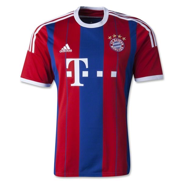
I am sure people were surprised when thei first saw this one. After blue played quite a dominating role in the Bayern jerseys from the mid- to late 1990s, it was not seen since those times with the club seemingly pleasing their fan base’s demand for red shirts with white accents. So back we are with a red and blue striped jersey with white accents. In a way it is a mixture between the current and the previous AC Milan jerseys: just replace black with blue. A bold blue stripe runs down the middle framed by two equally wide red stripes that also feature at the center a blue pinstripe. The pinstripes provide the center lines for the Adidas logo and the club’s crest. However, the two are also sitting at the same base-line which may look a bit odd. The whole is finished off with the remnants of further blue stripes. To keep the balance between the two main colors somewhat even, the sleeves are red. The whole is topped off with a white round collar and white cuffs. The mandatory three stripes and the large sponsor are also kept in white.

Back as the front with the exception of the red shoulders and the white arc. There is also white taping down the sides (not visible) which is a feature of all Adidas shirts this season. The lettering is also in white and has not changed for quite a while.
While I question the choice of colors (Did they want to emulate Barcelona? Did want to recall past days that were not all that glorious?), I admit it does not look unlike Bayern. After all my “formative” years as soccer fan were spent watching Bayern sporting exactly these colors. Also, I like the wide and cleanish look of the striping as compared to both the AC Milan jersey’s mentioned above. If only Milan would have adopted that look. But then, even then I would have to complain. As for Bayern and the fact that this look is worn with red pants and socks, it is not all that bad. Still and all-red jersey would be preferable.
My rating: 6/10 stars.
How do you rate this shirt?


You must be logged in to post a comment.