Lithuania (Home & Away 2016-19)

Now, we are really going deep. In fact, only two nations from Nations League C are missing (including Lithuania). However, I won’t go to League D afterwards, but rather start looking at the new jerseys for the big competitions this summer. So, expect a lot of African and South American posts soon. And then, there is also the Women’s World Cup with some excellent jerseys. All in the future, so let’s get to Lithuania first.

To be honest, there really is not much I can tell off the top of my head about the national team of Lithuania. They were always a lot better in Basketball than soccer. But I do remember one thing: in the early 1990s, Austria’s leading team at the time, FK Austria Wien, relied heavily on the brilliance of two Lithuanian stars: Valdas Ivanauskas and Arminas Narbekovas – both of whom were star players in the league.

But that is probably it as Lithuania never really made any major impact on the European soccer scene and even worse is currently in a true funk. In World Cup qualifying, the team only managed a solitary win over Malta and finished well off the pace. At least, the jerseys worn in that campaign are something to talk about:

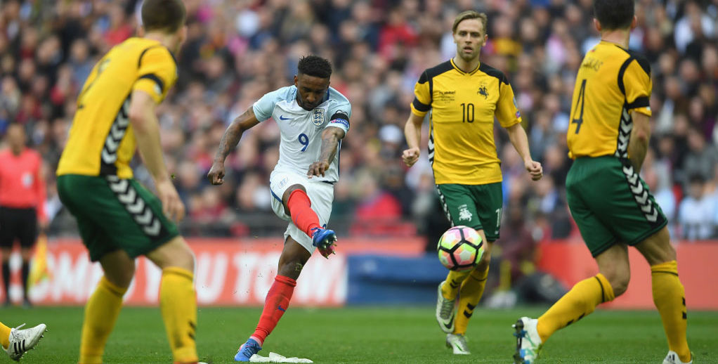
As we will see, Lithuania splits its national colors between the two versions of the kits which are currently manufactured by Hummel. The home jersey is typically yellow and worn with green shorts. And while I would love to see red socks, more often than not the socks are yellow. It surely is a very unique look within Europe.

In the 2016-17 version though, the shirt is yellow with black and white accents which is quite off brand. In fact, at a first glance, I would not have made these out as Lithuania shirts. Why not use green and red instead and do something special here?

Also, the design is rather odd with hockey-style black shoulder yokes that are connected to the black side panels with some piping. In between is a V-neck collar outlined in black-yellow-black and with. the front looking weirdly incomplete.

The sides are embellished by Hummel’s trademark chevrons in white. Take out the piping and this would actually be an interesting template. However, as I said above when using it for Lithuania, I would have wished that black would have been replaced by green and the chevrons probably should have been in red.

So, that was a downer, but there are also some really nice features: the crest is quite unique and frankly superb. Of course it references the knight from the coat of arms, but in a modernized version. Furthermore, there is a subtle all over pattern on the shirt that really adds a special something to it.

Names and numbers are applied in a rather simple style, which is what I come to expect from Hummel. So, no foul, but rather enhancement here if we again overlook the use of black.

My main problem with this shirt is two-fold: the strange template and the use of black (and to lesser degree white) as an accent. The crest and the pattern are on the other hand quite superb, but they don’t lift this shirt too much:

My rating: 5/10 stars.

I wrote a lot about the home jersey, but there was a good reason: the away jersey is just the home jersey in red. All the black and white accents remain as does the overall look of the shirt.

Oddly enough, the shirt is worn within an all-red kit thus all the other two national colors are not even present on this one. But then, the yellow/green is so unique that this shirt has not been worn in any of the qualifying matches for the World Cup, which is a bit of a shame as it doesn’t look bad.

My rating: 5/10 stars.

Now, for the Nations league. Hummel issued a new set that pretty much addressed all the issues I have raised above:

Off the bat, the design is much simpler with yellow a lot more dominant. In typical Hummel style the chevrons run down the shoulders and are in green. Other than that, there are side panels in green and white which to me don’t serve much purpose except for pointing out that players sweat there a lot. Well, it does extend onto the sleeves and so gives it a bit character, but it also should have extended to the bottom.

Speaking of the bottom, there is a really nice pattern on the tail of the shirts in the national colors. It is very subtle, but a great looking touch!

But then, the black accents are retained for all applications. Maybe green would have also done, but here I do not mind the black at all. And I am also happy that the simple font was retained.

The side panels are odd, but everything else looks quite well. This is a nice kit!

My rating: 7/10 stars.

Now, as before the away kit is just an all-red version of the home kit. And this one actually was worn when the Lithuanians had to face Romania away from home. And on that rainy night, we got a rather simple shirt.

Same template, but now we have only silver accents and white applications. It is a decent look, but maybe bordering n a tad boring as none of the other national colors pops up.

My rating: 6/10 stars.

How would you rate these shirts?

Montenegro (Home & Away 2014-19)

This is another post that has been in the works for a long time. I had the initial post started before the post on the centenary France jersey posted, but over the past weeks, I came to the realization that the Montenegro jerseys over the past 6 years are not only interesting, but also relatively easy to find online. In addition, there are is a little interesting twist in there. So, let’s get started …

Despite being one of the newer UEFA members, Montenegro has actually made quite some noise. After separating from Serbia in 2006, the team actually did make quite some noise in EURO 2012 qualifying even drawing twice with England. In the end, they failed at the last hurdle versus the Czech Republic in the playoffs. But Europe took notice of the Hrabri Sokoli (brave falcons). In World Cup qualifying, they confirmed their strong campaign with a credible third place finish behind England (again) and the Ukraine. And we will start our journey towards the end of this campaign.

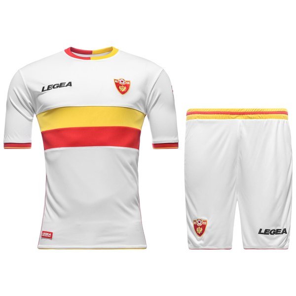
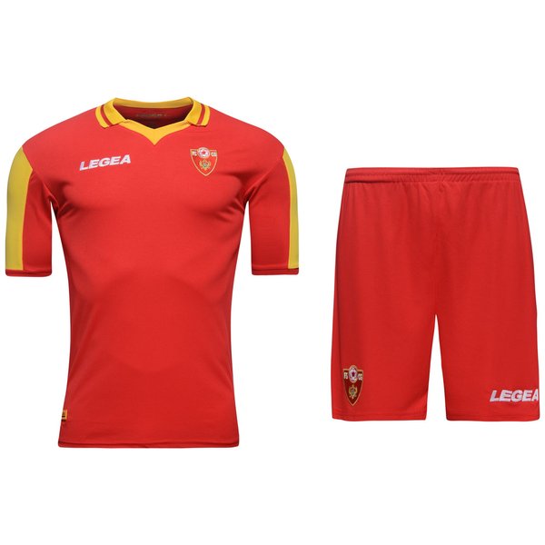
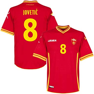
Montenegro’s jerseys are pleasantly well defined: red with golden accents at home (obviously using the flag as inspiration) and white with red and to lesser degree golden accents on the road. And since 2008 Italian brand Legea provides the kits and somehow on a weird schedule as the set below was worn in 2014 (into the start of the EURO 2016 qualifying campaign).

What a nice set of kits! The taping on the side may give them a certain turn of the millennium feel, but if those were left out, we are talking Grade A jerseys.

The home jersey is an all red affair, where the accents only appear on the V-neck, the sleeve cuffs and the aforementioned taping. Why the taping stops somehow in nowhere is beyond me, but to its credit it gives the bottom part of the jersey a nice frame. Still, I probably could do without it.

However, I absolutely love the V-neck with its two bands of gold which are also reflected on the sleeve cuffs. On the latter however, the outer band is a whole lot thicker than on the collar which makes the look a bit inconsistent.

No complaints about the rest of the jersey: the font used for names and numbers is simple but very effective and the crest looks actually quite nice. Maybe the Legea word mark could also have been in gold. Also, note the huge scissor kick player silhouette on the sleeves.

Maybe the red is a bit too dominant, the taping could have been left out and the striping on collar and sleeve cuffs is inconsistent. Still, these look very well overall and I like to see smaller nations in a great look.

My rating: 8/10 stars.

The away jersey has the exact same template, but thanks to the white base, all the accents stick out even more. This really makes the collar and the sleeve cuffs shine and I absolutely love it. Reminds me of a Roma away jersey – and that is never a bad thing! To me they look even better than the home jersey!

My rating: 9/10 stars.

Montenegro’s home fans are both a blessing and a curse. At best, they provide the fervent support in a relatively small stadium that can lift a team and intimidate the opponent. However, on the flip side there is the frequent racial abuse (which is unfortunately not all to uncommon in the Balkans) and the volatile behavior. It is a powder keg that exploded early in 2015 in a game against Russia that saw the game abandoned and awarded to the opponent. And after that disaster, the nice kits above were retired and replaced by the next iteration:

Well, things got simplified and a bold chest band was introduced, but I cannot help but say these were a significant downgrade from the previous set. In a way they look cheap and hastily put together.

Again, I like the home jersey a tad less as we have only a huge yellow (gold?) chest band with next to no functionality. Put the number in there! Would you? To me squeezing the number between the crest and the Legea logo clutters the top half way too much.

But what really turns me off is the collar: Nothing against the crew neck, but making it half gold, half red is not only odd looking, the red half disappears from the shirt! It gives the shirt an incomplete look, which actually fit with the team who was in transition

I don’t like asymmetric looks (especially collars) unless they are delivered in a classy way. To me this collar truly breaks the shirt. The band is also too clunky and does not serve any purpose. Therefore, the result is a less than average shirt.

My rating: 3/10 stars.

The away jersey has the bonus of having two accents. That means the two tone band (gold on top) gives the jersey a lighter feel. The half-half collar also looks a bit better, but still not great. At least the sleeve cuffs stand out and add another accents. But overall, only slightly better and by no means a favorite of mine.

My rating: 4/10 stars.

Obviously, the EURO 2016 qualifying campaign did not go well as the team who was expected to contend for the qualifying spots fell well short of them. So, it was in a way back to the drawing board for World Cup qualifying which also meant a new set of kits:

It is funny how Montenegro’s kit designs do a little follow the form of the team. As the team picked up the pieces during a decent World Cup qualifying campaign, their look also improved.

Finally, both jerseys have the simple look I have been calling for and there are really only two accents: the collar and a bold stripe on the top side of the sleeves.

The collar is a definite improvement albeit with a slightly peculiar shape as the front turns into a point. Still, a vast improvement. I am however not sure, what to make of the two-tone sleeves. I think contrasting sleeves would have looked better, but this is quite reminiscent of 1990 Adidas. It surely looks weird.

Comparing the two versions, I have to say that the collar looks again better on the away jersey, but the sleeves make more sense on the home jersey. And for that reason, believe it or not, we have a tie, ladies and gentlemen!

My rating: 6/10 stars (for both).

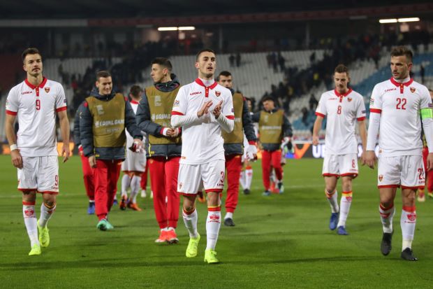
As mentioned above, the World Cup qualifying campaign started brightly, but fizzled out in the end. But it was enough to haul Montenegro into League C where they were to meet neighbors Serbia, Romania and Lithuania. For a while Montenegro seemed to be in contention, but in the end both Serbia and Romania proved to be stronger. And so was the latest set provided by Legea:

Now, that is more like it and I would say these are the best kits Montenegro have worn ever. Yes, they seem at first sight more fit to be worn as leisure wear, but they are truly stylish.

The home kit is really taking inspiration from the flag by limiting the golden accents to a minimum – namely the sleeve cuffs and the buttons on the collar. And yes, the Legea word mark is finally not messing the color scheme while the font remains consistent and beautiful.

The only minor complaint are the sleeves which are in a slightly darker color. But overall, this is a great looking shirt!

My rating: 9/10 stars.

And would you believe it? I find the away shirt even better looking! The red collar on the white shirt with the yellow buttons stands out and the red sleeve cuffs add character. I also like how the crest stands out even more clearly.

These are very fine shirts and probably the best Legea shirts I have seen so far and the away jersey IS the crowning glory:

My rating: 10/10 stars.

Estonia (Home & Away 2014-19)

I promised a shorter time between posts, so here it is. I actually really want to get all League C teams done before deciding whether to look at some other continents or to continue with League D. Speaking of which, League D has some truly interesting shirts that are in many ways more exciting than what we have seen so far. But, I will decide later. For now, we look at a team that was relegated to League D.

Going through all of Europe’s teams you are bound to get to nations where soccer clearly is not the number 1 sport and whose players barely have made any dent on a bigger stage. Estonia is one of those countries, but interestingly enough, their supplier, Nike, still issues somewhat unique kits for them. And there is also a surprising continuity running through the past three sets. Let’s start in 2014:

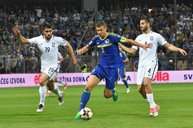
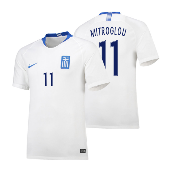
Well, let’s look at the entire set together as they use the same template, but rather different execution. The template should be well known from the 2014 World Cup, as Greece pretty much used the same jersey (the first time I was made aware of this template was on the 2013-14 Arsenal away kit). And what a fine template it is! I absolutely love it and it is probably my favorite Nike template of the current decade.

As the Greece shirt is so similar, I just want to point out the bespoke details that the Estonia shirt has:

First of an average crest that is so close to the Bulgarian one, but does not really feature the clip art soccer ball, but rather an abstract version of it. I am quite lukewarm about it.

Second, a quite unique kit font that has been carried forward until today. It is angular and slightly awkward, but surely unique (more pictures below).

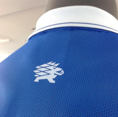
Third, a little hedgehog is making an appearance at the backside of the collar. This detail (also carried forward until today) is probably my favorite and I wouldn’t even mind it replacing the crest. I actually think the design of the hedgehog is also reflected on the numbers. Great touch.

Also, note how the kit mimics the flag (as all great kits for national teams should attempt – unless tradition dictates otherwise). And the order of colors is just reversed on the away kit (although FIFA and UEFA kit regulations get an extra say here).

So, lots to like here and the home shirt is pretty much up there with the aforementioned Greece away jersey. The crest maybe could need a little work, but then the bespoke font and hedgehog detail are super nice touches so that I am willing to give the same score:

My rating: 9/10 stars.

Now, the away jersey is pretty much the same but suffers a minor flaw: too little color – it is just all-white. Unlike the Greece home shirt of the same year, the collar does not stand out and therefore just vanishes. Don’t get me wrong, it is still a very nice shirt and the blue lettering saves it from being too monochromatic. If more color was there, a higher grade would be in order, but this way:

My rating: 7/10 stars.

Now, we spent a whole lotta time on a quite old kit, but interestingly the main design elements have been retained for the next two iteration, as well. However, the template has changed and that is what we will focus on.

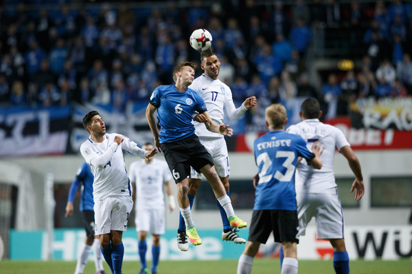
This home kit that was issued for the World Cup qualifying campaign is actually quite interesting for two reasons: it is noticeably darker than its predecessor, but also the cut of this template does not use the raglan sleeves seen on the most prevalent 2016 Nike template. While I loved the 2014 shirt, I actually see a lot of reason to incorporate black into the design as it is one of the three national colors and since white is used for all lettering this is a way to give black its due. The slight fade from blue to black on the sleeves is a sign of the times, but I actually find it a nice touch. I do however wonder, why the swoosh is black, as it almost disappears from the shirt and gives it a somewhat cheap feel.

Let’s be clear, I like the inclusion of black but overall, this shirt does not look as great as the previous one. It is just a bit too dark – especially when seen by itself.

My rating: 7/10 stars.

Well, the corresponding away jersey (which was worn in a humiliating 8-1 defeat to Belgium) uses the same template, but exchanges blue with white. In addition the numbers and all applications are in black making for a quite monochromatic jersey (I am not sure about the crest, but it was never that colorful anyway).

I am not against monochromatic jerseys per se, but given that blue is also a national color, this seems to be going a bit too far. I think the numbers in blue would have worked really well on that one. But then, given the result from Brussels, the black is fitting. All in all, not quite my cup of tea.

My rating: 6/10 stars.

And with that we come to the current set. Took us a while to get there, but I think it was worth it to look at two previous iterations. So, the here is the latest home jersey which was worn during the inaugural UEFA Nations League and now in the European qualifiers:

Unfortunately, this is the best shot I got from that jersey but it gives us a very good look about all the features. The shirt is basically what we would have expected in 2016. I am not 100% sure, but I would assume it is the 2018 updated version of that (infamous 2016 template). White is back as the accent color and there is next to no black. I think an Estonian version of the 2016 France home jersey might have looked quite nice, but overall I do like the white accents better as it makes for a lighter shirt.

But then, the template is rather boring and thus the shirt is just average. Only the retained number font and hedgehog accents lift it slightly from the doldrums of absolute mediocrity.

My rating: 6/10 stars.

And so, what would you expect from the away jersey?

GRE-EST 0-1 (Athens, Nov 18, 2018)

Well, the only real picture I could find does not show much, but after watching it in action, it really is only a white version of the home template. As for 2016, the main accent is black and thus a monochromatic look is retained. But due to the template, it is even less appealing than the 2016-17 away kit.

My rating: 5/10 stars.

How would you rate these shirts?

Bulgaria (Home & Away 2014-19)

Yeah, this was a lot longer in the making as I have been not well over the past few days and then there was the small matter of Christmas …
If you are a long-time reader, you are probably well aware of my special relationship with the country of Bulgaria. If not, it is the country of my dear wife and both our children are (naturally) dual citizens. So, I decided to end this little tour through the Balkans over the past few posts by looking at the recent Bulgaria jerseys.

Unfortunately, the Bulgarian national team is having a down period since qualifying fro EURO 2004. For the 2014 World Cup, Bulgaria was in contention in their group to snatch second place behind Italy, but in the end the team fell short and due to the tight competition by Denmark and the Czechs it would not have been enough for a playoff spot. So, 2014 started with some hope and to underline a fresh start into better times, a new supplier was presented in the Spanish brand Joma (who also supplies kits for neighbors Romania):

Well, I would say it was not a bad start with Joma retaining the classic home kit. In many ways this kit is similar to the 2008-09 shirt that I own with the green side panels and collar. However, here it is a shirt collar with a stylish green triangle inset on the front. Additionally, there is some green piping outlining the shoulders and giving this shirt a very distinct and defined look.

As is custom, the numbers were applied in red, but I wonder why the Joma logos on the proper right and the shoulders had to be in black? On Romania’s kits of the same period it was all tone in tone. Definitely an odd choice. And I have said enough about the crest – it deserves a re-do!

Well, I have some really good memories attached to this shirt as I was present when Bulgaria faced Italy in Sofia wearing these kits. On a rainy night, Bulgaria gave Italy an early lead (own goal) before turning the game around before half time. However, the second half was all Italy and they got the equalizer in the 84th. It was a great game that deserved a lot more spectators, but given the disillusionment with the Football federation and the bad weather only 8000 showed up. I loved how close I could get to the pitch and see both teams warm-up! Fond memories!

Anyway, I did and do like this shirt quite some. Only the logos need some improvement and maybe the collar could have been even more stylish.

My rating: 8/10 stars.

The away jersey was a much simpler affair: a red shirt with a crew neck collar and white applications. There really is not much more to it. However, there is a certain charm in this simplicity as it almost looks like an old soccer jersey. Almost since the crest clearly is not old-school (are the 90s old school these days?). Other than that, it is simple effective and yes, a tad bit boring.

My rating: 6/10 stars.

As you might have expected despite the spirited showing at home to Italy, Bulgaria failed to qualify once more from a tough group with Italy, Croatia and Norway finishing ahead of them. But the squad had shown that given a good draw something was possible. However, the draw was awful as the Lions had to face France, the Dutch and Sweden in what can only be described as a no-hope draw. But hope came in some other ways due to experimentation by Joma:

The new home jersey was in many ways the jersey I have been looking for! All that because of two features: the Bulgarian flag fold-over V-neck (which reminds me of that famous 1994 shirt), flag sleeve cuffs and of course the updated crest! We finally have part of the coat of arms displayed on the Bulgaria home shirt. I cannot tell you how happy I was about that one. So happy that I completely disregard the fact that the federation logo is still present on the proper right.

But the shirt has a few more features that make it special: red form stripes down the shoulders give it character and make it look not so bland. And since it is 2016, we also need some sort of fade in there. Here it is in the form of silvery/golden hoops that get thicker towards the tail of the jersey. It is not very visible but makes for an interesting effect.

Would I have preferred the shirt without the fade effect? Yes! I think with the red stripe on the shoulders it also has quite some character and didn’t really need more accents. On the other side, it does not particularly bother me.

It also helps that the shirt features a nice numbering style in red. Yes, I really like this shirt – a lot!

My rating: 9/10 stars.

Now, with the (rarely worn) away jersey, we really got some experiment: a green jersey with a red sash. While I had seen a green (third?) jersey in a Bulgarian mall in 2014, I never think I have seen any Bulgarian team play in green as main color. Don’t get me wrong, it makes totally sense as it is one of the national colors, but it took me by surprise. Adding the off-diagonal sash on there and the yellow collar and cuffs, though, makes it look a lot like an African kit. It is daring in every regard.

I like how the new crest pops and even the red sash is quite nice. But it is outlined in white which messes up the color order of the Bulgarian flag. Also, note that the Bulgarian FA crest is ghosted within the sash (just below the Joma logo). The other feature that I find unnecessary is the yellow collar and (to lesser degree) the sleeve cuffs. I think the jersey is colorful enough and this added color makes it look a tad messy.

The white numbers make a lot of sense. But I am not sure that cramming the numbers between the crest and the sash was the best solution. I guess this is the problem with off-diagonal sashes as they should either encompass the number or the front gets too crammed. If the sash ran through the crest, it would pop much less, but you would have enough space to have the number on the proper right. Personally, I wold have angled the sash in such a way that it can easily encompass the number. But that is me!

So, there is much to like, but as often the execution could have been better. What saves this shirt for me is the fact that both my daughters and my wife approve of it more than the home shirt. Yes, they do not have the feeling for traditional looks that I do, but then they can not only look at it with fresh eyes but also with their infinitely better sense of fashion.

My rating: 7/10 stars.

As it turned out, the previous away jersey pointed the way forward in terms of the treatment of the crests as the 2018 set of jerseys (finally!!!) completely omitted the federation crest:

With the home shirt, Joma clearly went for a “classic” if not very old fashioned look, which I generally commend. We have a neckline that recalls the tied-down collars popular in the 1930s to 1950s but without any strings. Still, the collar is cut very deep and looks super classy. However, there is one little problem: you have to get a real close-up to make it out as it is white as is the rest of the jersey. I think using a different color (red or green or a combination of both) would have helped the look of this jersey tremendously!

So, clearly the problem with this one is the monochromatic look. Despite having a very classy design you cannot make it out and the whole shirt looks rather boring. Admittedly, the look is a whole lot better when worn with green pants and red socks. However, when the green shorts got replaced with white ones away to Norway in 2018 it just intensified the bland look.

There are unfortunately more problems and it all has to do with the placing of the crest. First of all, I am so excited about this switch as I have been calling for it for a long, long time. It gives a whole new dimension to this shirt. But centering it below the very deep collar does de-value it a little bit. Maybe it is a reference to the old kits from the communist era, but I would prefer to have them worn on a more traditional spot. To me it becomes even more of an issue as the number on the front is placed where the crest should be and thus overpowers it considerably.

The numbering style is alright overall, but with these double lines does not jive well with the retro look of this shirt. But then, there is also a very nice feature – one that my wife almost immediately picked up on: below the collar on the back is a traditional stitching pattern that can be seen on clothing, table cloths etc. almost all over Bulgaria. I really like this touch as not only does it connect to the traditions of the country but also adds a teeny bit of color.

The potential was there for doing something great here. Make the collar green (yes, I think this would look better) with some slight red accents (the fold-overs maybe) and move the crest to its proper spot and we are talking all-time great. But this way it is just way to bland and undersells its beauty.

My rating: 6/10 stars.

The away jersey is an entirely different matter:

Well, at first this looks more like a polo shirt than a soccer shirt, but that is part of its beauty. I simply love the polo collar and how it adds the Bulgarian flag (twice!) to it. Same goes for the sleeve cuffs. Then, the crest is positioned appropriately as are all other applications. Simple, red and awesome!

If there is one (minor) complaint, it would be that the crest does gets a teeny bit lost due to the red shield. But then, this is how it is meant to be and I won’t complain too much here. Maybe, just maybe, the full coat of arms would have done wonders here, but I actually like to only use the shield here as it creates a simpler and stronger look.

This is one of my favorite shirts of 2018, so high marks are in order! Now, if only the good Nations League performance can be backed up with a decent qualification run. Then it would look even better!

My rating: 9/10 stars.

How would you rate these shirts?
Greece (Home & Away 2016-19)

I promised we will stay in the Balkans and I decided to slightly alter my random sequence in order to jump from neighboring country to neighboring country (the team that should have been this time will be featured in two posts from now – ah the geographic lure). And Greece has already been featured on this blog with their wonderful 2014 World Cup kits and let’s see how Nike proceeded with their kits.

Together with the Netherlands Greece was THE disappointment of the EURO 2016 qualifying campaign and I have covered their downfall after two very successful tournaments in 2012 and 2014. However, the rails really came off and for World Cup qualifying a re-boot was sorely needed. And things took an upturn in qualifying with only Belgium landing in front of them in their group. Unfortunately, Croatia proved too much to handle in the playoffs and so a second tournament in a row was missed out. So, the performances were better, but as you already expected the kits probably weren’t (you know, Nike and 2016 and all …)

Looking at these, I really feel that I don’t need to do much of a review as I already have done it – this week when looking at the Finland jerseys. Replace the crests and the inscription on the back (which at least uses the Greek alphabet) and you move from Finland to Greece – down to the colors used. It is just Nike at its template-worst! There really is no need to say more and use the same ratings as for the Finland home jersey. And call me a hypocrite, but the blue jersey suits Finland just a tad better than Greece, where I really think some more white was needed. So, same score for both of them.

My rating: 5/10 stars.

Well, the outcry from most fans of Nike teams was huge and so it was no surprise that more varied kits (as we have seen quite a bit on this blog) were released. However, in Greece’s case there was another surprise in store. Let’s look at the home kit first:

Yes, the home kit is blue again!!! Ever since winning EURO 2004, Greece did what many teams do: adopt the winning look as the home kit (BTW not the case in ANY way for Austria). And to be fair, I think given the rather even usage of blue and white on the Greek flag, either look is justified, but unless longstanding tradition (England, Germany) is behind it, teams should go for a color jersey at home. And for that reason, I am very pleased with Greece going back to blue!

But there is more: while you could have expected a rather plain blue look, this time around we are treated with a really nice pattern on the front – inspired by the Greek flag. I say inspired since the cross on the flag is its own entity and does not extend to the full width of the flag. Also, as we all know, the Greek flag is blue and white. Here the pattern is in a light (and very pleasant) blue. Personally, I would have liked to see an even lighter shade if not white, but I still like it a lot.

Clearly, the main advantage of having the pattern in blue is that all other applications can be in white (except of course for the crest) and have them stand out nicely. Speaking of the crest, it actually breaks a bit with the cohesion of the crest as the blue there doesn’t really match the blue of the shirt. But that is a very minor concern here.

I also love the flag inspired blue and white stripes on the taping on the back. Really nice shirt! Definitely a highlight of this year’s Nations League.

My rating: 9/10 stars.

On the other hand the white away jersey was a lot more simple (and in a way more traditional):

Well, look up the Finland home jersey and you almost get this one! The difference? This one is more plain as it does not have any additional features except for the blue faux-style collar. The crest is popping nicely, but basically the biggest design feature is the taping on the back. Not very exciting.

But then, if this is worn with blue pants it makes for a really nice look and it also is not a bad jersey overall. Just a tad bit too plain. I guess the weirdest feature are the numbers which are a tad darker than the other blue accents, but who would have noticed that? And I am very sorry to say, but these jerseys matched the Greece’s Nations League performances much better than the superb home jerseys.

My rating: 6/10 stars.

How would you rate these shirts?

Albania (Home & Away 2016-19)

Well, we stay with a EURO 2016 team and also one from Group A.. In fact, we will stay in the Balkans for a bit now – just a little heads-up! And to make things even more interesting, we will look at a different supplier in this post, too. 

Among the qualified teams for EURO 2016, Albania was surely the biggest surprise as they never had either taken part in a big tournament nor had they been close (Iceland was in the World Cup playoffs for 2014 at least). The team was actually so unheralded that many (including yours truly) discarded the growing legion of players in big leagues (mostly Serie A) and that Albania actually had a clever coach. Yes, qualification was surely helped by that incident in Belgrade, but nevertheless you also had to land in front of Denmark. A truly remarkable result.

It was also remarkable that prior to the tournament, Albania actually got a proper kit supplier as they had been under UEFA’s program in which Adidas equipped all their smaller nations with team wear. Now, the Italian connection was completed by having Albania wear Macron kits in France:

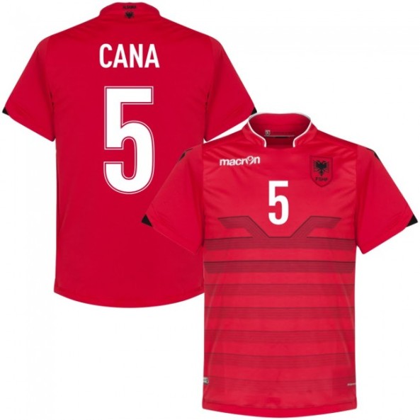
So, the new Macron kit was a bit of a mixed bag. First of all, it was interesting to look at and one of the more interesting kits at EURO 2016. I especially liked the wide Mandarn-style collar and the subtle use of white and black accents. White outlines the collar nicely and black as a little insert on the sleeve cuffs and the shoulder logos. Also, the crest with the double headed eagle looks nice on this shirt and is also featured on the backside of the collar.

But let’s not talk around the big feature: it is a hooped gradient pattern that is very similar to what Switzerland was wearing on their away kit (and ironically when they met in the group stage). The initially grey-ish hoops get a bit darker towards the top of the shirt where they are culminating in a pattern that clearly takes inspiration from the double-headed eagle of the flag. However, it is so stylized that this reference might get lost and the pattern is more akin to a bug with two antennas. Again, this falls under the umbrella great idea, bad execution.

A really nice feature though is that the front number nicely fits between the eagle heads/antennas and the lettering style is really nice.

Honestly, these aren’t bad. Yes, the execution of the pattern could have been a bit more eagle-like but it is interesting and stands out. For that, I am giving this a good grade:

My rating: 7/10 stars.

Now, the away and third kits used the same template and accents:

I actually think the white jersey looks quite nice, but it surely lacks red. I would have loved to see names and numbers applied in red, as it would have introduced the national colour more prominently. On the other hand, the crest is really pooping nicely here, but almost looks a bit too detached.

Still, it is a nice and cohesive look and is not really worse than the home jersey.

My rating: 7/10 stars.

Now, the third jersey (note that Albania wore all three jerseys at EURO 2016!) had to solve a conundrum: the accent pattern on both the home and away jersey was achieved using black/grey on the base color. That doesn’t work with black, does it? So, to solve that issue, Macron opted for a dark grey, which in principle is fine, but why not make the sleeves also grey. This way the shirt looks somewhat disjointed without any need for it. Only few teams can pull off sleeves in different colors and it should be a big contrast (you know, Arsenal style!). Here, I don’t like it. I would have rather have had black shirts and the pattern applied in red. That might have been a looker. But this way, I gotta drop my rating:

My rating: 6/10 stars.

I think any hopes for qualifying for Russia 2018 were immediately squashed by the draw (feat. Spain and Italy). And as with many other kits I have written about lately, it means that the new kits were first prominently displayed in the Nations League, where a decent start cold not be sustained and relegation was narrowly avoided.


While this new edition bears many similarities with the previous shirt (red with black accents and white lettering) it does have a distinct look to it. The collar is now fully in black and not as pronounced as before and I am not sure the black side panels are a very good look.

Still, the diamond pattern steals the show. I am not sure if it is a reference to any national symbol, but it looks nice. It actually reminds me of dragon scales or a mountain landscape.

So, there are some things I like better and some I like less. If the collar was a bit nicer and the panels were not there, I would consider a. higher rating, but this way it pretty much retains the status quo:

My rating: 7/10 stars.

And honestly, I can almost say the same for the away and third jerseys:

However, they both have some problems, that the 2016 versions did not have: The away jersey is nice and cohesive, but it lacks even more red and discoloring the crest is not to my liking.

My rating: 6/10 stars.

And the third jersey not only has the same flaw as the 2016 one, it also color reverses the crest and the red accents are a bit too erratic. Honestly, it looks quite messy and is my least favorite of the Albania jerseys in this post.

My rating: 4/10 stars.

How would you rate these shirts?


Romania (Home 2015-19)

Are you also tired of all these Nike kits? Well, fortunately there has been quite the influx of kit makers into UEFA’s national teams and one of them is Joma who is expanding into the Eastern European market. And probably their first signing was Romania. 

After years of being served one (mostly bad) Adidas template after another, the Romanian FA seemingly had enough of that. Well, that and Adidas’ new strategy. In case you are actually interested in the very old Romania Adidas kits, I found actually a very interesting article – talk about inconsistency!).

In any case, beginning in 2015 a new supplier contract woth Joma was signed and the new kit was immediately presented and worn for more than two years – including EURO 2016. Clearly, the question is whether the switch was worth it.

Frankly, no! Except for the missing three-stripe branding, these kits still had that luke-warm template feel to them. I like that all three national colors were employed (blue for the V-neck and numbers, red for sleeve cuffs and side panels), but of course this is mainly a yellow shirt. The yellow is actually a bit brighter than previously under Adidas.

The jersey retains the classic Romania crest which to me has the obvious flaw of featuring the clipart-style Tango ball. For that reason, I was never really a fan although I appreciate the three-color swirl around it.

On the bright side, it is a simple style that continues a traditional look and feel. I also like the font used as it is a) simple and b) fitting well with the shirt.

So, it is not exciting, but also in no way offensive. You can guess the rating then.

My rating: 6/10 stars.

For the away jersey, there is actually nothing more to add except that red and yellow are swapped and that all names and numbers appear in yellow (you know better contrast). So, to me I keep the same rating.

So, it is not exciting, but also in no way offensive. You can guess the rating then.

My rating: 6/10 stars.

As you could imagine, with a new supplier and a pretty dated crest a re-design was in the books. And for 2018, we really got a new look Romania: new kit, new crest, new design! Just have a look:

Now, full disclosure, I am a huge fan of the off center band through the crest. So, automatically you are getting better marks from me. That is in the colors of the Romanian flag, makes it even better! It is also a very distinct design that Romania has not been using.

But there is one big drawback to me: while I like the simple and plain overall style the whole thing is simply too yellow – especially when worn with yellow pants and socks. I think just increasing the thin blue trims would do wonders here. At least the red is used for the numbers once more thus adding a bit more of the third national color.

Still, given what has been before, the shirt is a big improvement. And we haven’t talked about the biggest change here, the crest! First of all, there is no soccer ball!!! Already a winner! Now, at first it looks a bit clunky but upon closer research and inspection it is actually really nice: the five panels on the shield are simplified versions of the coat of arms of the five main regions of Romania. They are arranged the same way as they are on the shield in the Romanian coat of arms. The pentagon in the center not only represents the country as a whole, but also links the five regions into unity. And given the slogan on the inside of the shirt (Together, we are football in Romanian), it is meant to represent Romanian unity. While at first it looks unusual, I actually warmed up to it a lot and I am quite happy with the change.

Now, the full coat of arms is also featured as a stylized version on the shirt as the shadow pattern adding another nice detail to it. However, upon close inspection it does resemble a bit a kid’s drawing of the coat of arms. Whether intended or not, this might be messing a bit too much with a national symbol. Still, the idea is nice and it is rally only visible upon closer inspection (check out the pic of the away shirt below, too).

Well, the yellow might be a bit overbearing, but overall this one is a winner.

My rating: 8/10 stars.

Now, of course with the home shirt alternatives had to be issued and while they follow the overall pattern present in the home shirt, they are not quite as distinct:


Now, the blue jersey is probably mostly used for goal keepers and is somewhere between the hoe and away jersey for me. I like the color, but the flag band gets a bit lost due to no proper separation from the base color. I therefore will forgo rating this one.

The red away jersey is also very similar to the home jersey basically swapping red for yellow and yellow for blue (except for the collar which is still trimmed in blue). However, it is weird that the band only uses two yellow stripes and no blue. It kind of makes it look quite boring and this less appealing than the home shirt.

I have been thinking long and hard of how the flag band could have been incorporated there without having the issue of the blue shirt where the blue side of the flag is barely distinguishable from the blue base color. First I thought about changing the stripe order, but you don’t do that with a flag. But, as the band is housed in a separate panel, why not use the yellow panel from the home shirt on the red shirt? It would retain the flag stripe and it would put some more color on there. I might be wrong, but I would love to see that.

As I said, the basic template is not bad, but this one is a bit boring. Especially the lack of blue drops it for me!

My rating: 6/10 stars.

How would you rate these shirts?

Finland (Home & Away 2016-19)

The nice thing about writing this blog is the fact that I can go to smaller nations that usually do not get the headlines. Slovenia was already one such nation although we have seen them at big tournaments. Unless you are you are talking (ice) hockey, no such honor has ever been bestowed upon Finland. However, recent results show a clear upturn. 

Finland has produced some big players over the past decades (Jari Litmanen, Sami Hyypia), but even with these greats the national team was never in any way close to qualifying for a big tournament. And so it proved once more in the qualifying campaign for Russia 2018, where the tough opposition (Iceland, Croatia, Turkey and Ukraine) proved too much once again. And the jerseys worn in this campaign were as non-descript as that performance:

Well, I deal with both the home and away jerseys in one go as they are both the simplest application of the 2016 Nike template. Take the template, use simple shoulders (no pattering like for France or England – a plus!) and, chose the national colors and slap the federation crest onto it. Done!

In the case of the home jersey the classic white base colour with blue accents (just like the flag was used). I do like the flag shield on it, but overall it looks quite bare and boring. Not even the Suomi wordmark on the backside of the collar does make it better as this was the standard treatment. So, pretty average, I would say.

My rating: 5/10 stars.

The away jersey does pretty much the same thing as the home jersey but profits a bit from not being the exact opposite. No, the accents are not in white but an even darker blue. While a little bit of a head-scratcher, I think this gives the shirt a bit more of an old-fashioned plain look that the home shirt lacks. Yes, it is not very exciting, but then it does not need to be. ANd to me, it looks just a tad better than the home shirt.

My rating: 6/10 stars.

So, the previous two shirts were nothing to really write home about. And since Finland was of course not present at the World Cup, the new sets were introduced for the Nations League. There, the Fins surprised everyone by winning their League C group ahead of Hungary and Greece. In some way it was probably the most remarkable performance of the new tournament. And of course, Nike applied their latest template also to the Finnish national team:

In a way not much changed and still at least the home jersey is a lot better than its predecessor.  The white jersey again features blue accents in the form of the collar and two sleeve bands. The collar is the typical 2018 Nike fare and not that great, but it gives character to the shirt. The sleeve bands, however, give the shirt some customized extra that makes it stand out a bit more. Fix the collar and we are talking about a wonderful shirt!

My rating: 8/10 stars.

Now, the away jersey is a bit more of a looker as it introduces an entirely new color scheme: navy base with light blue shoulders. If you are a regular to my blog, you know that navy is one of my favorite shades for a soccer shirt and paired with a lighter blue, it usually produces greatness. That is, if the country’s national colors allow for that. And in the case of Finland, I am not so sure about it.

Yes, the flag is blue, but none of the two dominant tones here. Navy is too dark and the shoulders are too light. I still like the overall feel and that Nike prodices something more custom made, but it does not work so well with me. In particular, the crest looks disjointed from the rest of the shirt.

Still, I don’t want to be too harsh as overall, this shirt really does not look that bad. It just dies not scream Finland to me. A black shirt with Finland flag accents might have done that, bit not this version.

My rating: 7/10 stars.

How would you rate these shirts?

Czech Republic (Away 2016-19)

Just as a brief heads-up: I have been nursing a pretty bad cold over the past three days, and I am trying my best to give you a post once a day. However, it may happen that I have to skip a post this weekend. Will try my best to avoid this, though …

Let’s get to the classic two-face team of Europe. Historically the Czechs are among the European elite, but as an independent country, they only manage to bring the goods on the European stage. And so it was in France 2016 that we could admire the Czechs once again at a big tournament, but unfortunately they left little impression. And in a way, their kits were also not very much noticed. We already saw that the home kit was decent, but how about the away kit which was worn in the initial two group games?

You have seen Austria (Away), Italy (Away) and Slovakia (Home) already and at first sight this shirt bears a definite resemblance. However, there are two things that set it slightly apart:

a) the collar reminds me more of the current 2018 Nike template and makes the shirt interesting as it is outlined in blue while otherwise white. I usually don’t like that the front looks different that the rest, but here it does add a little excitement.

b) unlike the aforementioned jerseys, the cat logos and lettering are applied in a different color, red. And as the red goes well with the crest, this gives the shirt another thing to set itself apart and have its own identity.

The other features are rather standard: blue shoulder stripes, blue tail outline and horizontal shadow striping. It is not the most exciting shirt, nor is it the dullest. However, thanks to some little twists it manages to set itself apart from the overall template and thus falls on the “good” side of the scale:

My rating: 7/10 stars.

Now, once again the Czechs managed to fall flat in qualifying and even had a rocky start to their Nations League campaign. But then, in the match against their Slovakian brothers they achieved an unexpected victory in their brand new away jerseys:

Hmm, like most Puma away jerseys in 2018 this one lacks excitement. If it had the greater coat of arms on there, we could argue about a great feature, but I still cannot look very much past this meager lion. Maybe it will grow on me with time, but it surely does not help such a plain shirt. Add to it the really weird blue collar and we are already lacking excitement. To be fair, the Austria, Italy and Switzerland away jerseys are hardly any different, but in their case I feel that going plain helps the look. Here, not so much and it really is all down to a crest that I simply find lacking. I am really sorry to say so. But I won’t be too harsh:

My rating: 6/10 stars.

Ukraine (Away 2016-19)

So, let’s go through the League B teams one more time and cover the “other” jerseys of the recent past. And since I want to use a slightly different order, let’s start with the team that already earned promotion to League A: the Ukraine.

While I do enjoy the yellow Ukraine jerseys, I generally like their blue ones even better. In a way, I never quite understood why Ukraine is not always playing in the Snow white look (my daughter coined that term) of blue shirts with yellow pants and socks just like the flag. And thus, we get too see the frequently blue shirts less often. For instance, the blue 2016 kit was never worn at EURO 2016 in France:

Ukraine 2016 Away

What a pity! Honestly! Yes it is the exact same template as the home shirt only the colors are reversed. But the darker color, let’s the yellow elements stand out even more and thus making it a more striking look. Also, note how the crest also reverses colors here! This is very unique and actually works quite well on both jerseys.

Al you have read about the home jersey applies here as well. I just like it a tad more and thus:

My rating: 8/10 stars.

When Joma took over in 2017, Ukraine’s first competitive match with the new supplier was actually against Croatia in their new blue away shirts. Let’s check these out:

I could be lazy here and say: “everything I have written about the 2016 shirt applies here as well.” And there is quite some truth to it, as the colors are once again simply reversed which again applies to the crest as well. However, unlike the Adidas version, the switch does not enhance the shirt as the slivers especially on the sides, become even more annoying. However, the pattern IS popping a bit more. Still, the good changes are outdone by the not so good ones.

My rating: 6/10 stars.

And thus, we arrive already at the latest version of the away shirt, which has not yet been worn in a competitive fixture. And unless Ukraine will continue to wear these kits in 2019 (I assume so) and gets drawn into a EURO qualification group that makes it necessary to wear the away shirt (say against Sweden or Romania), we may never get to see this shirt in action:


I hate to be repetitive, but they have done it again: reverse yellow and blue and you get the current Away shirt. But for some reason the pattern across the front is more visible on a blue background (kinda makes sense as blue is much darker). And that makes the away jersey again just a bit better than the home counterpart. But only just a bit …

My rating: 7/10 stars.

How would you rate these shirts?