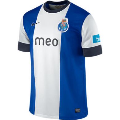
Let’s go to yet another country and have a look at Portugal’s power house team FC Porto. As such, Porto has a very recognizable uniform: white-blue striped shirt (I like the version with a white central stripe and two bold blue stripes), blue shorts and socks. The striping changes from season to season, so we always get something new to look at.
It seems for this season, Nike ran out of ideas and tried a somewhat new look. The current home shirt follows the Ajax pattern with a blue shirt that has a bold white center stripe In somewhat of a break with the Ajax style, though, the sleeves are also white. To me this makes the whole shirt a bit unbalanced with the shirt having too little blue. It is also an unusual style for Porto. I also find the dark blue collar and sleeve trims a bit out of place, but they do at least tie in with the sponsor.
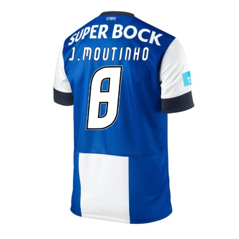
Seemingly to make up for the missing blue on the front, the back features an all blue shield for names, numbers and (unfortunately) another sponsor. Given the bold white stripe on the front this seems unnecessary and using another color for the font (in ’87 the numbers were in red) it could easily be accomplished. I don’t mind though that name and numbers are printed in white that much – after all it preserves the club’s colors. On the other side, I totally dislike the font used. It looks too squeezed, with angles where we should see curves and vice versa.
I am sorry, but this is another blunder. I did like the Porto shirts of previous seasons much better than this one. Well, at least we don’t have to see this shirt in the Champions League anymore …
My rating: 4/10 stars.
How do you rate this shirt?


Pingback: FC Porto (Home 2014/15) | My Soccer Universe