SL Benfica (Away 2012/13)

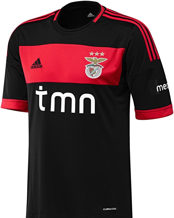
Let’s get back to the Europa League and have a look at the away jerseys of the semi-finalists. We start with Portugal power Benfica. The Benfica away jersey often changes shades. Mostly it was white, last season it was golden and sometimes it is black as it is this season. Given that red is already a dark color, I find that black is a somewhat unlucky choice,  but then red is about the only color where a white AND a black change kit are defensible. In Benfica’s case it is done well, since the home kit is red and white and the away kit is black and red, thus there should be sufficient contrast.

So, what do we have here? The current Benfica away jersey is a black jersey with a thick red band running across the chest holding the club’s crest as well as the Adidas logo. While not entirely original it is a nice design displaying the club’s colors quite well. The three stripes are also red as is the band around the round collar. To top it off, there is also a red trim to the sleeves. The sponsor is displayed nicely, although I feel it would have made for a nicer appearance in red. Still white is acceptable.

Benfica-2012-awayBenfica-2012-away-witsel

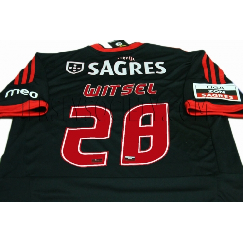
The back is all black but thanks to the additional sponsor as well as the name and numbers it is a bit too busy. If the sponsor is already featured on top, the name should be below the number as we see in so many other (cash-strapped?) leagues. The font for the numbers is plain weird.

Overall, this is a very nice jersey, but in a way it lacks a bit of originality. The round collar design is the same as used on the AC Milan away jersey an the Fenerbahce home jersey. But this is the first time I do like it. Probably since the red is applied to an all-black background. I also want to note that everything pertaining to the club is held in red, while all sponsors are applied in white. While I love dark jerseys (although they became a bit too numerous these days), I do prefer the home jersey for Benfica this season.

My rating: 8/10 stars.

How do you rate this shirt?

SL Benfica (Home 2012/13)

The other big name team in the Europa League semifinals is Benfica. Being the first team not named Real Madrid to win the European Cup and being the team of Eusebio, they have secured their legacy in Europe. Unfortunately, their form has been pointing down a bit ever since. A total of 5 lost European Cup finals up until 1990 and then hardly a dent has been made on the European stage. In the last few years there has been the occasional burst but mostly Benfica has been in the shadow of Porto domestically and internationally. Still, they are one of the greats in European football and I would be more than happy to see them win another European trophy.

The traditional outfit for Benfica is a red shirt, white pants and red socks which is what we are also getting this season. Probably the standout feature of the shirt is the wide shirt collar which is reminiscent of soccer shirts from the early 20th century. While it does t have a tie-down front, the front of the shirt does have a certain resemblance to it. I think it looks great – even better than on the current AC Milan jerseu. Other than that, we have the three white shoulder stripes and a white trim on the sleeves that break the red. Crest, logo and sponsor are well placed and adequatly sized. Only the blue patch on the left sleeve is a bit bothersome.

Benfica-2012-homeBenfica-2012-home-aimar

The back is unfortunately a slightly  different story. First of all, there is also a rather large sponsor on the back which makes the name of the player almost disappear. One of the two should definitely go below the number if a back sponsor is so badly needed (and I assume it is). Second, as with FC Porto the font used by the Portuguese league is strange and wakward. It tries to be both modern, rounded and angular but is neither. Also, with it being (at least) the third font type on the shirt, would it be too much to ask that the font used for name and number matches at least one of the sponsors? That would be revolutionary. On the bright side, the back of the collar mirrors the red-green detail of the crest and states the club’s motto: E Pluribus Unum.”

Honestly, I love the shirt on the front. Probably the best Benfica shirt I have seen in recent years. The issues on the back a re largely out of the hand of the club so I won’t count them too much against it.

My rating: 9/10 stars.

How do you rate this shirt?

FC Porto (Home 2012/13)

Let’s go to yet another country and have a look at Portugal’s power house team FC Porto. As such, Porto has a very recognizable uniform: white-blue striped shirt (I like the version with a white central stripe and two bold blue stripes), blue shorts and socks. The striping changes from season to season, so we always get something new to look at.

It seems for this season, Nike ran out of ideas and tried a somewhat new look. The current home shirt follows the Ajax pattern with a blue shirt that has a bold white center stripe In somewhat of a break with the Ajax style, though, the sleeves are also white. To me this makes the whole shirt a bit unbalanced with the shirt having too little blue. It is also an unusual style for Porto. I also find the dark blue collar and sleeve trims a bit out of place, but they do at least tie in with the sponsor.

Image

Seemingly to make up for the missing blue on the front, the back features an all blue shield for names, numbers and (unfortunately) another sponsor. Given the bold white stripe on the front this seems unnecessary and using another color for the font (in ’87 the numbers were in red) it could easily be accomplished. I don’t mind though that name and numbers are printed in white that much – after all it preserves the club’s colors. On the other side, I totally dislike the font used. It looks too squeezed, with angles where we should see curves and vice versa.

Image

I am sorry, but this is another blunder. I did like the Porto shirts of previous seasons much better than this one. Well, at least we don’t have to see this shirt in the Champions League anymore …

My rating: 4/10 stars.

How do you rate this shirt?