
Well, I made a quick computation and realized that if I want to cover all the jerseys of the upcoming World Cup (most of which have not even been commerically released yet) AND at least all of EURO 2016 in addition to the previous versions of the World Cup jerseys, I better not delay any further and get cracking! 🙂 Well that and the fact that it is probably better to combine jerseys in the posts as much as is reasonable. So, for the first time I will look at a complete set of a team. I am not sure how I will proceed with the World Cup teams for which I have already covered the home jersey (mostly Adidas), but I guess looking at full sets for the teams seems like a good idea to continue from here on.
Portugal, the somewhat surprise champions of EURO 2016 is next on our list. Well, them winning was not exactly on the same level as Greece ’04 and Denmark ’92, but still not many would have given them much of chance. But then, any team featuring C. Ronaldo would always be a dangerous one (has he meanwhile let go of the trophy?). And the fact that they still managed to beat France on home soil in the final and for the most time without their talismanic striker speaks volumes for the squad. That and a sound albeit destructive tactical plan. Additionally, their kits were among the better ones issued by Nike in 2016. Let’s see the home jersey first:

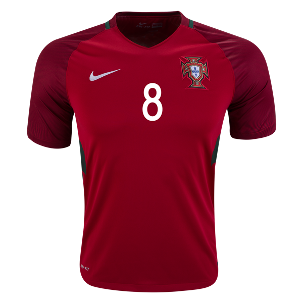

The kit is basically the France kit in red – except that things here make whole lot more sense! The red tones chosen are similar to those on the 2014 World Cup kit, but instead of having them fade in and out of each other, here the darker red features on the raglan sleeves. In fact it is achieved by mixing a very dark red with the red from the torso. As an additional accent, we have the back of the collar outlined in green (A national color! How about that France?). And the same green also runs down the sides broken up by mint green pinstripes (more on that tone in a little). Now, the template is still not the greatest, but here it actually does mae some sense and makes for a nice jersey. Yes, the collar outline could run all around the collar and the sleeves could go down a bit lower on the front, but overall, of the big Nike nations this was the best looking one of them. Now for two more unusual features:

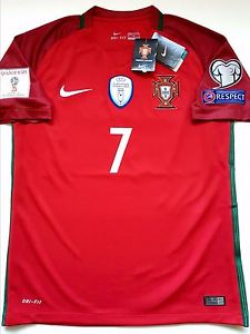
Pictured above we can make out two particular details: on the left the weird looking chest plate design on the authentic version. Well, given some other performance enhancing features on modern soccer jerseys, this one actually is not as bad as it gives the jersey a slightly more aggressive look without being overbearing. On the left the jersey is pictured in full World Cup qualifying get-up. While the sleeve patches are certainly interesting, the big feature is the EURO-winners patch on the center. Not as shiny as the World Cup winners patch, but still standing out. I just wish the winning federation would have more control over the color used on the outline and the patch itself. While it is not a big drawback, the blue does not quite fit that well and green may have been a better choice there. Maybe something to consider.
I said before, of the big Nike nations, this is probably the best one. I even have it in my collection, although obtained at a bargain.
My rating: 7/10 stars.
On to the away kit, which features a rather unusual color for the first time:
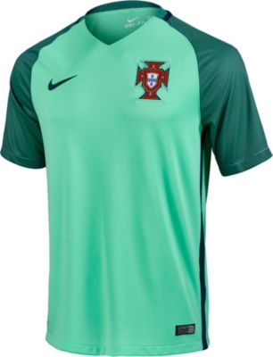
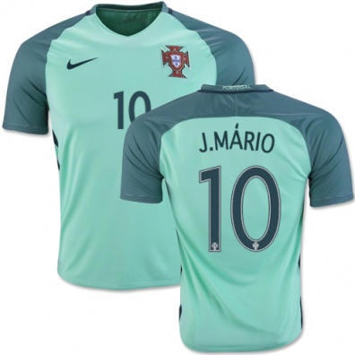
Well, in many ways this is the same shirt in mint green. Yes, mint green! Very unusual color and off the top of my head, I cannot recall any sports team having ever used this color. After a first “ugh” this color however made some sense to me. Green is a national color and for an alternate jersey you need some contrast: enter mint green as possibly the lightest possible green tone without it looking really odd. Given that the shoulders are in a much darker green tone gives this shirt additional contrast and character – even more so than the home jersey. Now, for the accents, I think it would have been a nice touch to use red around the back of the neck and down the sides, potentially even the swoosh. But then, this is a minor issue and the jersey has a certain cohesiveness to it. I even like the dark green numbers as they are very legible and have good contrast. Overall, a decent choice for an unusual away jersey, but it does work. Still, I do like the home jersey better.
My rating: 6/10 stars.
How do you rate these shirts?


You must be logged in to post a comment.