Oh Arsenal! So close to have a major comeback in Munich. Well at least they looked stylish – or did they? Arsenal is also one of the few teams with an established away jersey – although over the past decade Nike mixed it up a bit. The classic away shirt is yellow with dark blue/black and red accents. Well, not this season …
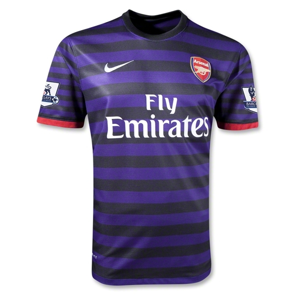
This season we have a hooped jersey with alternating purple and black hoops. You don’t think this is appropriate? Me neither! Both colors are very un-Arsenal! The design was supposedly inspired by the club’s royal roots (how is this related to the colors?) and modern fashion. Well, parade on the catwalk then, but don’t pretend to be Arsenal on the pitch. While the color choice is already contentious, it really looks odd that the hoops on the sleeves are thinner than for the rest of the shirt. Don’t do that. The only thing that recalls Arsenal’s identity is the (modernized) crest and the red trim on the sleeves.
The back features more of the same. In the Premier League we get at least to see the nice EPL font and the print is in white. In the Champions League though, a somewhat futuristic font in red is used making it even worse.

I do get the idea that sometimes away jerseys need to be freshened up. But this one completely has no connection to Arsenal whatsoever.
My rating: 3/10 stars.
How do you rate this shirt?
