Cote d’Ivoire (Home 2014-15)

We stay with a Puma team from Africa: the Elephants from Cote d’Ivoire, a team that has been considered among if not the strongest African team, but always failed to deliver. At the World Cup this was mainly due to being twice placed into the Group of Death. This year, many fancy the chances of the Ivorians progressing from the group stage for a first time. ivory-2014-home-10

In a way it is great that the random ordering of the 32 teams resulted in the Ivorians coming after Cameroon. It makes for a great comparison between two African Puma jerseys. The basic layout is the same, but the Cote d’Ivoire shirt is a lot more plain since it does not feature the cave painting pattern except for the shoulders and under the arms. There, the lions are of course replaced by elephants. Why the pattern is relegated to the less visible underarms is a bit beyond me. The pattern also appears on the sleeve trim. Other than that, we have a round collar, white Puma logos on the sleeves and the right chest and a white centered numbered. The confederation logo manages to combine the two previous ones: the elephant was featured on the 2010 jerseys, while the outline (representing the entire country) harks back to the 2006 jerseys.

ivory-2014-home-gervinho

The back is much like the front: simple light orange with white names and numbers. Nothing fancy.

Likelihood of being featured: 100%
vs. Japan: 99% (Should be 100%, but I leave 1% just to allow for some error)
vs. Colombia: 1% (Same as above, just reversed)
vs. Greece: 75% (Same as above)

For a Puma jersey for an African team this jersey is remarkably understated – if not boring! And it is not that the Ivorians suffered from outlandish designs. On the other side, it has a very classic look. I hope the team will be flashier than this jersey.

My rating: 7/10 stars.

How do you rate this shirt?

AS Roma (Away 2013/14)

Well, like Milan and for the most part Inter, AS Roma also established a white away jersey for them. And due to an impending switch in suppliers, Roma is also producing this itself and it is is a classic:

roma-2013-away
There is really nothing bad that I can say about this one: I love the shirt collar with the yellow band and the red V-opening, the yellow/red sleeve trims are also really nice. The crest is located where it should be and the logo of the charity (which is shown in the small picture) fits also very well with the color scheme.

Screen Shot 2014-03-27 at 3.42.17 PM

If anyone needed lessons in how to design a great looking and classic soccer jersey, they should use this one as a template.
roma-2013-away-gervinho

The back is also plain like the front and has the same features as the home jersey only the names and numbers are applied in red this time.

I cannot find anything wrong with this one and truly doubt that Nike will produce a better looking jersey for the giallorossi. If you like flashy 1990s-style jerseys, you will not like this jersey, but for the rest of us we can well conclude that this one is perfect.

My rating: 10/10 stars.

How do you rate this shirt?

Arsenal FC (Away 2012/13)

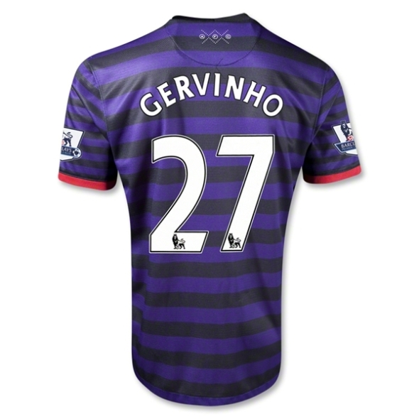
Oh Arsenal! So close to have a major comeback in Munich. Well at least they looked stylish – or did they? Arsenal is also one of the few teams with an established away jersey – although over the past decade Nike mixed it up a bit. The classic away shirt is yellow with dark blue/black and red accents. Well, not this season …

This season we have a hooped jersey with alternating purple and black hoops. You don’t think this is appropriate? Me neither! Both colors are very un-Arsenal! The design was supposedly inspired by the club’s royal roots (how is this related to the colors?) and modern fashion. Well, parade on the catwalk then, but don’t pretend to be Arsenal on the pitch. While the color choice is already contentious, it really looks odd that the hoops on the sleeves are thinner than for the rest of the shirt. Don’t do that. The only thing that recalls Arsenal’s identity is the (modernized) crest and the red trim on the sleeves.

Image

The back features more of the same. In the Premier League we get at least to see the nice EPL font and the print is in white. In the Champions League though, a somewhat futuristic font in red is used making it even worse.

Image

I do get the idea that sometimes away jerseys need to be freshened up. But this one completely has no connection to Arsenal whatsoever.

My rating: 3/10 stars.

How do you rate this shirt?