You know that earlier this year I decided to restart this blog and put a focus on national teams. Given that the World Cup was about to be upon us, that was a very easy decision for me. And now with the Nations League and my time restrictions it is still a challenge to post regularly. Therefore, it is unlikely that I will go back to club jerseys any time soon. However, today is my birthday and for that reason I want to do something special. After all the Austria extravaganza yesterday, I just cannot go back to normal “programming”. For that reason, I went back to my jersey review videos for 2018-19 (links are below) and decided to post here all my favorite shirts of the European Club season. No long description, just the shirts and a short sentence. 🙂
Before we start, I run through the leagues/competitions in the order I covered them on my YouTube channel. To see my quick thoughts on each shirt simply click on it.
Let’s start in England in the Premier League:
AFC Bournemouth Home: Bold design, subtle use of gold and a sponsor the ties nicely to the color scheme
Chelsea FC Home: A fresh new design on the classic blue kit
FC Everton Home: simple, yet very classic look.
FC Liverpool Home: A classic look for a classic team
Manchester City Away: Probably my favorite Premier League jersey this year. I love the alternating pinstripes
Manchester United Third: best example for this Adidas template and a great job aligning the colors of the sponsor with the logos on the jersey
Tottenham Hotspur FC Home: I just love the navy accents on the white shirt. Even the gradient looks great!
For a full description of these and (most of) the other Premier League jerseys, watch my jersey review videos:
Now, next up is the league of the World Cup winners France:
Girondins de Bordeaux Third: wonderfl alternate look.
Caen Home: Nice re-interpretation of PSG 93-94 and Barcelona 17-18
Olympique Marseille Away: great use of light blue accents on a black shirt
OGC Nice Home: If Macron would make a Milan jersey it would look like this. Classic, classy, superb!
Nimes full set: I just love how the dragon from the crest is featured on the bottom of the shirt.
Stade Rennais Away: I love the pattern on the bottom on the jersey and the subtle red/black accents.
AS St. Etienne Away: Super nice look! Making the very best out of this classy template.
Toulouse Away: Even the many sponsors (all in one color) cannot distract from the modern look of this jersey.
Again, you can see full comments on these and all the other Ligue 1 jerseys in this playlist:
By now, you should know that Serie A is my favorite league and there are sooo many great shirts this season:
Atalanta Bergamo Home: Just a classic look!
US Cagliari Home: I love te half/half look and the colors. Also the sponsors tie in with the crest
FC Internazionale Away: Simple at first, but I love the half/half collar and the subtle snake skin pattern all over.
SS Lazio Home: Perfect Lazio look! They should wear this forever!
AC Milan Home: Puma issues a classic Milan shirt and eases my nerves about the supplier switch.
FC Parma Home: Yellow, blue, hoops! How great is that shirt?
AS Roma Home: Did you notice the chainmail pattern on this shirt? Roman legionnaires for sure!
US Sampdoria Away: What a clever way to incorporate the classic pattern on a super classy shirt.
US Sassuolo Away: Alternating pinstripes for the win!
Udinese Calcio Home: Nice way to add a touch of gold that ties in nicely with the crest.
That was just a small sampling. Watch all Serie A shirts in these videos:
Quick, let’s look at a few La Liga jerseys:
Real Betis Balompie Home: Super nice looking shirt!
Atletic Bilbao Home: Interesting reinterpretation of a classic shirt
Celta de Vigo Home: Only very subtle Adidas branding to make a great shirt.
RCD Espanyol Home: All shirts look great, but the home jersey paired with that sponsor is a beauty!
Girona Home: Diagonal striping? Unusual, but very much in tone with the crest!
UD Levante Home: The best Barcelna shirt of the past 5 years?
Real Madrid Home: Happy to have the black accents back and I love the neckline!
Real Sociedad Home: Macron delivers another really nice kit.
Real Valladolid Home: I love how the sponsor is made to fit in the clor scheme.
Even more jerseys right here:
So, here are my favorite Bundesliga jerseys this year:
Bayer 04 Leverkusen Away: Alternating diagonal pinstripes in reference to the 1988 UEFA Cup winning kit.
Borussia Dortmund Home: I love the black sleeves broken up by yello bands.
Mainz 05 Home: Simple, yet effective with two-tone red hoops.
Borussia M’Gladbach Third: Beautiful green shirt with nice texture.
VfB Stuttgart Third: All Stuttgart jerseys this season are great, but this one is probably the best!
SV Werder Bremen Third: Classic Werder look and I love the diamonds radiating from the crest.
Of course, I reviewed also all the Bundesliga jerseys:
Now, let’s go tho the Champions League and look at a few jerseys from teams not in the big 5 leagues.
AEK Third: Simple and classy!
AFC Ajax Home: You cannot mess with greatness and Adidas surely didn’t.
SL Benfica Home: Still this is a very modern yet classy interpretation of a classic strip.
Crvena Zvezda Third: Very smart away jersey using a dark blue base and still showcasing the club’s colors.
Galatasaray SK Away: I love how the half-half look from the home jersey is used here in the accents.
FC Porto Third: a very playful, yet beatiful shirt!
The full set of Champions League jerseys are critiqued in these videos:
And finally, let’s get a tad more exotic with the jerseys from the Europa League. Here are my favorites:
Celtic FC Away: tartan pattern and celtic cross, what’s not to like!
SK Slavia Home: iconic and beautiful
Fenerbahce SK Home: A nice Adidas version of a great kit.
Sporting CP Home: Macron delivers again.
Apollon Limassol Away: I love the texture on the shirt and the choice of colors! I look at it and imagine the sea!
Dynamo Kiev Away: Simple and wonderful like a classic jersey should be.
PAOK Home: Everything in black and white making for a very unified and solid look. Also, I love the collar!
And here I tried critique all Europa League jerseys:
Well, I hope you enjoyed this slightly different post. Let me know what are your favorite club jerseys this season and how you would rate the jerseys above.
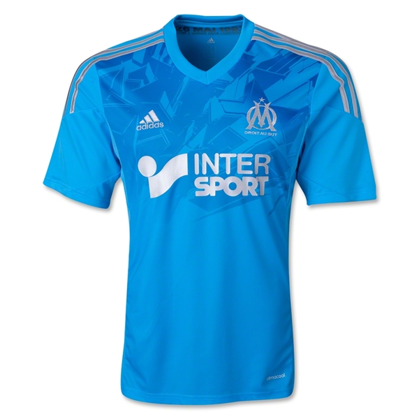
Like Lyon, OM also has a third jersey that is mainly used in European competitions, although more as an away jersey than a home jersey. It is also the only jersey that pays homage to that one May evening in Munich some 20 years ago – although only as an inscription on the inside of the collar (something I usually do not comment on).
Unsurprisingly, the jersey features the club’s second color sky blue. However instead of white, the accent color is in silver – possibly a reference to the Champions League trophy. In principle the story here is quickly told: light blue jersey with a V-neck, silver shoulder stripes as well as silver Adidas logo, club crest and sponsor (all placed quite well). However, it is the upper portion of the jersey that catches the eye. I am not quite sure what this (not so) shadow pattern is supposed to represent (I guess somehow a mixture between broken glass and the star ball), but it does not quite fit in with the simplicity of the rest of the jersey.
At least the back is quite simple – probably the way the front should have been. Not sure if the white numbers and names stand out enough, but I guess the dark blue outline helps.
I could have liked this one a lot, if it were not the busy pattern on top. This way, I guess it is my least favorite of the three OM jerseys this season – despite the nice choice of colors.
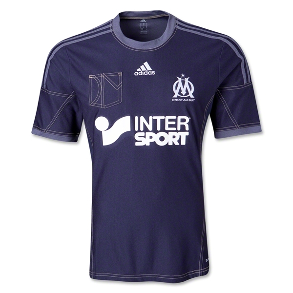
This one is the real reason I chose to post about OM this season. A truly unique and remarkable shirt. Right up there with the Napoli away jersey. I guess having a very long partnership with Adidas (I guess since 1986 with a short interregnum by Reebok from 1993-’96) warrants unique designs. Without further ado, I present to you the OM denim jersey:
The entire jersey has a definite denim feel and look to it. starting with the dark blue choice of the jersey and accented by the double seams all over. On the occasion, even the three stripes are somewhat subdued in another denim colored, but lighter blue tone. The same lighter tone is seen on the round collar and the sleeve trims. The jersey is also the other Adidas jersey featuring a breast pocket. But unlike Milan’s version this looks actually nice since it adds the letters OM in forms of seams. The seams actually look a bit silly on the sleeves, but fine otherwise. The jersey could have been a mess if sponsor and logos were applied in original colors, but similarly to the Manchester United away jersey, everything is applied in white, looking good this way.
On the back we have pretty much a plain jersey with names and numbers appropriately applied in white with grey-ish outline. Keeps well with the tone of this jersey.
Concluding, I actually think this one is a highlight of the season. Unusual, but unlike the aforementioned jerseys by Napoli and Manchester United it does not really suffer from patterns all over it. The seams are a bit distracting at times, but I think this one is a winner (compared to the other two) – if only it would fit the club’s color scheme.
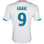
One more team from France: Olympique Marseille – a team that brings up more passion (either way) than any other French team. The glory days are a bit in the past now, but it remains (to date) the only French team to have won the Champions League. The club’s colors are white and sky-blue, something that has been featured regularly on the home jersey. This is also the case this year:
This is very much a classic looking OM jersey. All white with sky-blue accents, mainly on the collar (same style as OL 3rd jersey and the current Milan home jersey) and the three shoulder stripes, but also on the sleeve trims and Adidas logo. The club’s crest is placed beautifully with the golden star reminding us of that triumph in 1993. The club’s motto (Droit au But) is also applied in gold. The sponsor is well placed, but did not change colors to fit the jersey better. Although, it would also make it less visible, so I guess it is (somewhat) OK.
The back is plain white with the names and numbers applied in light blue with a yellow outline. The latter seems a bit odd. But even odder are the orange stripes running down the sides since they have nothing to do with the rest of the jersey. Should have been left out in my opinion.
The front looks very classic and is really likeable. It is the back that causes some head-scratching on my part and will lead to deductions. Actually, a pity. If the club could have decided on one accent color (either yellow or orange) it would have been alright. A choice of gold would actually be the best given the front of the jersey and OM’s status.


You must be logged in to post a comment.