This one is the real reason I chose to post about OM this season. A truly unique and remarkable shirt. Right up there with the Napoli away jersey. I guess having a very long partnership with Adidas (I guess since 1986 with a short interregnum by Reebok from 1993-’96) warrants unique designs. Without further ado, I present to you the OM denim jersey:
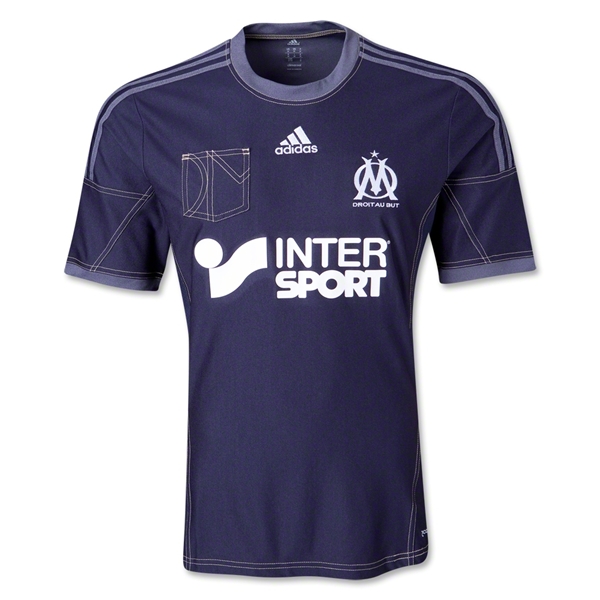
The entire jersey has a definite denim feel and look to it. starting with the dark blue choice of the jersey and accented by the double seams all over. On the occasion, even the three stripes are somewhat subdued in another denim colored, but lighter blue tone. The same lighter tone is seen on the round collar and the sleeve trims. The jersey is also the other Adidas jersey featuring a breast pocket. But unlike Milan’s version this looks actually nice since it adds the letters OM in forms of seams. The seams actually look a bit silly on the sleeves, but fine otherwise. The jersey could have been a mess if sponsor and logos were applied in original colors, but similarly to the Manchester United away jersey, everything is applied in white, looking good this way.

On the back we have pretty much a plain jersey with names and numbers appropriately applied in white with grey-ish outline. Keeps well with the tone of this jersey.
Concluding, I actually think this one is a highlight of the season. Unusual, but unlike the aforementioned jerseys by Napoli and Manchester United it does not really suffer from patterns all over it. The seams are a bit distracting at times, but I think this one is a winner (compared to the other two) – if only it would fit the club’s color scheme.
My rating: 7/10 stars.
How do you rate this shirt?

Pingback: France (Home 2014-15) | My Soccer Universe
Pingback: SSC Napoli (Away 2014/15) | My Soccer Universe