One more team from France: Olympique Marseille – a team that brings up more passion (either way) than any other French team. The glory days are a bit in the past now, but it remains (to date) the only French team to have won the Champions League. The club’s colors are white and sky-blue, something that has been featured regularly on the home jersey. This is also the case this year:

This is very much a classic looking OM jersey. All white with sky-blue accents, mainly on the collar (same style as OL 3rd jersey and the current Milan home jersey) and the three shoulder stripes, but also on the sleeve trims and Adidas logo. The club’s crest is placed beautifully with the golden star reminding us of that triumph in 1993. The club’s motto (Droit au But) is also applied in gold. The sponsor is well placed, but did not change colors to fit the jersey better. Although, it would also make it less visible, so I guess it is (somewhat) OK.
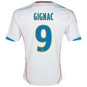
The back is plain white with the names and numbers applied in light blue with a yellow outline. The latter seems a bit odd. But even odder are the orange stripes running down the sides since they have nothing to do with the rest of the jersey. Should have been left out in my opinion.
The front looks very classic and is really likeable. It is the back that causes some head-scratching on my part and will lead to deductions. Actually, a pity. If the club could have decided on one accent color (either yellow or orange) it would have been alright. A choice of gold would actually be the best given the front of the jersey and OM’s status.
My rating: 8/10 stars.
How do you rate this shirt?

You must be logged in to post a comment.