As my collection is growing, I always wanted to document my shirts and I think this is the perfect opportunity to keep on posting to my blog. In case you are still interested in me rating current shirts, I offer you to come over to my YouTube channel https://www.youtube.com/c/MySoccerUniverse and follow me there. Now, I am planning to do these posts in order as they entered my collection which of course is a bit fuzzy esp. at the beginning. But for most cases, I have the order down quite well. But then, for this shirt I am not quite certain whether it is No. 3 or No. 4, but I think I owned it before the one I am going to post next. 🙂
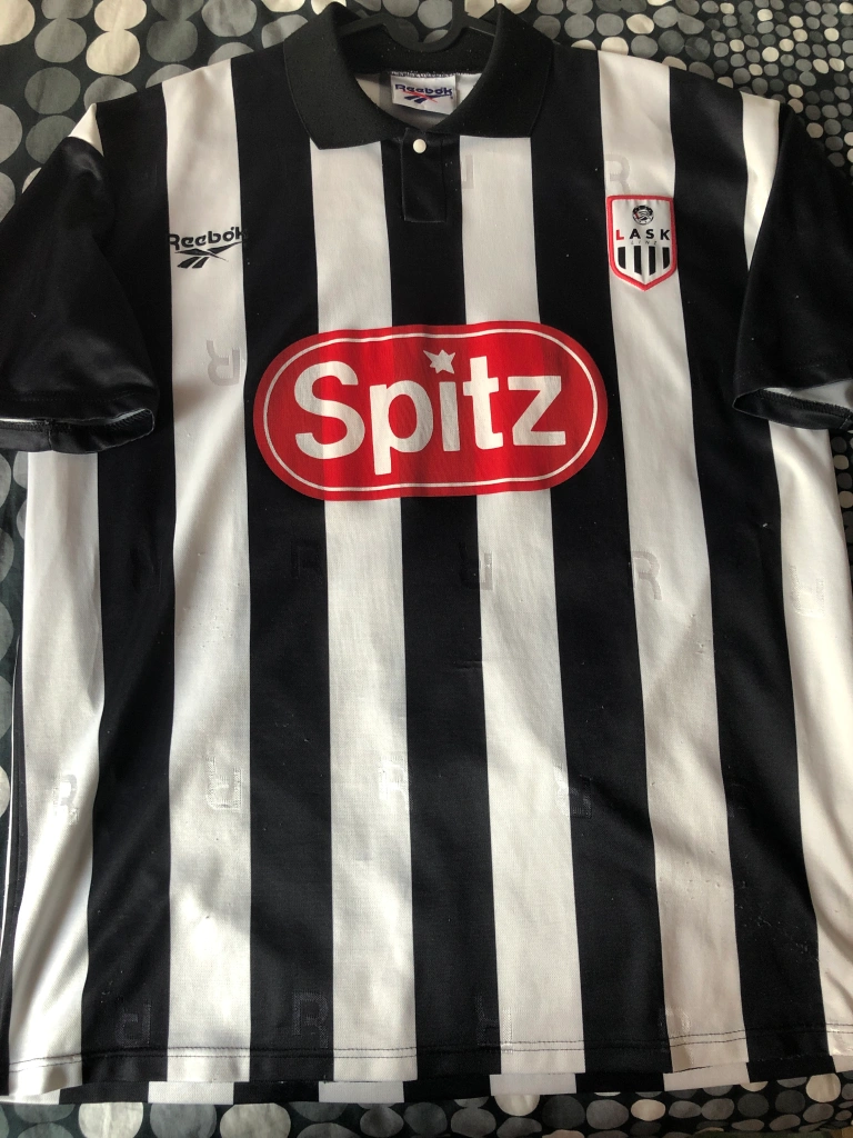
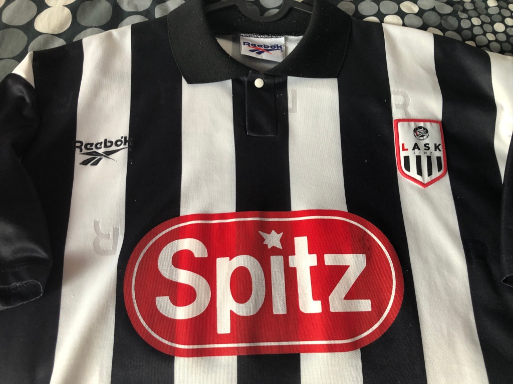
⚽👕#3: LASK Home (1996-1998) 🇦🇹
Acquired: 1996 (Passage Linz – local sports retailer)
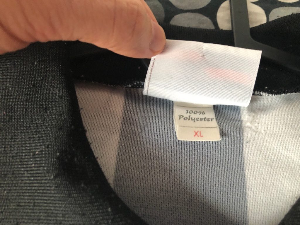
Brand: Reebok
Size: X-Large
Version: Fan replica version
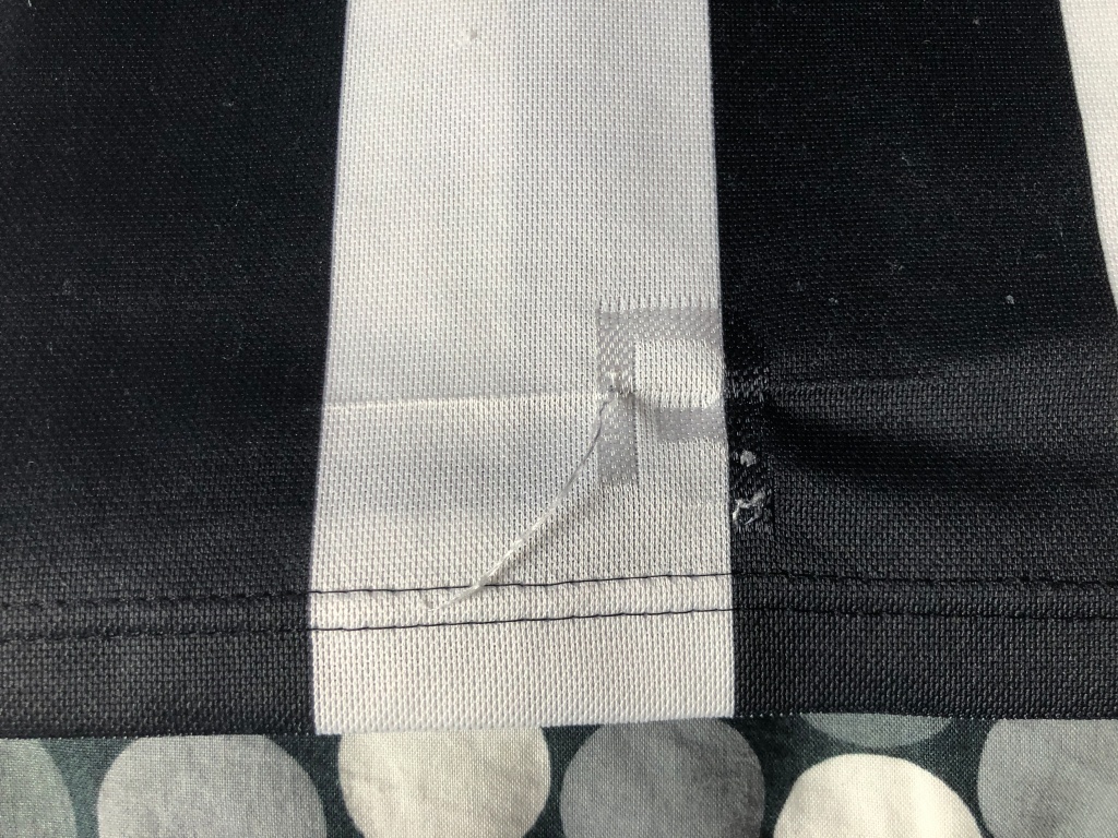
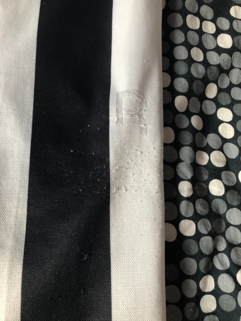
Condition: very good (on pull on back and signs of use)
Favorite player: Vidar Riseth 🇳🇴
Rating: ⭐⭐⭐⭐⭐⭐⭐⭐⭐⭐
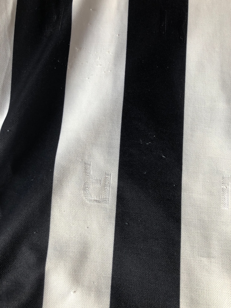
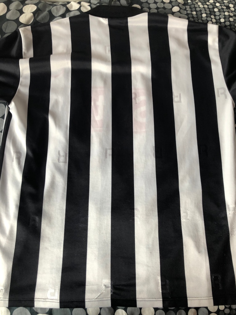
Notes: Another quintessential shirt! This one is a true LASK classic and a model of how a proper LASK shirt should look like. It is also helped by the fact that at the time there was a true sense of change around the team and some of my favorite memories of watching the team were in my late teens. In particular the 97-98 season under Norwegian coach Per Brogeland and the then innovative and attractive style of play were a true joy. Heck, we even had the league’s top scorer in Norwegian Geir Frigard. This shirt may also be the first one that I bought with my own money, however I am unsure about the order in which I got my third, fourth and fifth shirt. In any case, I have worn this shirt a lot to LASK games and it is still my go to LASK shirt, so there are quite some signs of wear Interestingly, for the player version, the (then new) crest was one stripe closer to the center and the Reebok logo was centered I order to allow space for the (also then new) league logo resulting in a better look IMHO.
as my collection is growing, I always wanted to document my shirts and I think this is the perfect opportunity to keep on posting to my blog. In case you are still interested in me rating current shirts, I offer you to come over to my YouTube channel https://www.youtube.com/c/MySoccerUniverse and follow me there. Now, I am planning to do these posts in order as they entered my collection which of course is a bit fuzzy esp. at the beginning. But for most cases, I have the order down quite well.
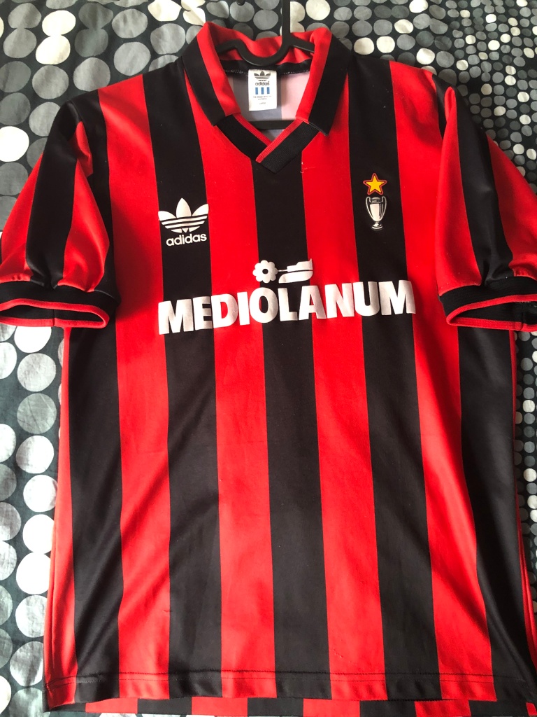
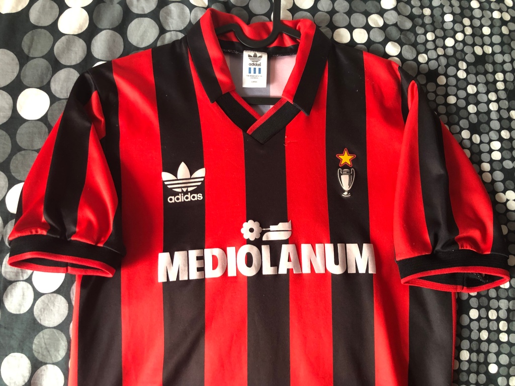
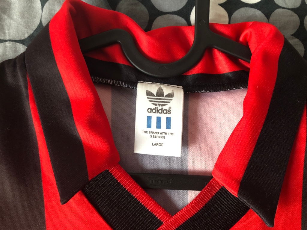
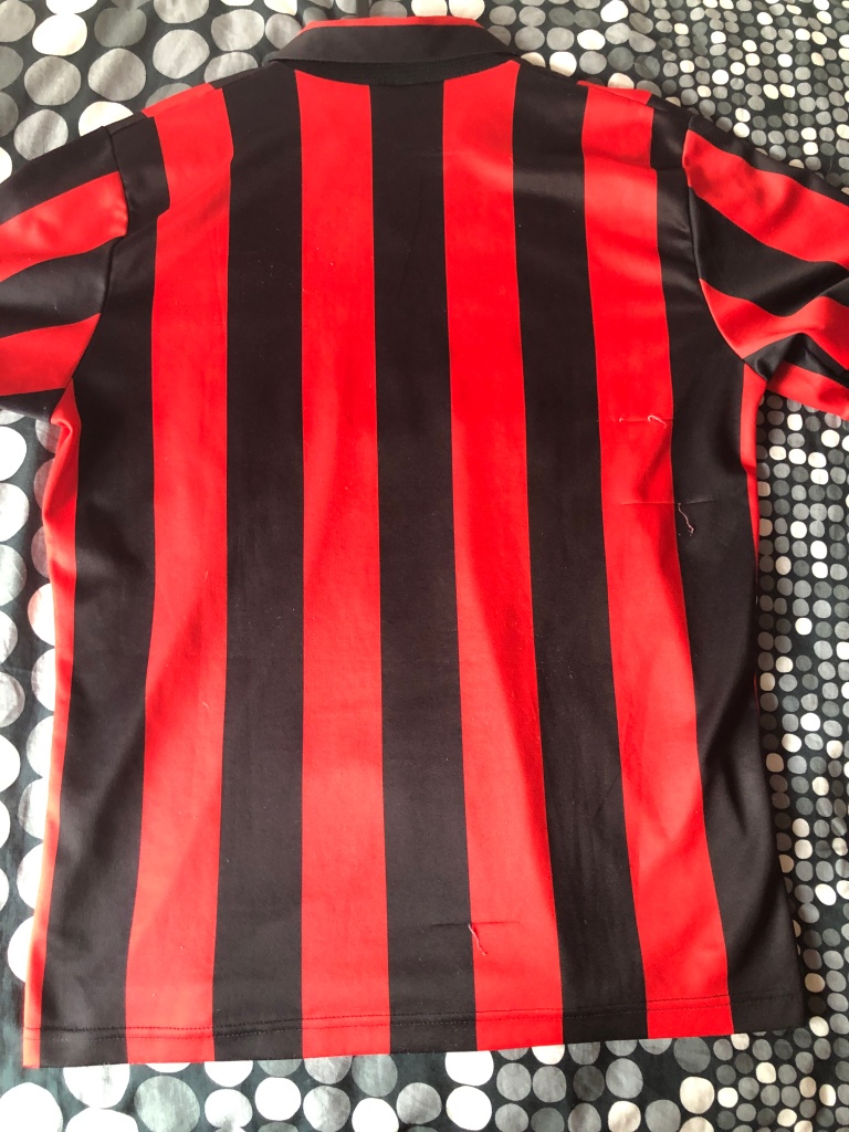
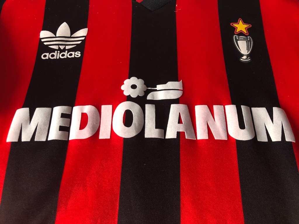
⚽👕#2: AC Milan Home (1990-1991) 🇮🇹
Acquired: 1991 (Intersport Eybl – local sports retailer)
Brand: Adidas
Size: Large
Version: Fan replica version
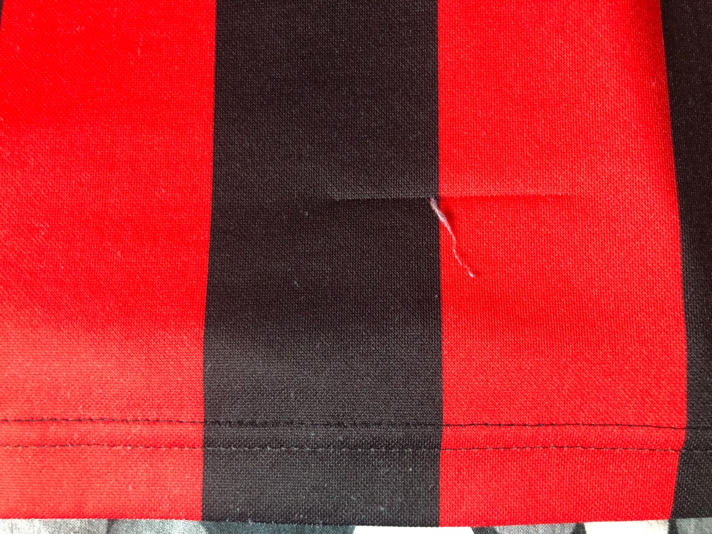
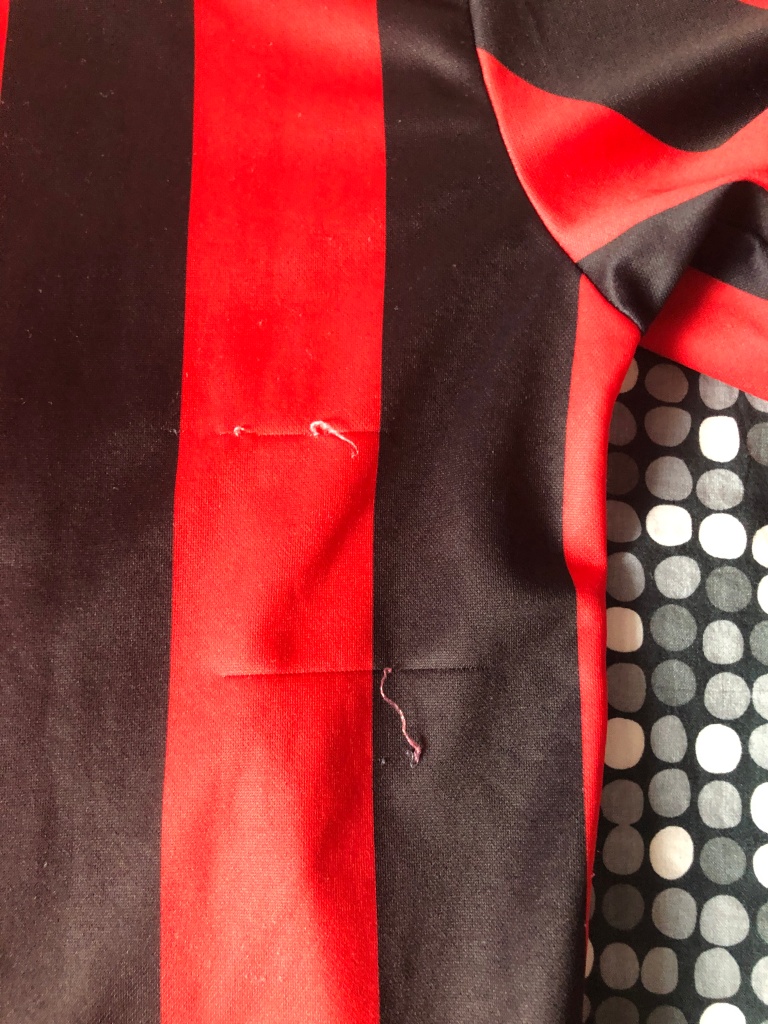
Condition: very good (four pulls on the shirt – yes we had cats!)
Favorite player: Marco van Basten 🇳🇱
Rating: ⭐⭐⭐⭐⭐⭐⭐⭐⭐⭐
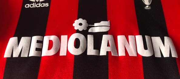
Notes: To me, this is the quintessential AC Milan shirt – despite the lack of crest. It is of course my second ever shirt and I had to pester my aunt quite hard to buy it for me. She finally gave in upon a visit to Intersport Eybl in Linz, where this fan version was sold. All the logos are made of a felt like material and the shirt is in remarkable shape for its age. Yes, there is a minor pull on the front and three larger ones on the back as we had cats and I was wearing this shirt quite frequently during my teens – even in gym class. I love the floppy rossonero-collar and the sponsor is just a classic. After all, Mediolanum is the Latin name for the city of Milan.
Again, there was a long silence from me as I am continuing to focus on my YouTube channel. However, as my collection is growing, I always wanted to document my shirts and I think this is the perfect opportunity to keep on posting to my blog. In case you are still interested in me rating current shirts, I offer you to come over to my YouTube channel https://www.youtube.com/c/MySoccerUniverse and follow me there. Now, I am planning to do these posts in order as they entered my collection which of course is a bit fuzzy esp. at the beginning. But for most cases, I have the order down quite well.
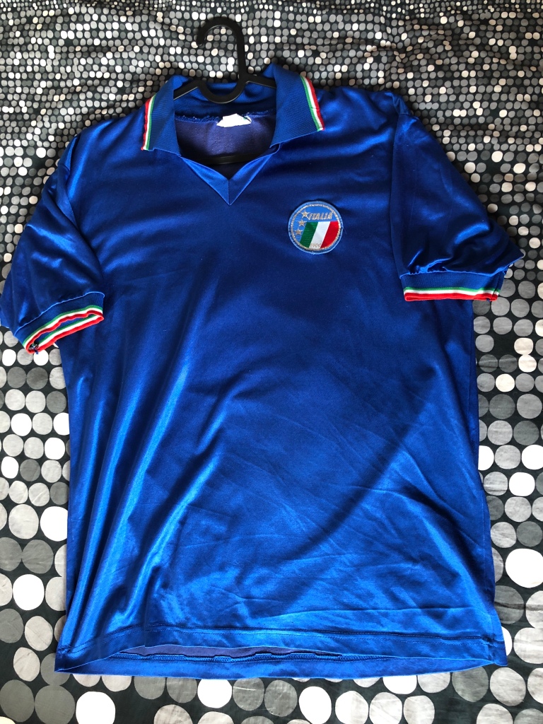
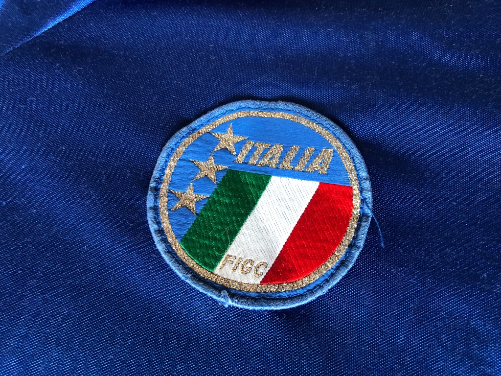
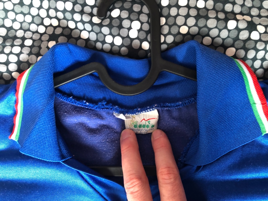
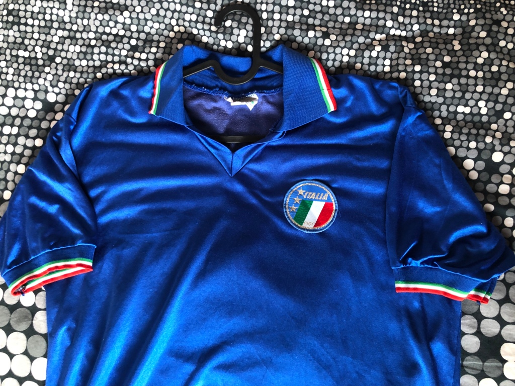
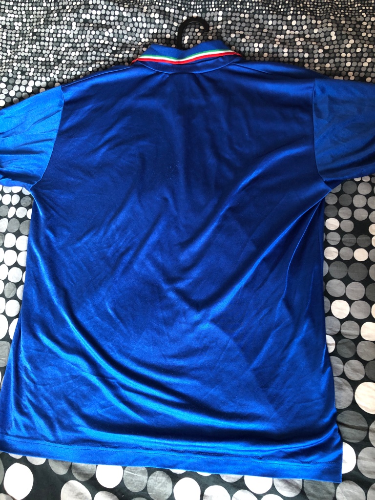
⚽👕#1: Italy Home (1990-1991) 🇮🇹
Acquired: 1990 (gift from my aunt)
Brand: Diadora
Size: Large
Version: Unbranded player version
Condition: good (sleeves, collar and crest wrinkled)
Favorite player: Roberto Baggio 🇮🇹
Notes: This one started it all! This is my first ever real soccer jersey. A friend of my aunt bought it for her while on vacation in Italy as a gift for me. The price was more than my aunt expected to pay, but little did she (or I for that matter – being just 12 years old at that time) know that this is a player issue version. Regardless, this shirt has always been the pride and joy of my collection! The silky smooth and shiny material, the beautiful flag trim and the overall quality speak for itself. I was wearing this in gym class regularly for 6 years running!!! At the end of the past millennium it suffered an unfortunate accident, when my mother accidentally washed it a bit too hot and hence the wrinkling occurred. From that moment on, I was wearing it much less often and even learned to take care of shirt for myself from that moment on. About 5 years ago, I learned that this is indeed a player issue and was truly dumbfounded! In 2020, I finally got the courage to try and iron out some of the wrinkling which was a good but not overwhelming success. As of this moment, it hangs very prominently in my office/studio on permanent display only to be worn at very special occasions!
Before we tackle the smaller nations at this year’s Copa, there is one less giant that we need to look at first. After all, the last time a (proper) soccer tournament was played in Brazil they reached the final. We are talking of course about Argentina’s albiceleste.
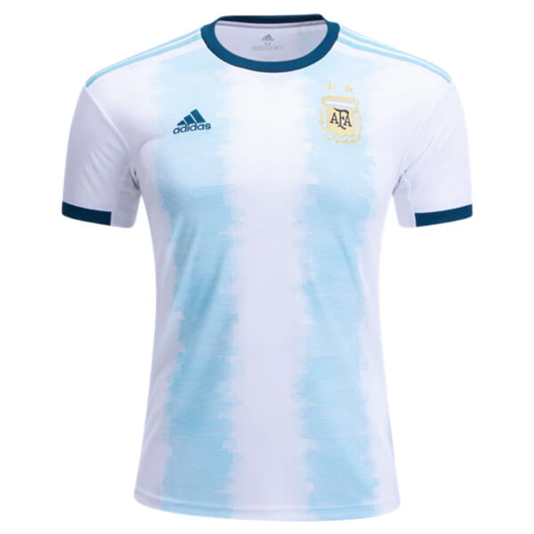
Well, these days it is almost expected that we get a new Argentina (home) shirt ever year. It is also a testament on the crazy amount of tournaments South American teams had to play since (at least) 2013 (for Argentina 2014): Confed Cup 2013, World Cup 2014, Copa America 2015, Copa America Centenario 2016, World Cup 2018, Copa America 2019, Copa America 2020. What can I say it is a marathon. And the cynic in me would argue that having the next Copa in 2020 would allow L. Messi one more realistic chance to finally win a title with the national team and of course another jersey.
Considering all this, we are looking at another “transition” jersey. The last such jersey (for the Copa America in Chile) was a great one that would have deserved to be worn a lot longer. So what about the 2019 version:
Argentina 2019 Home Jersey
Argentina 2019 Home Jersey with full #7 Kun Aguero customization
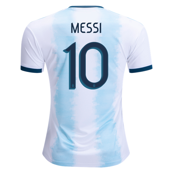
Back of Home Jersey with 10 Messi customization
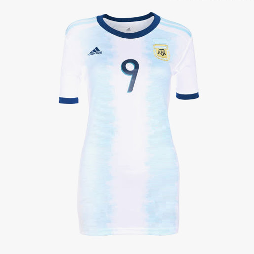
Women’s version of the 2019 Home Jersey
Argentina-Venezuela 1-3 (Madrid, Mar 22, 2019)
Japan-Argentina 0-0 (Paris, Jun 10, 2019)
Oh boy! Where should I start? Well, it may not hurt to start with the positive: This jersey is very much identifiable as an Argentina jersey despite all its flaws that I will describe below. So, it at least passes that minimum smell test.
However … this time Adidas went for the minimum amount of stripes on the jersey – the first time they have done so since 2011. Not bad per se, but having white as the base and this super light tone of blue makes this jersey feel a lot more like a plain white jersey rather than a proper Argentina jersey. It is a personal preference, but I do like the blue stripe in the center and think that it would have given this jersey a bit more personality if they had done so (and keep the sleeves as is to continue the stripe theme).
Then, there is the weird soundwave patter of the stripes. I know pixelated accents are the latest trend in Adidas jerseys, but here it does get a bit much – especially up close. And it is in total contrast to the very orderly three shoulder stripes. Those are probably the best feature here as they add a certain elegance to the shirt.
Now, if you thought we had covered all the not so nice to bad, you are right. So, let’s get to the worst: the tertiary color on this jersey is not black, but rather a steely dark blue! I understand somewhat the need to do new things, but this is definitely taking it a few steps too far. Going outside the traditional color palette is never a good idea and this blue tone adds a certain softness to the shirt, that the regular black just does not have! Even worse, the color is carried over to the pants! I would have understood it if they had their 2015 away jersey. Then you could mix and match pants. But the current away jersey is black (and will remain so during the Copa)! It just does not make sense from whatever angle you may look at it. I really hate this choice.
So, let’s finish on a slightly more positive note: the new font. I like its more traditional rounded look, although it gets at times quite close to the 2010 Adidas font that marred some of the best shirts in that tournament. Still, it is a vast improvement over the one used in Russia last year. Note especially how legible the names suddenly are!
Well, I do understand that in order to sell a new shirt (almost) every year, you need to get creative. And towards that end the soundwave pattern is not a bad idea. However, it may have looked better on thinner striping or if the colors were reversed as indicated above. In a way, Argentina’s stripes have seen quite some modifications as of late (i.e. 2014 and 2018). I just find the “loose” forms of these stripes a bit too much in contrast with the (wonderful) shoulder stripes. That the accent color in addition is totally off-kilter doesn’t make things better. To be honest, this is one of the first Argentina kits I have seen in a while – even worse than the last one!
On to another South American power. Yes, I am gonna do all the South American teams first. Then, we will switch the continent. 🙂
Of the big three in CONMEBOL, Uruguay arguably had arguably the best decade. And I personally loved their revival. Yes, Chile may have won more titles, but in the end Uruguay was the most consistent team. Always surviving the group stage of the World Cup and even making it to the semis. In addition, they won the 2011 Copa America in their big rival’s backyard – Buenos Aires. And now, the competition is hosted by another rival. And Uruguay playing in Brazil? There was something …
In any case, Puma did release a new set of kits for the celeste celebrating not the triumph of 1950, but rather the win in 1987 (curiously in Argentina …). So, let’s see the home shirt first:
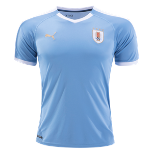
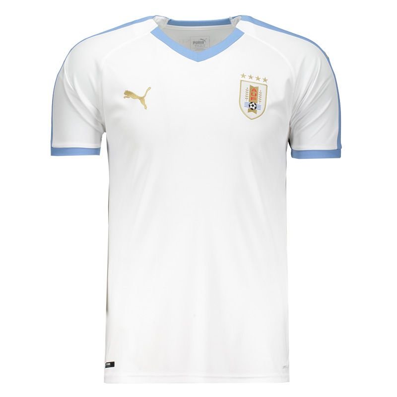
Uruguay 2019 Home shirt
Thailand-Uruguay 0-4 (Nanning, Mar 25, 2019)
Well, more or less what we expected: a light blue jersey – plain and simple. There is no sublimated motif, just a few golden Puma logos and white accents. Wait, white accents? Well, yes! This is what Uruguay was wearing back in 1987 and occasionally even in recenttimes. And overall, I do like the white form stripe along the shoulders, white sleeve cuffs and the white V-neck. And since the numbers are added in black, there is enough continuity carrying over to the black shorts and socks.
Let’s look at the details: As with the 2018 shirt, the V-neck is only accentuated on the front and the back in white. The form stripe comes down from the collar which leaves then two little gaps on the sides of the collar. Which is slightly odd. And the gold? Yes, it has featured before and is very subtly applied. But I do think that a little black would have done the shirt quite well.
So, yes it is a nice looking shirt, but it does lack a little bit of visual interest. And for that reason:
My rating: 7/10 stars.
Now, the away jersey is just what you would expect given the home jersey:
Uruguay 2019 Away shirt
Back side of the away shirt
Uzbekistan-Uruguay 0-3 (Nanning, Mar 22, 2019)
This is really just a color reversal: white for light blue and done. So, we can look at one further accent of this shirt: just below the collar both shirts have a Uruguay word mark. Very subtle and rather simple. Especially when comparing it to the font still in use for the numbers. Still cannot get over that.
Well, there really is not much more to it. Both jerseys remind me of the current Israel jerseys, but at least the home jersey is worn with black pants for added contrast. And so, it wouldn’t make sense to rate this jersey any different than the home jersey:
With the Champions League final effectively closing out the club season, I am now more than ready to turn the page to this summer’s national team tournaments. I also hope to find sufficient time to look at least at the most interesting jerseys. One, we have already seen, so let’s turn to the other big talking point at a national team level:
As this year’s hosts, Brazil are not only favored to win it all, but for once want to host a sporting event without much trouble surrounding it Remember, Brazil and Chile switched hosting rights for 2015 in order to avoid Brazil hosting four events in four years as the populace was not ready to shoulder the sole burden for the World Cup AND the Olympics. Well, the switch also had a nice side effect: it provides a suitable way for Brazil to celebrate the centenary of them hosting and winning the Copa America for the first time. And they do so by wearing this shirt:
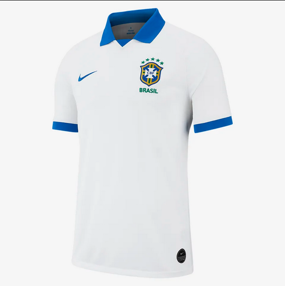
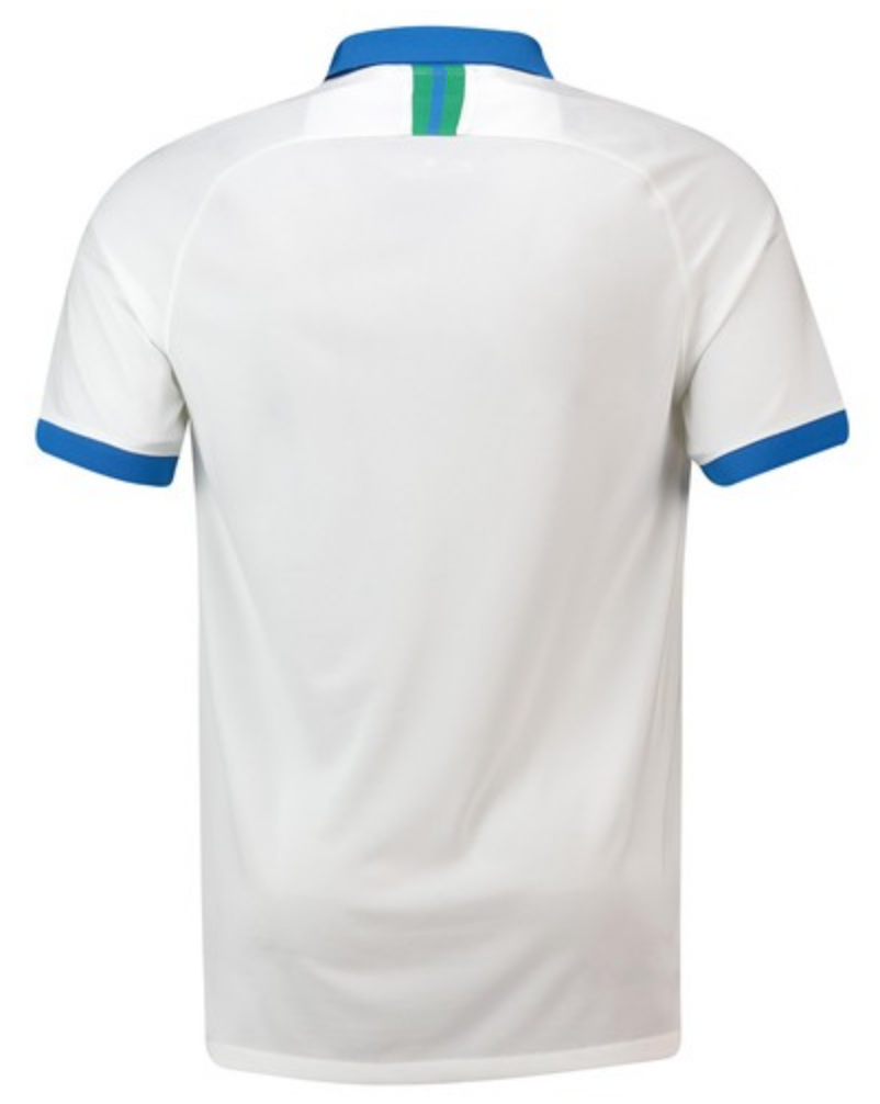
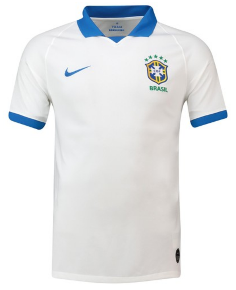
The 2019 Copa America Brazil Away shirt by Nike
The backside of the shirt – note the green and blue taping.
Front view of the shirt.
Well, what a surprise! A white kit with a blue collar. As I have outlined in my history of the Brazil home shirt, this used to be Brazil’s look until it got retired in the wake of the Maracanazo. In fact, since then it has only been used once in the FIFA centenary match in 2004. At first, it was rumoured that this style would replace the iconic home kit, but then seemingly cooler heads prevailed and the white jersey was released as the away jersey just for the 2019 Copa America proper.
In a way it is a shame as this is a very fine, classy and classic looking shirt. Overall, rather plain with a blue collar that is complemented with a triangular inset on the front. Also, the sleeve cuffs are blue to round out the nice overall look. There really is not much more to it and fortunately, the CBF has refrained from using their new logo on the shirt (it will happen in 2020, though).
The font for names and numbers leaves slight room speculation. I do expect the same font as for the World Cup, but what color will they use. Blue seems to be the most reasonable, but I would love it if the font was green with yellow accents. But that is unlikely. Or how about replicating the pattern on the taping below the collar on the back? That would be color accent, I would very much welcome!
To me, the look is a winner and I hope that the selecao will fare better in these than their predecessors from 1950. But then, it is not a World Cup played on home soil and so, we wouldn’t expect a Brazilian meltdown. From all I have seen so far, this shirt gets a big thumbs up from me! (And I may change the grade based upon the type of font used.)
My rating: 9/10 stars.
It is unusual that I cover the away shirt prior to the home shirt, but given its unique choice of color, I think this is justified. And honestly, there won’t be much to write about this particular jersey:
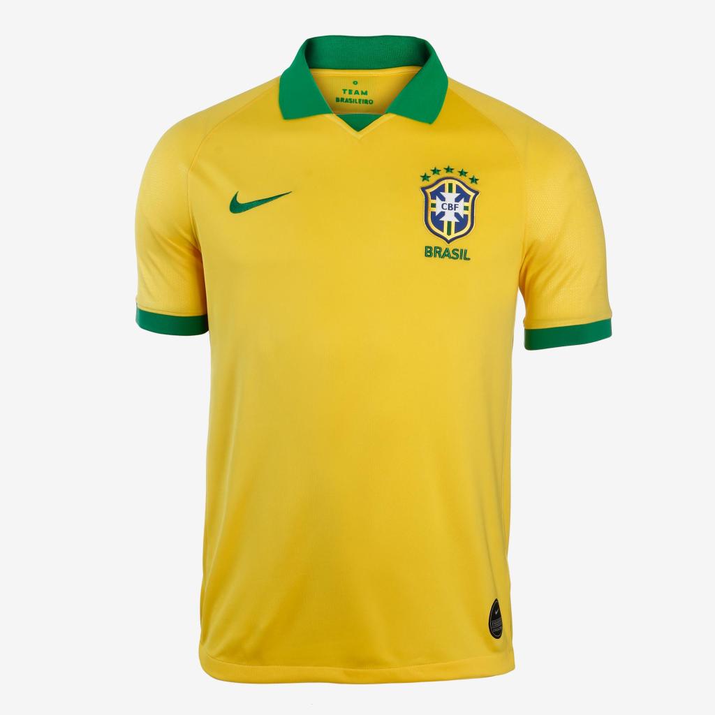
The 2019 Brazil home shirt issued for the Copa America.
The back side of the shirt.
This is the away jersey recolored in the typical yellow with green style we come to expect from Brazil. And that this particular style is used also does not come as a big surprise: the last time the collar with a triangular inset featured on the home shirt, Brazil won the 2013 FIFA Confederations Cup on home soil. In addition, that shirt is also a reference to the 1988-91 shirt, where Brazil bombed at the World Cup, but again managed to win the Copa America on home soil in 1989. So, like France in 1998, Brazil tries to conjure up good spirits to carry them to continental glory.
However, not so fast my friend. There is one key difference: the triangle is green here and not yellow as on the more successful predecessors. I really hope this is not a bad omen. 🙂 But I also have to say, you could choose worse jerseys to be superstitious with as I really like this look a lot. In fact, I would even say that this is my favorite Brazil look (I guess the fact that I saw Brazil first play at Italia ’90 played a big part here).
Honestly, this is the best Brazil look! I gave it 10 stars in 2013 and I will do so here. The hosts will definitely look sharp this summer!
So, we leave Europe for a while and look elsewhere in the world. With three big national team competitions (plus the Gold Cup) this summer, there surely is enough to cover in terms of new jerseys. And I want to start with the Copa America as this very jersey might feature slightly altered in the Premier League next season. More on that in a bit.
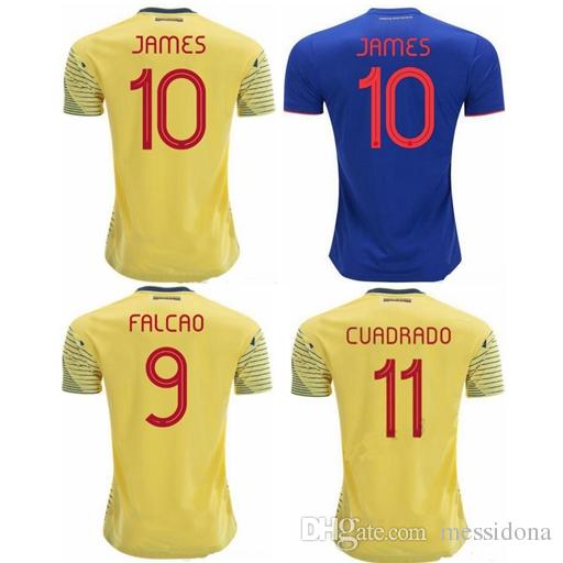
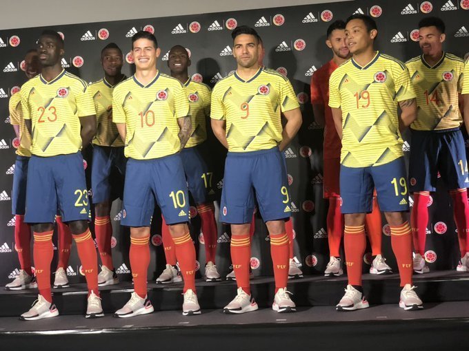
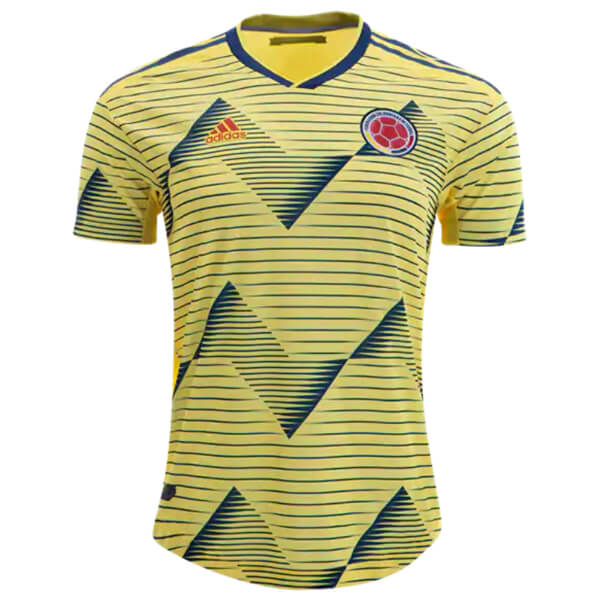
It may not be the big story (jersey-wise) of the upcoming Copa America, but the new Colombia shirt is definitely a looker and thus, let’s make this the first Copa America jersey we will look at this year:
James Rodriguez and Radamel Falcao celebrating in honor of Quintero at Japan-Colombia 0-1 (Yokohama, March 22, 2019)
New font used on the 2019 Colombia jerseys.
Presentation of 2019 home kit
Colombia 2019 home jersey
‘Bruised banana‘ was one of the first things that came to mind here. And if that was truly the inspiration (Colombia is after all a major banana producer), then kudos to Adidas. But I do have my doubts. I rather think that another 90s inspired print needed to be shown off at a major tournament and of the three South American Adidas teams (there is also Japan) present in Brazil, only Colombia with its yellow tops fit the bill.
However, Adidas fared much better with re-creating a classic kit a year ago than with this one. There is just too much navy on there and the whole look is decidedly cluttered. The wavy bruised banana pattern is created by horizontal lines of differing widths in similar fashion to the current Germany jersey and is also present on the sleeves. But it is all a bit too much as I think the pattern is too big. It also is very much present behind the crest and the Adidas logo on the front and thus de-emphasizes them. Not a very good idea. The placement could have been done in a more clever way. To top it off, the top part of the red numbers on the front is also affected.
I also think the jersey lacks some visual punch due to the even lighter shade of yellow used. It was already too light at the World Cup, but this one takes it a step further into a wrong direction. It increases the contrast even more and thus from a distance, the overall look is a bit “muddy”.
My two favorite features here are the nice fold-over V-neck and also the new number font. Very clear and nicely rounded. It is pleasant to look at and reminds me of numbers used in the 1950s and 1960s. Nice touch.
The back is in complete contrast to the front totally plain. Given that UEFA is trying to ban these two-sided shirts soon, I hope this is also the last time we see this on the international stage. I like that the numbers are clearly legible, but I do not like the contrast between front and back.
Now, back to the ‘bruised banana’: the reason, I chose to write this post first is that I really think that Arsenal could wear a very similar shirt in the ’19/’20 campaign. We already have reports that the ‘bruised banana’ design will come back and this is very close to it. So, you hear it from me first: this is not only the new Colombia home jersey, but also the new Arsenal away jersey! Well, time will tell if I am right here.
As Colombia jersey, this one is meh. At the moment, I do not see the obvious connection to the country (except for the bananas and the colors) and I really do not like the light shade of yellow. The red numbers are saving it from the abyss, but considering the size and the placement of this pattern, this one is not a very good jersey. Sorry, Adidas. However, if you do this for Arsenal, I might give out a higher grade!
My rating: 3/10 stars.
How would you rate this jersey?
If you enjoy this post or this blog, consider checking out my YouTube channel, where I talk more about jerseys, but also about soccer in general. You can also follow me on Facebook and Twitter and get notified every time I post either here or on YouTube.
I am feeling creative and I am starting this post on the same day that the Albania one posted. So, on to the last but surely not the least team of the 2018 UEFA Nations League C. During my research on Israel jerseys, I found the super informative blog Israeli Matchworn, which I of course used extensively in my research. Originally, I even wanted to extend to at least 2014, but in the end it seemed best to start in 2016 as I could not find a good picture for the 2014-15 home jersey. And as both jerseys used the same template as Albania, my motivation to go super comprehensive got diminished. After all, you can check out Israeli Matchworn. But, let me know if you wanted me to cover these in a future post. I would like to hear from my readers.
Israel is in many ways the odd man out in European soccer. Don’t get me wrong – when I hear Israel, I am automatically thinking Europe. But geographically it is decidedly in Asia. However, with that many non-cooperative neighbors, it makes all the sense in the world to have Israel as part of UEFA. It might diminish their chances of qualifying for a big tournament, but you frequently get matches against bigger nations and are truly competing against the best of the world which is a big advantage.
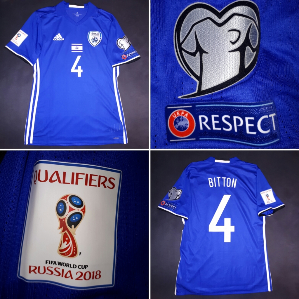
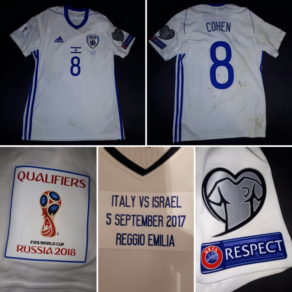
Another benefit of being a member of UEFA is the fact that UEFA has a contract with one big supplier to give jerseys to its smaller nations that have no hope of getting a good kit deal themselves. Somewhat surprisingly, Israel was part of this program from 2008-2017 after seemingly being dropped by longtime supplier Puma. Thus, Israel was wearing Adidas jerseys starting with the 2010 World Cup qualifying campaign:
2016-17 Israel home jersey as worn against Italy on Sep 5, 2016. Image courtesy of Israeli Matchworn.
2016-17 Israel away jersey as worn against Italy on Sep 5, 2017. Image courtesy of Israeli Matchworn.
First off, do you see what I mean with slim chances for qualifying? Israel was in a group with Spain and Italy! But to the shirts, where we first look at the home shirt which is blue as we would expect. In fact it is very close to the shade of blue from the flag. Now, the first time I saw Israel play in 1992 (against Austria), they did so in light blue jerseys and they also did so at the 1970 World Cup. So, in a way I always had Israel pegged down for sky blue jerseys. But looking at the flag, the deeper royal blue seems to make more sense, but also looks a bit generic.
Now, to the jerseys per se. Both feature a very generic and simple Adidas template with the three stripes running down the sides. For the blue home jersey this means white side stripes. White further appears on the sleeve cuffs and the backside of the collar. Of course the Adidas logo and the names/numbers are also white.
As for applications, Israel uses both a crest and the flag. And I have a slight issue with both of these. I definitely do not mind putting a flag on the shirt, but just the flag in its rectangular form is boring. Do it at least the Algeria way and make something more interesting, do not do it the Swiss way! It just adds to the “generic” look of the shirt. The crest on the other hand is everything but generic. It is rather a product of modern abstraction. In this case, the lines at the center form a star of David, but it is not immediately obvious. At least there is no soccer ball. But wait, there is more! Doesn’t it look familiar? No? Just imagine it in green! Clearly, Israel hired the same designer as Ireland and they both got very similar crests, which is disappointing. So, to summarize, both symbols are fine, but not great. And as usual, I would have preferred the national emblem.
I like the simplicity of the shirt, but almost everything here screams average. So, that’s what you get.
My rating: 5/10 stars.
Now, the away jersey is in many ways just a color reversal of the home jersey. Except for two details: the collar is now contrasting with the rest of the shirt (a nice feature) and there is some piping emanating from it (a not so nice feature). The piping somewhat bugs me as there is no real rhyme or reason to it. It just goes over the shoulder and end in the middle of nowhere. It just looks odd.
So, one nice feature, one that bugs me. Both are offsetting each other and the rating remains the same.
My rating: 5/10 stars.
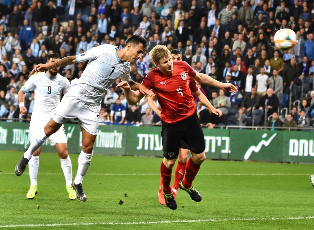
Now, after that qualifying campaign, big changes were ahead for the Israel national team. It all started by hiring former Austrian sporting director Willi Ruttensteiner – a man of high football knowledge and vision. To this day I cannot understand why he was let go by Austria at the end of 2017. Austria has been going down ever since. Now, the Austrian connection did not end there, as Ruttensteiner quickly hired Austria’s best player of the 1990s, Andreas Herzog, as the new coach. A contentious decision, as a free kick of his ended Israeli qualifying hopes in 2001 in a very heated atmosphere. But Herzog seemingly was able to form a team spirit and the team almost made it out of Nations League C. Only a narrow loss to Scotland prohibited them from doing so. And they did so in their spiffy new Puma jerseys:
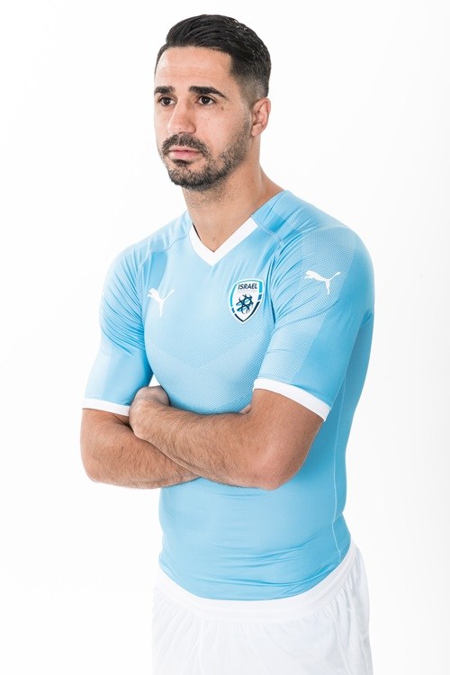
Promo shot for 2018-19 Israel kits
2018-19 Israel home kit
Israel-Scotland 2-1 (Haifa, Oct 11, 2018)
Wikipedia claims that these blue jerseys are the away kit, but from all I have seen in the Nations league, I can only come to the conclusion that these really should be the home kits. And what home kits they are!
Sky blue is back and boy it is beautiful. And the simplicity of the shirt really let’s the blue shine through! There are only a few white accents on the sleeve cuffs and of course the collar, which – as is usual for the current Puma template – is broken up by the raglan sleeves. You also get the typical Puma dot pattern, but nothing special. It is more Italy than Uruguay when looking for bespoke pattering. Looking up close you might make out a very subtle chevron made from the same dot pattern as on the sleeves.
While the jersey is missing a bespoke pattern like most other Puma nations, the overall feel is very much like the Uruguay – especially considering the black names and numbers. In fact, I would argue the white accents make it feel like a better version of the Uruguay shirt. But I guess, this down to personal preference.
Simple, but beautiful. Not quite sold on the collar, but I love the uncluttered look and the simple feel of this one. A definite improvement!
My rating: 8/10 stars.
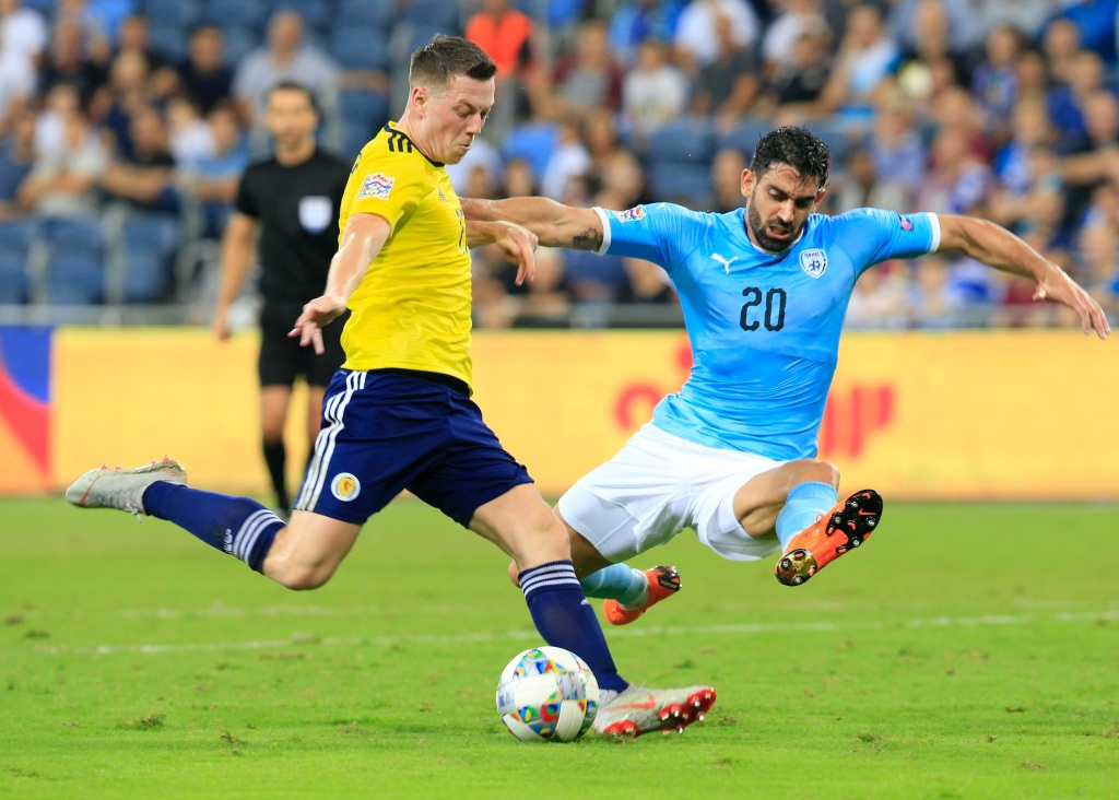
Now, the Nations League did not end as desired, but Israel was handed a very doable qualifying group containing Poland, Austria and Slovenia. Playing Austria also had the added benefit of knowing the opponent inside out and providing coach Herzog a chance for redemption. After all he got overlooked three times as the new coach of the Austrian national team (and dare I say rightly so on at least two occasions). And redemption he did get, when Israel beat Austria 4-2 at the start of the qualifying campaign (a game I am still not over because Austria thought they would win it in first gear). And that win was achieved in their away jersey:
2018-19 Israel away jersey as worn against Scotland. Image courtesy of Israeli Matchworn
Promo picture of 2018-19 Israel away jersey. Note the light blue number!
Israel-Austria 4-2 (Haifa, Mar 24, 2019)
Again, this is a color-reversal but with a slight twist. And that twist comes in form of the chevron across the chest which is now much more visible. The obligatory form stripe is also of the same subtle shade achieved by a tight dot pattern. All in all a very nice touch.
Originally, this shirt was intended to be worn with sky-blue numbers (and I have a feeling white numbers were slated for the home kit), but I guess saner minds prevailed and black was chosen instead. After all it does provide the best contrast.
As with the home jersey, the collar is broken by the sleeves, but otherwise the shirt is simple and effective. My only gripe is the fact that the white contrasts too little with the home jersey and Israel is poorly equipped for color clashes. I think this might be the reason that the team had to play their opening EURO 2020 qualifying matches at home in white. But by itself, this is simple, but also quite nice.
Yes, I did not forget about Israel. But in my randomly generated list, they are the last team to be covered and Albania is among the first ones. And in reality, I already want to write about some of the awesome kits released for the big three tournaments this summer. But finish the job, Roland! So, I briefly agonized over putting Albania ahead of Israel or not. In the end it will be Albania first, simply because it will require a bit less time consuming. Ah, the lazy side always wins! 🙂
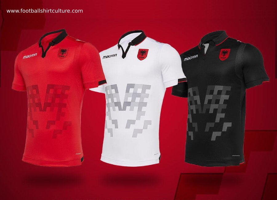
So, somewhat unexpectedly (at least to me) Macron released an entirely new set of kits for the start of EURO 2020 qualifying. A start that was kind of shaky: 0-2 at home to Turkey followed by a 3-0 away to Israel. Here they are in their full PR glory:
Albania 2019-20 jersey set
This release was surprising to me as the previous set only lasted for a single year or so. However, the new set does something that the 2018 version does not: reference the Albanian flag. Otherwise, Macron stayed largely true to their previous concept. Let’s knock the jerseys out, one by one and start with the home jersey:
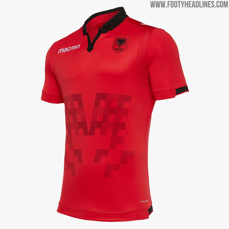
Albania 2019-20 home jersey by Macron
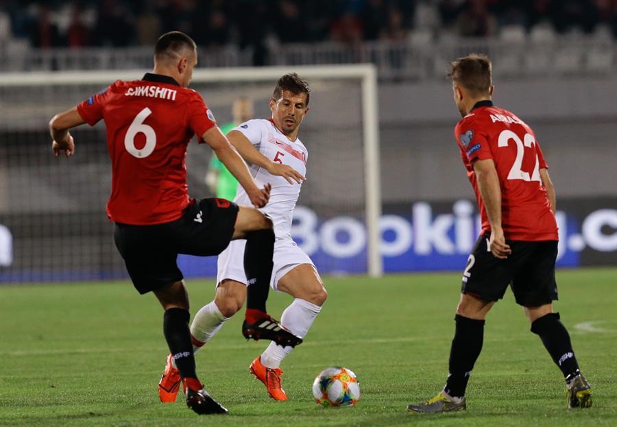
Albania-Turkey (Tirana, Mar 22, 2019)
Well, as before we get a largely red shirt with a black collar.. This time around, Macron really aced the collar (at least to my eyes). I especially like the opening of the polo style collar as it reminds me of traditional clothing on the Balkans. I am not sure of the top of the sleeve cuffs is open or features a black patch. As far as I can tell from the promo-shots it is the former, but the in-match pictures don’t confirm this. Still, it is a decent, but somewhat strange look, either way.
The crest is still quite nice, but the red shield more or less blends in with the shirt as it did with the previous iterations. But surely, the big eye-grabber is the abstract pattern on the front. As with the 2016-17 shirt, this is a clear reference to the double-headed eagle on the Albanian flag. I personally like it a bit better than the 2016 version, but it still is a bit too abstract to my liking. And the different shades are a bit too random (I am of course saying this as a statistician).
Overall, this is an improved look over 2018, but I still would love a less abstract pattern on there. But in-match these jerseys look quite nice. And I love that a pretty simple font is used for names and numbers. No fancy Puma or Adidas stuff. Just keep it simple!
Due to the really nice collar and the slightly cleaner look, I will go with a slightly higher rating as before:
My rating: 8/10 stars.
Now, to the two alternate versions:
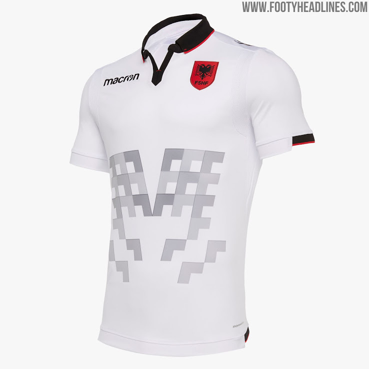
Albania 2019-20 away jersey
Albania 2019-20 third jersey
Well, both jerseys are just re-colored versions of the home jersey. And this also means that the collar with the red trim and the full-colored crest. And it is especially the latter feature that makes both of these look great. Also, the abstract pattern is preserved and adjusted for the main color of the jersey. So, they are light grey on the white version and dark grey on the black one.
I really love the look and feel of the white jersey, which also comes with black names and numbers. Due to the high contrast, the collar really stands out and gives the jersey even more elegance (which is swiftly undone by the pattern on front). Also, note how the crest really stands out here. This is high contrast at its best. So, this is marginally better than the home jersey, but not really enough to warrant a higher grade.
My rating: 8/10 stars.
And this time around, the black jersey also really looks well as it is simply that: all black with the exception of the crest and the pattern. I assume they would use white names and numbers on this shirt, although I would love red ones on there – but I really cannot see that.
Should they have re-colored the collar to red with a white trim? Maybe. But I like the clean overall look here. To me, I cannot really separate this from the home shirt, so let’s stay with the rating. These are nice shirts, after all!
Now, we are really going deep. In fact, only two nations from Nations League C are missing (including Lithuania). However, I won’t go to League D afterwards, but rather start looking at the new jerseys for the big competitions this summer. So, expect a lot of African and South American posts soon. And then, there is also the Women’s World Cup with some excellent jerseys. All in the future, so let’s get to Lithuania first.
To be honest, there really is not much I can tell off the top of my head about the national team of Lithuania. They were always a lot better in Basketball than soccer. But I do remember one thing: in the early 1990s, Austria’s leading team at the time, FK Austria Wien, relied heavily on the brilliance of two Lithuanian stars: Valdas Ivanauskas and Arminas Narbekovas – both of whom were star players in the league.
But that is probably it as Lithuania never really made any major impact on the European soccer scene and even worse is currently in a true funk. In World Cup qualifying, the team only managed a solitary win over Malta and finished well off the pace. At least, the jerseys worn in that campaign are something to talk about:
As we will see, Lithuania splits its national colors between the two versions of the kits which are currently manufactured by Hummel. The home jersey is typically yellow and worn with green shorts. And while I would love to see red socks, more often than not the socks are yellow. It surely is a very unique look within Europe.
In the 2016-17 version though, the shirt is yellow with black and white accents which is quite off brand. In fact, at a first glance, I would not have made these out as Lithuania shirts. Why not use green and red instead and do something special here?
Also, the design is rather odd with hockey-style black shoulder yokes that are connected to the black side panels with some piping. In between is a V-neck collar outlined in black-yellow-black and with. the front looking weirdly incomplete.
The sides are embellished by Hummel’s trademark chevrons in white. Take out the piping and this would actually be an interesting template. However, as I said above when using it for Lithuania, I would have wished that black would have been replaced by green and the chevrons probably should have been in red.
So, that was a downer, but there are also some really nice features: the crest is quite unique and frankly superb. Of course it references the knight from the coat of arms, but in a modernized version. Furthermore, there is a subtle all over pattern on the shirt that really adds a special something to it.
Names and numbers are applied in a rather simple style, which is what I come to expect from Hummel. So, no foul, but rather enhancement here if we again overlook the use of black.
My main problem with this shirt is two-fold: the strange template and the use of black (and to lesser degree white) as an accent. The crest and the pattern are on the other hand quite superb, but they don’t lift this shirt too much:
My rating: 5/10 stars.
I wrote a lot about the home jersey, but there was a good reason: the away jersey is just the home jersey in red. All the black and white accents remain as does the overall look of the shirt.
Oddly enough, the shirt is worn within an all-red kit thus all the other two national colors are not even present on this one. But then, the yellow/green is so unique that this shirt has not been worn in any of the qualifying matches for the World Cup, which is a bit of a shame as it doesn’t look bad.
My rating: 5/10 stars.
Now, for the Nations league. Hummel issued a new set that pretty much addressed all the issues I have raised above:
The jerseys prepared for the clash against Serbia. Note the 100 year patches below the collar.
Romania-Lithuania 3-0 (Ploiesti, Nov 17, 2018)
Off the bat, the design is much simpler with yellow a lot more dominant. In typical Hummel style the chevrons run down the shoulders and are in green. Other than that, there are side panels in green and white which to me don’t serve much purpose except for pointing out that players sweat there a lot. Well, it does extend onto the sleeves and so gives it a bit character, but it also should have extended to the bottom.
Speaking of the bottom, there is a really nice pattern on the tail of the shirts in the national colors. It is very subtle, but a great looking touch!
But then, the black accents are retained for all applications. Maybe green would have also done, but here I do not mind the black at all. And I am also happy that the simple font was retained.
The side panels are odd, but everything else looks quite well. This is a nice kit!
My rating: 7/10 stars.
Now, as before the away kit is just an all-red version of the home kit. And this one actually was worn when the Lithuanians had to face Romania away from home. And on that rainy night, we got a rather simple shirt.
Same template, but now we have only silver accents and white applications. It is a decent look, but maybe bordering n a tad boring as none of the other national colors pops up.


You must be logged in to post a comment.