LASK (Home 1996-98)

As my collection is growing, I always wanted to document my shirts and I think this is the perfect opportunity to keep on posting to my blog. In case you are still interested in me rating current shirts, I offer you to come over to my YouTube channel https://www.youtube.com/c/MySoccerUniverse and follow me there. Now, I am planning to do these posts in order as they entered my collection which of course is a bit fuzzy esp. at the beginning. But for most cases, I have the order down quite well. But then, for this shirt I am not quite certain whether it is No. 3 or No. 4, but I think I owned it before the one I am going to post next. 🙂

⚽👕#3: LASK Home (1996-1998) 🇦🇹

Acquired: 1996 (Passage Linz – local sports retailer)

Brand: Reebok

Size: X-Large

Version: Fan replica version

Condition: very good (on pull on back and signs of use)

Favorite player: Vidar Riseth 🇳🇴

Rating: ⭐⭐⭐⭐⭐⭐⭐⭐⭐⭐

Notes: Another quintessential shirt! This one is a true LASK classic and a model of how a proper LASK shirt should look like. It is also helped by the fact that at the time there was a true sense of change around the team and some of my favorite memories of watching the team were in my late teens. In particular the 97-98 season under Norwegian coach Per Brogeland and the then innovative and attractive style of play were a true joy. Heck, we even had the league’s top scorer in Norwegian Geir Frigard. This shirt may also be the first one that I bought with my own money, however I am unsure about the order in which I got my third, fourth and fifth shirt. In any case, I have worn this shirt a lot to LASK games and it is still my go to LASK shirt, so there are quite some signs of wear Interestingly, for the player version, the (then new) crest was one stripe closer to the center and the Reebok logo was centered I order to allow space for the (also then new) league logo resulting in a better look IMHO.

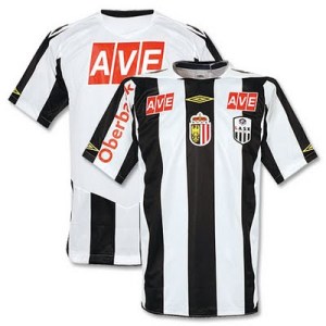
LASK (Home 2009/10)

During my goodbye week for Umbro (I certainly will not stop posting Umbro shirts from the past), I definitely don’t want to forget that Umbro has also supplied my home town team during the most recent successful period of the club. Not only will Umbro be linked to the side that gained promotion and also surprised everyone during their first season back at the top level, but also to a side that in Fall 2009 probably played the most spectacular (if not necessarily successful) soccer in Austria. And it is the shirt worn by that team that I want to look at today.

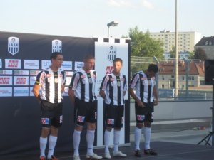
The shirt features the classic striped design with the black stripe running down the center. As you may know from previous posts, I do prefer thinner stripes a bit more, but this shirt does look acceptable. Around the round collar there is a triangular white patch holding two rhomboids each – a reference to the classic Umbro logo. While it gives some “closure” to the stripes it also gives no accent whatsoever to the collar. I like that the sleeves are also striped and they hold the Umbro logo towards the end. The best feature of the shirt (and for that matter any LASK shirt since 2006 ?) is the inclusion of the Upper Austrian coat of arms on the center stripe right below the Umbro logo. While other teams from my home province have been more successful lately, LASK is by far the most popular and polarizing team there. A true team for all Upper Austrians (unless you live on the fringe towards Bavaria). I also like that due to the wider stripes, the club’s crest is nicely placed in between two stripes. The right side may look empty on the shirt below but during league play it held the logo of the T-Mobile Bundesliga (see picture at the presentation of the new kit). Thus everything was nicely balanced here. Now to the downside of the shirt (or for that matter of almost any team in Austria): due to lack of sufficient funding Austrian teams are full with little sponsor patches. LASK being one of only two teams not having sold their name to a sponsor is actually one of the less offensive ones. First of all, the jersey features only two sponsors (one on the right sleeve and two small patches above the crest and the league’s logo) and second they actually fit into the team’s color scheme. So, while it does look busy it does not look as bad as it really could.

LASK-2009-homeLASK-2009-home-team

Unfortunately, the back of the shirt is not all striped, but has a big white patch holding the sponsor as well as names and numbers applied in black in a somewhat angular font.

This was a nice, but not perfect jersey for LASK. They played some very exciting games in that jersey, but ultimately they ended up conceding too many goals in order to launch a real challenge. Still, I will remember this one fondly.

My rating: 7/10 stars.

How do you rate this shirt?

LASK (Home 1996/98)

Today is my brother Wolfgang’s birthday and in his honor I am going to review two jerseys of his choice. Since one of them fits so nicely into Flashback Friday, I will write about it tomorrow, but still for him. However, his first choice also holds a very special place in my heart since it is probably the most iconic jersey of our favorite team: LASK from our hometown Linz.In addition, this is my 77th post. Since this number is one if my “lucky” numbers, I just find it fitting to reserve it for a special jersey.

Some of the most memorable games that I remember from my teenage years have been played in this one. Although it fell apart quickly in November 1998, this was the time when our team finally seemed on the way of assembling a truly great team. One that played extremely entertaining and high-scoring (if often maddening) soccer under Per Brogeland and delivered Austria‘s highest scoring player in the guise of Geir Frigard. It was indeed a semi-Norwegian team back then featuring also Vidar Riseth (my favorite player of these times who also played at the 1998 World Cup), Rune Tangen and for a short period Hai Tran (yes, also a Norwegian). And they played in a jersey that should be a model for all subsequent LASK jerseys.

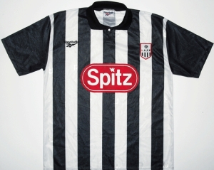
LASK traditionally plays in black-and-white stripes with a black stripe down the middle and the stripes having medium width. That is exatly what they got in their first year under Reebok. The jersey also had a nice shirt collar that fit in nicely. The single sponsor may not conform to the black-and-white color scheme, but note that red is the accent color and features usually heavily on the Away jersey. So, it just fits and is not too humongous either. The new LASK logo (and yes, we can debate about that one but it has been in use now since 1996) is framed in red and sits exactly opposite of the Reebok logo. If I want to be picky, both maybe should have been on the adjacent black stripe closer to the center, but are still appropriately placed. Also, the sleeves are in all-black. It really does not bother me that they are not striped since it gives the jersey a “cleaner” look, but since it was sometimes worn with white instead of black pants it made this particular combination a bit awkward.

LASK-1997-home

Although not pictured (could not yet find one), the issue with displaying name and number on this striped shirt were very elegantly solved with applying a dark rounded rectangular black patch with red border for the name and a black circle (again with red border) containing the white number which were both in a very nice sans-serif font. I still wish, this way would still be used today.

There are some minor points that could be improved, but for sentimental reasons I am going to ignore them entirely. This shirt is the classic LASK shirt to me (and all my family), so I only can give it full marks.

My rating: 10/10 stars.

How do you rate this shirt?

LASK (Home 2011/13)

No, something completely different. We leave the heights of the Champions League and go straight to Austria‘s third league? What? Why? Easy answer: my favorite team plays there – LASK from Linz. Being one of the most traditional teams from Austria, LASK did not get their professional licence last year thanks to a highly incompetent and autocratic president. Hence, the “gods in black and white” have to currently play in the amateur leagues for the first time. But I do like the chances and think that we (yes, we!) will be back where we belong very soon.

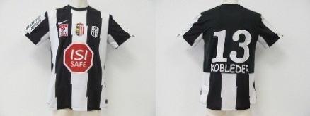
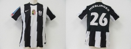
Well, let’s have a look at the current home shirt. Traditionally, LASK is playing with black and white stripes, black pants and white socks. Since Nike took over in 2010, they have tried to deliver striped jerseys, but unfortunately the stripes have always been too thick. The current uniform has been in use since 2011 and features a two relatively bold black stripes and three white ones. The sleeves are also striped. We had a similar design about 10 years ago – with Puma as supplier – so it is not too bad, but more stripes would be preferable. While I don’t particularly dislike the jaggedness of the stripes, I’d prefer straight. Below are the 2011/12 version (while playing in Austria’s second tier) and the 2012/13 version of this shirt. Both pictures are courtesy of LASK Trikotwelt. In both cases, the shirt has the crest as well as the Upper Austrian coat of arms and the manufacturer’s logo well placed. In the 2011/12 version, the shirt also incorporates the League’s logo (below the Nike swoosh) as well as a red sponsor. It looks a bit busy, but neither does it break with the color scheme (black-white-red) nor is it bad in comparison with other Austrian teams. I do however like the 2012/13 version better since it is cleaner.

Image

Image

Suppliers of any striped team have to solve the problem of how to display number and name of the player. This is especially crucial for teams playing in black-and-white stripes. Well the solution on this shirt is effective, but also crude: Have a black backside and show the stripes only for the bottom third. Since the number and name are printed in white it actually works quite well, but looks better on the 2012/13 version where the entire space is used. On the flip side, I do like the font used in 2011/12 better.

I would rate this shirt as a decent effort, but LASK has seen better shirts.

My rating: 6/10 stars.

How do you rate this shirt?