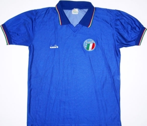
Italy (Home 1990-91)

Again, there was a long silence from me as I am continuing to focus on my YouTube channel. However, as my collection is growing, I always wanted to document my shirts and I think this is the perfect opportunity to keep on posting to my blog. In case you are still interested in me rating current shirts, I offer you to come over to my YouTube channel https://www.youtube.com/c/MySoccerUniverse and follow me there. Now, I am planning to do these posts in order as they entered my collection which of course is a bit fuzzy esp. at the beginning. But for most cases, I have the order down quite well.

⚽👕#1: Italy Home (1990-1991) 🇮🇹

Acquired: 1990 (gift from my aunt)

Brand: Diadora

Size: Large

Version: Unbranded player version

Condition: good (sleeves, collar and crest wrinkled)

Favorite player: Roberto Baggio 🇮🇹

Notes: This one started it all! This is my first ever real soccer jersey. A friend of my aunt bought it for her while on vacation in Italy as a gift for me. The price was more than my aunt expected to pay, but little did she (or I for that matter  – being just 12 years old at that time) know that this is a player issue version. Regardless, this shirt has always been the pride and joy of my collection! The silky smooth and shiny material, the beautiful flag trim and the overall quality speak for itself. I was wearing this in gym class regularly for 6 years running!!! At the end of the past millennium it suffered an unfortunate accident, when my mother accidentally washed it a bit too hot and hence the wrinkling occurred. From that moment on, I was wearing it much less often and even learned to take care of shirt for myself from that moment on. About 5 years ago, I learned that this is indeed a player issue and was truly dumbfounded! In 2020, I finally got the courage to try and iron out some of the wrinkling which was a good but not overwhelming success. As of this moment, it hangs very prominently in my office/studio on permanent display only to be worn at very special occasions!

Argentina (Away 1990-91)

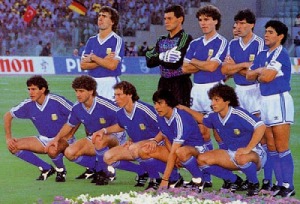
Well after the very successful campaign in Mexico, the blue shirt was considered definitely more favorably. That however was to change slightly for the next World Cup. Maybe one could blame the switch in supplier from Le Coq Sportif to Adidas. Well, only the insane would do that. Too mediocre was that team in Italy and it played arguably only one good game: the incredible encounter and de facto climax of the entire tournament against Italy in Maradona’s backyard, the San Paolo stadium (England and Germany may have a different opinion) of Naples.

1990-1991 Argentina Away (2)

The win came at a big cost: many players were suspended for the final and only a second string team wearing the blue jerseys could take on the Germans and subsequently lost totally deserved 0-1. The triumph of Naples was followed by Maradona’s tears in Rome. Hence the away jersey is often referred to as the “Trikot der Tränen” (jersey of tears) in Germany – I just hate the term, but it may have some justification.

argentina-1990-away

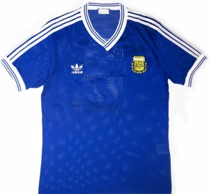
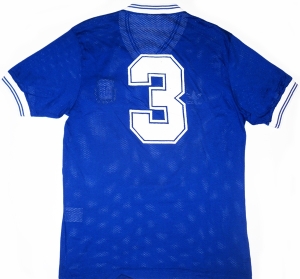
Well, the jersey for the final (which was also used in the quarterfinals against Yugoslavia) took the previous version and put an Adidas spin on it: namely, the three white shoulder stripes. But also two think lines were added to the collar and the sleeve trims – presumably referring to the Argentinian flag, but with the blue being too dark. The AFA crest was nicely placed on the left with the Adidas logo on the right similarly to 1978. When watching footage from the 1978 final it was always clear that there was a shadow pattern on the shirt, but I never could quite make it out. Well, above it can be seen, but it is surely not very identifiable.

argentina-90-away-3

The same pattern can also been on the back which otherwise only fearures the number in the same style as in 1987, i.e. an angular sans-serif number with a thin outline – one of the classics in the 1980s and early 1990s.

argentina-1990-away argentina-1990-away21990 argentina a[3]

The kit was supposed to be worn with white shorts and blue socks (as in the final), but against Yugoslavia, we once more saw the version worn with the black shorts and white socks from the home jersey. Overall, there is not much wrong with this shirt, except that I still prefer the darker blue tone. Also, compared to the 1986 version, the white stripes seem a bit much. But that’s not really the problem I think it is more that it does not quite look like an Argentina shirt. Actually, it reminds me more of a shirt that Chelsea might wear. Doesn’t it?

My rating: 8/10 stars.

How do you rate this shirt?

(West) Germany (Home 1988-1991)

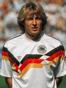
Well, what started out subtle soon turned into a brute application of the German flag. On the other side it was the most patriotic kit for Germany of all time (I am avoiding the term nationalistic on purpose) and showed that the nation grew more confident in being German. The kit was used over two tournaments (the last time that happened): first for EURO 1988 at home and then in their successful 1990 World Cup campaign, thus probably being the flashiest/most garish World Cup winning kits of all time – but also one of the most popular ones. For that reason it also ranks up there with the most iconic jerseys of all time. It was also the first jersey worn by a united German team giving it even more historical significance. So, let’s have a look:

germany-1990-home-lsgermany-1990-home-klinsmann

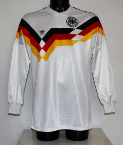
At its core, this is a white jersey with white crew collar and Adidas’ shoulder stripes being applied in black. However, the stripes do not extend much past the shoulders as they are stopped by an extremely bold German flag pattern that starts on the upper arms and weaves itself asymmetrically across the chest, i.e. it reaches its low point on the right and is horizontal in the center, while being diagonal otherwise. Above the two breaking points in the pattern resides on the right the Adidas logo and on the left the mandatory black DFB-eagle. The spacing above the band for both logos is about the same, making the Adidas logo riding considerably lower than the eagle. In fact, the Adidas logo would be placed OK, but due to the bold band, there is no space for the eagle. I guess, if Adidas would have had the foresight to incorporate the eagle nicely within the band, the shirt could have been saved from some glaring asymmetry making it very odd to look at. Not that the band itself wasn’t odd enough.

germany-1990-home-4

The back is actually OK – which is surprising given the front. However, the German flag band also extends past the shoulders on the back but doing so symmetrically and thus accenting the black number on the back, which again is applied in the great 3D font.

germany-1990-home

The kit was worn always with the usual black shorts and white socks and was used in both tournaments (1988 and 1990) for all but one match – the semi-final against England. In a way, this shirt is so iconic that it almost defies being rated – similar to the 1990 Cameroon shirt. But it is not the purpose of my blog to let bad designs – however iconic they may be – go unrated. To be clear, I do not mind the use of the German flag that much. I just find the execution seriously lacking. Especially the middle segment is bothering me quite some. Furthermore with the eagle being pushed out of position it just looks awkward. To me it looks like someone at Adidas got a new computer (they were rare these days) and went for the wildest design possible. Hence

My rating: 3/10 stars.

How do you rate this shirt?

Brazil (Home 1988-91)

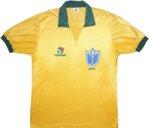
The last jersey issued by Topper for Brazil was also the first one in which the selecao finally managed to win a title: the 1989 Copa America – a title that has been evading them for years. But on home soil, Brazil was finally able to concentrate all their powers to secure that trophy once again. However, the Jogo Bonito was gone since Sebastião Lazaroni took over in 1989. Brazil was to play a more European style and globalization had finally reached the proponents of the beautiful game (although it has to be said: as beautiful as Brazil can play it is more based on individual brilliance and tricks rather than effective team play as the Dutch and more recently Spain demonstrated). The displays at the 1990 World Cup were rather underwhelming and Brazil managed three one-gooal wins in the group stage. Next up were defending champions and eternal rivals Argentina who had a terrible first round and snuck through only as one of the best third-placed teams. It is not clear whether the media frenzy calling for a more attack-minded style got to Lazaroni, but finally Brazil played as they were expected to do only to lose on a counter attack in the final minutes of the game. The cynics would say that thus it was proven that you cannot win while playing the beautiful game.

brazil-1990-home brazil-1990-home

Much more could be said about this team, but it is the shirts we are interested here. And again, the only modification from its predecessor was the collar. While the shirt collar remained, it was now not open but closed by a yellow triangle. A very unique design indeed that was copied when Nike issued the 2013 Brazil home jersey. The odd crest was retained one final time, but the logos could have been placed better. Still not much to argue with as compared to what was to come.

The collar is a classic although it may look odd at first. Other than that this is a very fine Brazil shirt that bears resemblance to the shirt worn in 1958. Never a bad comparison.

My rating: 9/10 stars.

How do you rate this shirt?

For regular updates, sign up at Soccer Jersey World on Facebook.

Italy (Home 1986-91)

This is my 60th post. 59 posts without a perfect score. That has to be changed! So let’s have a look at the first soccer shirt I ever owned – to this day probably my favorite. You already know that I like Holland, but I do like Italy equally well (if not more – they are at least winning trophies). Contradiction? Maybe. Have in mind, I fell for soccer in 1990 and at that time AC Milan was the most talked about team. And their stars were all from Holland (Gullit – Rijkaard – van Basten) with a strong Italian backing (Baresi – Donadoni – Maldini). So that’s where it all started. This Italy shirt is remarkable (by today’s standards) in the sense that it was used in three major tournaments. Unfortunately, it was not meant to be for Italy in all of these tournaments, but at least they looked extremely stylish.

italy-1986-home
italy-1988-home
italy-1990-home

This was a time when the Italian team was supplied by an Italian company: Diadora. The shirt is rather simple: it is plain azure blue with a shirt collar. What I really like are the Italian flag trims. It is subtle but you still incorporate the national colors. The crest of the FIGC looks light years better than the current abomination or any other. Although – and this is the only minor, minor criticism – I prefer the Italian shield. Still the crest is so close, that I don’t hold it against the shirt.

Italy-90-Home-USE-Dia_12_3_3_2_1_3

The back is also plain blue and only featured the number in white and that oh-so-classic 3D font. Simply superb.

italy-1990-home-schillaci

What can I say more? I love this shirt! The colors are amazing, it is a classic design and it manages to incorporate the national colors in a great and subtle way. Add to it that it was worn with white shorts and blue socks (something that does not happen that often these days of uni-colored uniforms) and it is the best. It was also the first one I owned. 🙂

My rating: 10/10 stars.

How do you rate this shirt?

Cameroon (Home 1990-92)

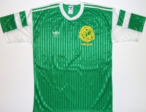
Now, my first African entry and we start off with probably the best African side ever: Cameroon 1990. Beside beating Argentina in the opening game, the image of Roger Milla dancing with the corner flag and the exciting quarterfinal against England – where Cameroon outplayed them for most of the time – will always be remembered as all-time highlights of World Cup history. The associated jersey has become so iconic that it almost defies being criticized. Still, I want to at least try, since there are a few things to not like.

Cameroon traditionally plays with a green shirt, red pants and yellow socks, the national colors. Indeed, they were playing like this in Italy, but for some reason, the actual shirt is green with white accents. That alone is quite odd. We have a round collar in white, the three Adidas stripes are in white. Further, the underarms are also white with two white bands across the upper sleeve. It is all out of sync with the rest of the kit, although the pants also had three white stripes. Then, to make the mess in a way complete the mandatory lion’s head is in yellow (instead of the crest) with ‘Cameroun‘ written below it. Frankly, this shirt is a bit of a mess in more than one way. Not only is the use of white odd, but also the way the sleeves are designed looks awkward. I wonder if using yellow instead of white would have made for a better look.

cameroon-90-home2_1
The back is pretty much the same as the front with the white number printed in that iconic 3D-style. When I grew up, I thought all soccer jerseys need to have their numbers printed that way. Unfortunately, it did not last too long.
1990-Omam-Biyik-Argentina-Cameroon-Group-B

I liked that Cameroon team a lot (who didn’t?) and I also like how they proudly parade their flag with their home jerseys. But exactly the 1990 version did not quite live up to the overall image that I have in mind now, when thinking about Cameroon. I still don’t want to be too harsh. So …

My rating: 5/10 stars.

How do you rate this shirt?

Argentina (Home 1990-91)

For this edition of “Flashback Friday” I want to go way back to the 1990 World Cup in Italy. This World Cup was the first one that I followed closely, so it does have a special place in my heart (except that it had the wrong winners/finalists). One special thing about Italia 1990 is that it was played in Italy when the Serie A was the best league in the world. So many stars played there and often enjoyed “home” games. Many remember this World Cup as being cynical and to this day it has the lowest average of goals scored. Still it featured some memorable and exciting games. While the 1990 final is best forgotten, I want to turn my attention to the first game of this World Cup, which featured one of the biggest upsets in World Cup history.

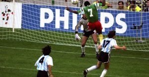
The day: June 8, 1990. The setting: San Siro, Milan. The game: defending world champions Argentina taking on the minnows from Cameroon. Well, Cameroon ended the game with only nine men, but they managed to win 1-0 thanks to a goal by Omam-Biyik in the 67th minute. Thus, the stage was set for what probably was Africa’s brightest moment at the World Cup to date. So, today I want to look back to that famous game and I will start with Argentina. After all, not only did manage to lose in that jersey, but they also managed to beat hosts Italy in the semi-finals – probably the climax of the tournament. They also managed to win the Copa America 1991 in this shirt!

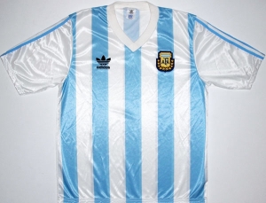
This was the first World Cup where Adidas supplied the Argentinian kit after almost a decade and it delivered the classic sky-blue – white striped jersey. I really do like the thinner stripes with a blue one in the center. Crest and logo are well placed and the shirt features a white V-neck collar. Only the sleeves seem a bit detached from the rest of the shirt, since they are all white and the only blue stripes are the three Adidas stripes that do not extend over the shoulder. Also, note that 1990 was the last tournament where the players did not wear numbers on the front.

Argentina-90-Home-USE_1_1_1_2_2_1_2_2_1_1_2_1_2

Looking at the picture of Omam-Biyik’s goal, we also see that in terms of accommodating the number on the back, it really were simpler times back then. Just print a black number over the stripes without any extended blue or white area. Also, the font is simple and classic with the number featuring a thin outline. Lastly, there were no additional logos worn as it is these days. Those were the times!

1990-Omam-Biyik-Argentina-Cameroon-Group-B

To me this is one of THE classic Argentina shirts so it is bound to get high marks. Still, I do not like the way the sleeves are detached from the rest of the jersey. Also, I’d prefer if the collar was an actual shirt collar as so many teams were wearing at that World Cup. Still, very nice and classic shirt.

My rating: 7/10 stars.

How do you rate this shirt?