You know that earlier this year I decided to restart this blog and put a focus on national teams. Given that the World Cup was about to be upon us, that was a very easy decision for me. And now with the Nations League and my time restrictions it is still a challenge to post regularly. Therefore, it is unlikely that I will go back to club jerseys any time soon. However, today is my birthday and for that reason I want to do something special. After all the Austria extravaganza yesterday, I just cannot go back to normal “programming”. For that reason, I went back to my jersey review videos for 2018-19 (links are below) and decided to post here all my favorite shirts of the European Club season. No long description, just the shirts and a short sentence. 🙂
Before we start, I run through the leagues/competitions in the order I covered them on my YouTube channel. To see my quick thoughts on each shirt simply click on it.
Let’s start in England in the Premier League:
AFC Bournemouth Home: Bold design, subtle use of gold and a sponsor the ties nicely to the color scheme
Chelsea FC Home: A fresh new design on the classic blue kit
FC Everton Home: simple, yet very classic look.
FC Liverpool Home: A classic look for a classic team
Manchester City Away: Probably my favorite Premier League jersey this year. I love the alternating pinstripes
Manchester United Third: best example for this Adidas template and a great job aligning the colors of the sponsor with the logos on the jersey
Tottenham Hotspur FC Home: I just love the navy accents on the white shirt. Even the gradient looks great!
For a full description of these and (most of) the other Premier League jerseys, watch my jersey review videos:
Now, next up is the league of the World Cup winners France:
Girondins de Bordeaux Third: wonderfl alternate look.
Caen Home: Nice re-interpretation of PSG 93-94 and Barcelona 17-18
Olympique Marseille Away: great use of light blue accents on a black shirt
OGC Nice Home: If Macron would make a Milan jersey it would look like this. Classic, classy, superb!
Nimes full set: I just love how the dragon from the crest is featured on the bottom of the shirt.
Stade Rennais Away: I love the pattern on the bottom on the jersey and the subtle red/black accents.
AS St. Etienne Away: Super nice look! Making the very best out of this classy template.
Toulouse Away: Even the many sponsors (all in one color) cannot distract from the modern look of this jersey.
Again, you can see full comments on these and all the other Ligue 1 jerseys in this playlist:
By now, you should know that Serie A is my favorite league and there are sooo many great shirts this season:
Atalanta Bergamo Home: Just a classic look!
US Cagliari Home: I love te half/half look and the colors. Also the sponsors tie in with the crest
FC Internazionale Away: Simple at first, but I love the half/half collar and the subtle snake skin pattern all over.
SS Lazio Home: Perfect Lazio look! They should wear this forever!
AC Milan Home: Puma issues a classic Milan shirt and eases my nerves about the supplier switch.
FC Parma Home: Yellow, blue, hoops! How great is that shirt?
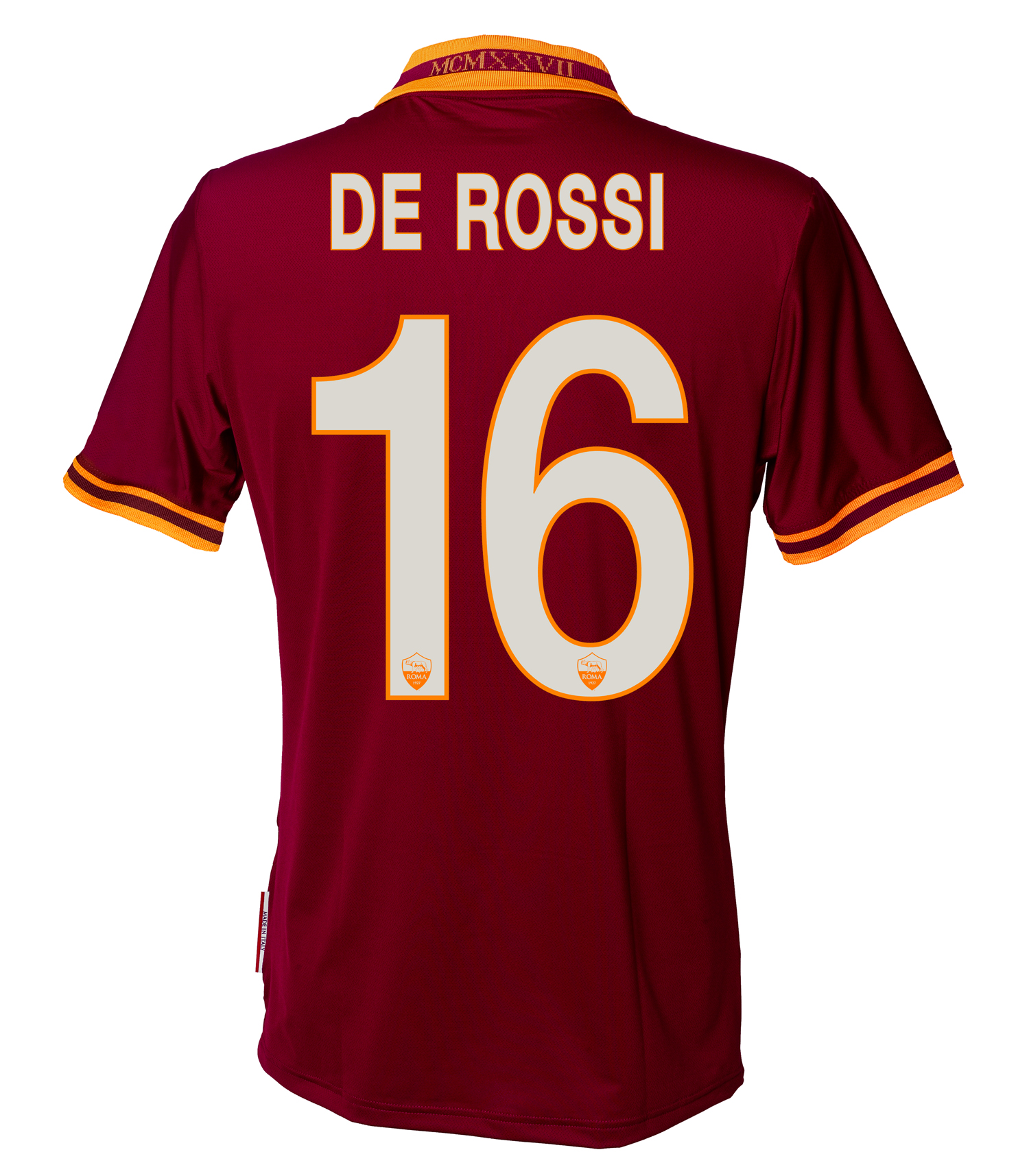
AS Roma Home: Did you notice the chainmail pattern on this shirt? Roman legionnaires for sure!
US Sampdoria Away: What a clever way to incorporate the classic pattern on a super classy shirt.
US Sassuolo Away: Alternating pinstripes for the win!
Udinese Calcio Home: Nice way to add a touch of gold that ties in nicely with the crest.
That was just a small sampling. Watch all Serie A shirts in these videos:
Quick, let’s look at a few La Liga jerseys:
Real Betis Balompie Home: Super nice looking shirt!
Atletic Bilbao Home: Interesting reinterpretation of a classic shirt
Celta de Vigo Home: Only very subtle Adidas branding to make a great shirt.
RCD Espanyol Home: All shirts look great, but the home jersey paired with that sponsor is a beauty!
Girona Home: Diagonal striping? Unusual, but very much in tone with the crest!
UD Levante Home: The best Barcelna shirt of the past 5 years?
Real Madrid Home: Happy to have the black accents back and I love the neckline!
Real Sociedad Home: Macron delivers another really nice kit.
Real Valladolid Home: I love how the sponsor is made to fit in the clor scheme.
Even more jerseys right here:
So, here are my favorite Bundesliga jerseys this year:
Bayer 04 Leverkusen Away: Alternating diagonal pinstripes in reference to the 1988 UEFA Cup winning kit.
Borussia Dortmund Home: I love the black sleeves broken up by yello bands.
Mainz 05 Home: Simple, yet effective with two-tone red hoops.
Borussia M’Gladbach Third: Beautiful green shirt with nice texture.
VfB Stuttgart Third: All Stuttgart jerseys this season are great, but this one is probably the best!
SV Werder Bremen Third: Classic Werder look and I love the diamonds radiating from the crest.
Of course, I reviewed also all the Bundesliga jerseys:
Now, let’s go tho the Champions League and look at a few jerseys from teams not in the big 5 leagues.
AEK Third: Simple and classy!
AFC Ajax Home: You cannot mess with greatness and Adidas surely didn’t.
SL Benfica Home: Still this is a very modern yet classy interpretation of a classic strip.
Crvena Zvezda Third: Very smart away jersey using a dark blue base and still showcasing the club’s colors.
Galatasaray SK Away: I love how the half-half look from the home jersey is used here in the accents.
FC Porto Third: a very playful, yet beatiful shirt!
The full set of Champions League jerseys are critiqued in these videos:
And finally, let’s get a tad more exotic with the jerseys from the Europa League. Here are my favorites:
Celtic FC Away: tartan pattern and celtic cross, what’s not to like!
SK Slavia Home: iconic and beautiful
Fenerbahce SK Home: A nice Adidas version of a great kit.
Sporting CP Home: Macron delivers again.
Apollon Limassol Away: I love the texture on the shirt and the choice of colors! I look at it and imagine the sea!
Dynamo Kiev Away: Simple and wonderful like a classic jersey should be.
PAOK Home: Everything in black and white making for a very unified and solid look. Also, I love the collar!
And here I tried critique all Europa League jerseys:
Well, I hope you enjoyed this slightly different post. Let me know what are your favorite club jerseys this season and how you would rate the jerseys above.
As Roma’s away jersey is an (almost) default white, so has the third jersey largely been a black affair. This season however, the club let the fans decide on the design of the third jersey. The fans had the choice between two black versions and a dark green one. In the end, the winning jersey truly showed that Italians have a good sense of fashion:
I am not sure whether Roma has used this jersey in any Serie A game so far (please, let me know), but I assume that it also features the Roma Cares charity unlike the picture shown here. Other than that, we have a plain black jersey with the sort of floppy shirt collar having yellow/red trims on the front which combine to form the opening of the collar.
The back is also plain black with yellow numbers and a red outline, something that looks really good in my opinion. The MCMXXVII inscription is now white (silver?) on the back of the collar, which makes it less visible than on the home and away jerseys. I also think it would have been better in yellow.
This one also looks great, but not as good as the home jersey. I do like the black in connection with red/yellow, but the collar is on one side not as classy and the inscription on the back is not as prominent. Still, this is a great jersey.
Well, like Milan and for the most part Inter, AS Roma also established a white away jersey for them. And due to an impending switch in suppliers, Roma is also producing this itself and it is is a classic:
There is really nothing bad that I can say about this one: I love the shirt collar with the yellow band and the red V-opening, the yellow/red sleeve trims are also really nice. The crest is located where it should be and the logo of the charity (which is shown in the small picture) fits also very well with the color scheme.
If anyone needed lessons in how to design a great looking and classic soccer jersey, they should use this one as a template.
The back is also plain like the front and has the same features as the home jersey only the names and numbers are applied in red this time.
I cannot find anything wrong with this one and truly doubt that Nike will produce a better looking jersey for the giallorossi. If you like flashy 1990s-style jerseys, you will not like this jersey, but for the rest of us we can well conclude that this one is perfect.
For a while, it seemed that Roma will be able to claim Juve’s throne, but too many draws and a resounding loss to Juventus leave the giallorossi hoping for a runner-up spot at most. However, things look secure and a return to the Champions League seems very likely. Roma is also in a transition phase from Kappa to Nike, which actually caused the team to release its own unbranded and unsponsored jerseys. Only a charity is shown on this one. Here we go …
Roma used this special occasion to create a very special jersey in the traditional imperial red tone and yellow accents on the shirt collar and the sleeve trims. Both accents feature a red stripe making for a classic look. However, the opening of the collar is a bit odd with yellow only used on the left and not on the right. Also, the collar itself is maybe a tad too short. Other than that we see the classic Roma crest and the logo of the charity fits well with the shirt – better than the previous sponsor who added blue to the color palette.
I guess the big feature on the back is the MCMXXVII inscription on the back of the collar commemorating the year when AS Roma was founded. Names and numbers are applied in white in a classic looking font with yellow outlines.
To me, the collar looks a bit too odd. Other than that, this one has the potential of a true classic shirt – if only Roma would have the chance of winning a trophy this year. But that’s not going to happen.
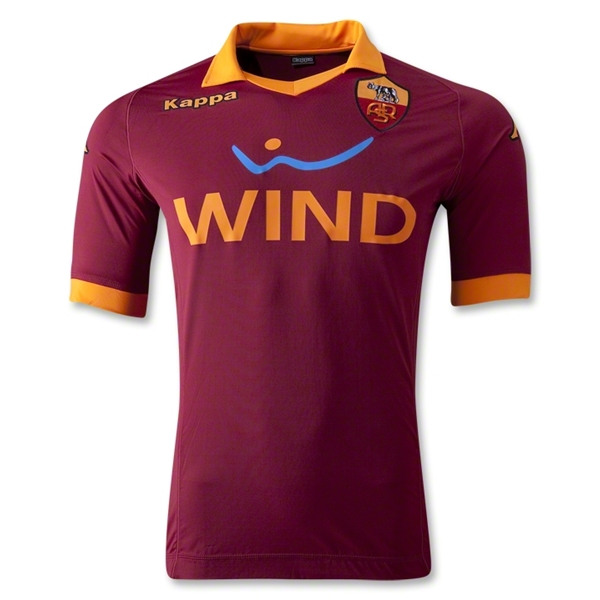
Let’s go back to Italy and look at a “dinosaur.” I don’t actually mean the team but its most iconic player: Francesco Totti of AS Roma. You may say what you want about Totti, but the fact that he not only grew up as a fan of Roma, but that so far he only has played for his beloved team makes him a standout in times where players change clubs more regularly than their underwear. Furthermore, I generally like AS Roma – they are my second Italian team – and I usually like their jersey a lot, since it so nicely represents the colors of the Eternal City.
Traditionally, AS Roma plays in dark red (imperial purple to be exact) shirts with golden (sometimes yellow) accents. This is worn with white shorts and black socks creating a quite iconic uniform. And for this season, Kappa delivered the goods with a really nice looking Roma jersey: We have the classic colors with golden trims on the sleeves and nice yellow shirt collar. The only minus is that the crest and the logo are riding a bit too high on the shirt thanks to the enormous sponsor. I really would have liked to see the sponsor moved down a bit. On the bright side (except for the blue squiggle), the sponsor fits very nicely into the color scheme of the shirt – a rarity.
The back is a classic for Kappa which seemingly have not changed their font in the last 10 years – and there is no need to “improve” such a classic jersey font. Lastly, note that as usual Kappa jerseys are made to be very formfitting – the first company to my knowledge to do so.
Yes, the crest is riding high but that is only a minor glitch. I love this jersey! Forza Giallo-rossi!


You must be logged in to post a comment.