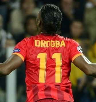
Like Manchester City, Galatasaray also used their third jersey rather than their “regular” away jersey in this year’s Champions League. And while they suffered a heavy defeat to Real Madrid in this jersey, they also managed to pick up a vital point in Turin against Juventus (although it might have been more).
The jersey is striped with two different tones of red. The darker is the one featured in the club’s colors, while the lighter red is most probably a reference to red as the national color of Turkey. The stripes are of medium width with the lighter one running down the center and through crest and swoosh. The round shirt collar is in the darker red tone, while the sleeves are in the lighter tone and have a yellow trim. Sponsors and swoosh are applied in yellow, thus reflecting the club’s second color. Overall, things are well arranged on the front, although I think the swoosh could be a tad lower or even exchanged with the Turkish emblem.
For Champions League play, the back also features a wide plate in the lighter red to display names and numbers which are all in yellow as well. The style for the numbers is a bit odd, but acceptable. Towards the end of the jersey, we again see the striped pattern from the front.
This is not a bad jersey, although I think it may have worked better in only the darker red. It still has a somewhat “royal” feel to it. It does reflect the club’s colors, but in a way provides also too little contrast to the home jersey.
My rating: 7/10 stars.
How do you rate this shirt?


Pingback: Galatasaray SK (Away 2013/14) | My Soccer Universe