
Well, Nike’s biggest team is undoubtedly Brazil. France may have (had?) the biggest contract, but Brazil is what the world wants to see. And the Brazil kit is easily the most iconic kit of them all. So iconic that my first full series on the history of soccer shirts was the Brazil jersey. And from that we also saw that since 1996 Nike is supplying the Seleçao. And most of the time they honored the iconic look: yellow jersey with green color and sleeve trims, blue pants with white striping and white socks with green/yellow striping. The wouldn’t force them into a template, wouldn’t they?


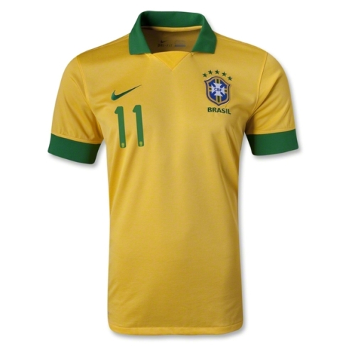
They would!!! But at least they held back a teeny little bit. Unlike the France kit, the sleeves/shoulders are the same color as the rest of the jersey which immediately gives this shirt a more cohesive feel. However, it does not look very Brazilian as the green is almost not present. The band around the back of the neck could be counted as a green collar if we want to be benevolent, but the fact that it does not wrap around to the front does not give the green enough weight. It is also hard to see on these pictures but there is a green band running down the sides from the sleeves. While if seen from the side gives the jersey a bit more character, it simply does not make this jersey more Brazilian to me. Even the names and numbers (standard, but good font) don’t do it for me as the jersey still looks naked with all that yellow that is not sufficiently balanced by green. It all reminds me too much of the 2011 jersey, where even a thick green bar could not save the jersey. Before getting to my verdict, I also want to point out the probably most ridiculous feature of this jersey: the yellow word mark on the back side of the collar just above the green line. In that template, all of these are more or less subdued and barely legible, but this one seems to be the least legible of them all. It really screams to be in green!
Well, it looks bare and naked. Too little green features to balance out all that yellow. The fact that it is a template used for the most marquee team without any additional features really irks me here. But then, Nike already has done this in 2011 and 2012. And as most people see Brazil playing at the World Cup, they don’t see the “bad” versions of the iconic jersey. Fortunately, at least to my knowledge, Brazil never wore these with yellow pants as this would have been sacrilegious. If this was some African team or even Australia, these would have just been fine. But for Brazil it just doesn’t cut it for me. Yes, it is better than the France kit, but it is even more bland and boring as well. I guess the big plus for this jersey is that they won the Olympics in this one albeit with a slightly different crest (don’t get me started!!!). Not terrible, but bland and therefore
My rating: 5/10 stars.
And then, the blue away jersey. And here as well, we get what we expect: a blue jersey. However, the question was never about the blue but rather the accent color: is it the more traditional white or the more modern yellow?


Well, it is both but applied in almost the worst way imaginable: white goes for the accents on the blue torso, i.e. swoosh, stars above the crest and all names and numbers. And then yellow, or a rather garish greenish yellow is used on the collar and sleeves, where it mixes with the blue of the torso. And that is where the problem lies as it all blends into a very undefinable blue tone that just does not do justice to the Brazilians. Again, this went the wrong way and does not make for a good look. In many ways, this is even worse than the France home jersey as it makes the look less aggressive and not vibrant at all. And given the history of blue Brazil jerseys, this one is near if not at the bottom!
My rating: 2/10 stars.
How do you rate these shirts?


You must be logged in to post a comment.