TSV 1860 Munich (Third 2013/14)

While the world-famous Oktoberfest in Munich is already over, we should have one quick look there, since both Munich teams presented jerseys that were influenced by it. As we will see, the one for Bayern will actually be used throughout the season, but the one issued by 1860 Munich is a true Oktoberfest Issue shirt. Needless to say that 1860 Munich is one of my favorite teams from Germany and I find that the Bundesliga is worse off now that the 60er have been demoted for almost a decade.

The 2013 Wies’n kit was unveiled at the beginning of the Oktoberfest this year and worn for the first time During the team’s overtime defeat against Dortmund in the DFB Pokal. Coincidentally, this is also my first post on a jersey issued by uhlsport.
1860-2013-third

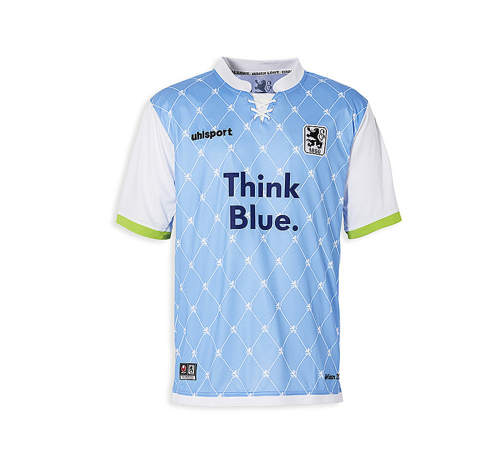
So, we have here a light blue jersey with white sleeves with light green trims. The standing collar is white as is the laced front. Both give the jersey a somewhat traditional look as intended. The true kicker is the rhomboid pattern on the blue shirt which does give the shirt a definitive Tracht look. As a nice add-on each corner is adorned by a white lion as in the club’s crest. Speaking of which, the crest is well placed as are the other components on the front of the jersey, although both manufacturer and sponsor are cumbersomely long).

On the back, I like the use of a very simple font for names and numbers. It does make for a clean look, although to keep with the theme a more decorative font (as usually seen at the Oktoberfest) might have added that extra something (or maybe not).

1860-2013-third-stahl

Well, where do we go with this one. The look of the jersey is like wearing a sleeveless sweater or vest over a white shirt with light green trims. A nice look for the Oktoberfest but not for the pitch. I especially dislike the green. And while the pattern on the front fits nicely with the theme it is too busy. I am sorry, but this look should be saved for the beer halls.

My rating: 4/10 stars.

How do you rate this shirt?

For regular updates, sign up at My Soccer Universe on Facebook.

Manchester United (Home 2013/14)

We will stay in the Premier League and I cover a team that not only is again the favorite to win that title, but should also be able to make a deep run in this year’s Champions League – despite the fact that for the first time since 1986 it is not coached by Sir Alex Ferguson: we are talking of course about Manchester United. In addition, I gave them a lot of flak for the jersey they used last season, so it will be interesting to see this one. Before going there, I have to make one more observation about ManU: although they are still one of the most valuable teams in all of soccer, to me they seem to lose a little bit of touch with the Spanish giants in particular. Translate this as: their squad’s star power is not potent as it used to be with their biggest assets Wayne Rooney and Robin van Persie definitely not on one league with the Messi‘s and Ronaldo‘s. Having said that, stars don’t make a team and in a way, ManU generally manages to get a team on the field. But off to the main purpose of this article, the new home shirt.

manu-2013-home
First off, this shirt is a huge improvement over previous year. Gone is the bothersome gingham pattern and we are back to a plain red jersey with a black collar. Actually, I think it is one of the classiest ManU shirts in a long time since it does look quite classic with its low-profile collar and the deep buttoned opening. If only, the black collar would be the traditional choice: it is not. Most of the time ManU used to wear a white collar and the only black on the kit was featured on the socks. Still, this shouldn’t bother too much, since the rest of the shirt looks quite well. Although the sponsor is quite large, due to only three letters it doesn’t seem very intrusive. Logo and swoosh are very well placed and complement a very pleasing front side of the shirt.

manu-2013-home-ferdinand

The back side is similarly plain with only a black evil showing below the collar (as now customary) and an oddly placed black button on the center of the backside of the collar. Name and number are very appropriately applied in white. The font is slightly different and more angular for Champions League matches as with other Premier League teams (see below – picture courtesy of (footballfashion.org).

manu-2013-home-giggs

The low-profile collar is my only real complaint. I personally am not a big fan of it, but I admit that the shirt looks great. If only the collar came in white I would give very high marks. Still, Nike did an outstanding job on this one presenting us with possibly their best effort for Manchester United.

My rating: 9/10 stars.

How do you rate this shirt?

For regular updates, sign up at My Soccer Universe on Facebook.

Arsenal FC (Away 2013/14)

Off to the Premier League we go. The best start to the new season definitely belongs to the Gunners who also started well into the Champions League. Maybe, the arrival of Mesut Özil gave them the much needed star power to make a serious run for a title and save Arsene Wenger‘s job. Having “recycled” their home jersey, the Gunners offer only one new shirt this season – and it is a good one!

arsenal-2013-away

Gone is the 2012/13 abomination – we are celebrating the return to THE classic Arsenal away kit: yellow shirt with blue shorts. It does look a bit like a Sweden shirt, though and younger “fans” will bemoan the fact that the chosen blue is not as “aggressive” as a navy blue. I, o the other side, just welcome this change. My favorite feature is the shirt collar with the three-button opening. Having also a yellow stripe towards the trim gives it a slight 1990s feel. The blue sleeve trims have a similar pattern. On the front, everything is placed quite well and the color choices are appropriate. Only the current Arsenal crest with its navy stripes is a bit of a “color contradiction”.

arsenal-2013-away-ozil

The back is plain blue. In the premier league, the club uses the league’s name and numberig style – unfortunately in navy/black.

arsenal-2013-away-walcott

In the Champions League, the club uses its own numbering style which is neither classic nor really modern, but at least applied in the right color.

Yes, like the current Sweden home jersey, this maybe lacks the aggressive punch of other shirts, but it looks so classic that you gotta love it. At least I do! I wish more teams would use this collar style in particular.

My rating: 8/10 stars.

How do you rate this shirt?

For regular updates, sign up at My Soccer Universe on Facebook.

FC Bayern München (UCL 2013/14)

Last week the 2013/14 Champions League campaign started and I thought we definitely need to look at some of the jerseys worn in Europe’s premier club competition. To start it off, I make (one last) nod to the current champions, FC Bayern and have a look at their current Champions League shirt (which probably will see some action in the group stage and make occasional appearances in the knockout stages – if needed).

bayern-2013-third
Bayern traditionally polarizes – especially in the German speaking world. If that wasn’t enough, the club also continues to issue polarizing shirts that divide even their own fans, whose hard core actually wants to see their stars play in red and white. Well, too bad – you got a … hmmm. what color is that jersey actually? That’s the crux of this jersey. It features vertical stripes in three different shades of blueish gray. How did this come about? The shirt looks absolutely messy. The V-neck atually makes things worse since it has the darkest shade on the front which extends far beyond the corresponding dark middle stripe. The only thing reminding us that this IS a Bayern jersey are the three red shoulder stripes and the Bayern logo.
bayern-2013-third-robben

Well, and the back is then in plain … whatever that color is with red number and white name in the now traditional Bayern style again reminding us of the true Bayern colors. Ah, and did I mention that to make things more beautiful the sleeves are in a darker shade.

I really would like to know what the designers were thinking about this one. Previous jerseys at least had some aesthetic value by being plain black. But this one defies any logic. Its colors are non-descript and the pattern on the front looks messy and of course it will sell like crazy … NOT! It is almost impossible but my dislike for this shirt exceeds my dislike for Bayern.

My rating: 1/10 stars.

How do you rate this shirt?

For regular updates, sign up at My Soccer Universe on Facebook.

AC Milan (Third 2013/14)

With the new season already upon us, it is time to look at all the new jerseys out there. We have already covered reigning European Champions FC Bayern and Spanish champions FC Barcelona. Both of these teams revealed their jerseys rather early, with Bayern wearing their new strip in the victorious 2013 Champions League final and Barcelona during the last day of the season. Here is another jersey that was revealed last season: AC Milan’s new third jersey which was worn in their last home game against AS Roma.
milan-2013-third

After a string of black third jerseys (which the club actually started considering as their unlucky jerseys – in contrast to their “lucky” white away jerseys), a new color was seemingly in order: gold. Two thoughts immediately come to mind: (i) for a team not having won any trophy last season, this is a bold move; and (ii) didn’t we have that before? Yes, it is a bold move and yes, we had that before in the centennial year 1999 and also during the 2004/05 season. I remain that gold jerseys should only be worn by champions, but Adidas has oozed gold over all their marquee teams over the past two years starting with Real Madrid and Bayern in 2011 and adding Chelsea in 2012. So it was Milan’s time, seemingly. All the discussion about gold aside, I actually think this is the best looking of the three Milan shirts issued for the new season. The gold jersey has black patches running down the sides and the underarms as well as three black stripes on the shoulders. The round neck as well as the sleeves display a black and red trim appropriately displaying the club’s true colors. On the front everything seems well arranged with Adidas logo and sponsor also being applied in black. Now, the standout feature (if you like) is the inclusion of a small breast pocket on the right side which also holds the Adidas logo and somewhat proudly displays a thin Italian flag above. The breast pocket was already introduced on the 2012/13 third jersey, so it is not entirely a novelty. While it is a neat feature, I seriously question the functionality. Why do players need a breast pocket? To carry around spare change? To store notes on tactics? I don’t know …

milan-2013-third-elshaarawy

The back is quite similar to the front wit Milan recycling previous year’s font for names and numbers. I like the red outline, but could do without the red Milan logos on the number. The numbers also seem oddly disproportional while the letters have weird endings – kind of pointy.

While gold is not quite appropriate, I still like this jersey as compared to its counterparts. As we will see this would have been a great template for the true white away jersey, but they decided to mess that one up – well I will leave those comments when I do cover that one.

My rating: 7/10 stars.

How do you rate this shirt?

For regular updates, sign up at My Soccer Universe on Facebook.

FC Barcelona (Home 2013/14)

OK, after so much technical stuff, I decided to give my followers a short breather and look at some jerseys. After all, the new seasons have or are just about to begin and we have already been informed in what kits the world’s biggest teams intend to play for the next year. The new designs have already sunk in, so I guess this is a good point to review some of them. Having already covered the new home shirt of the reigning European Champions, I decided to look at one of the first shirts to be unveiled and being publicly available: FC Barcelona‘s new home shirt. The Catalan giants have done everything this off-season to hold off eternal rivals Madrid and to re-claim their status as the world’s premier soccer team. Signing Brazilian starlet Neymar was definitely a warning shot at all opponents. Although critics do have some doubt about the necessity of having Neymar in a team where the Brazilian definitely won’t be the star and where there are definitely some needs in defense. Anyway, if things work out an attack featuring both Messi and Neymar looks daunting. Off to the new shirt, though.
barcelona-home-2013
Looking at the new home shirt, I note an immediate improvement over the  previous two shirts. In fact, it does remind me a lot about the kit worn in the 2010/11 season, which I actually liked quite a bit. Thinner stripes are back with a blue stripe appropriately down the middle. In total, I count five blue and four red stripes on the front. While not a classic Barca look (that would be three blue and two red stripes), it looks fine enough and as I said much better than what was on offer over the past two years. The shirt features a yellow V-neck collar, which is OK, although I’d prefer a blue one. The yellow swoosh and the crest are very well placed as is the new sponsor (traditionalists, please cringe here).
barcelona-home-2013-ls
However, the color of the sponsor is my first point of contention, since it introduces a second accent color for no apparent reason: white! Given that Barca has avoided any white on their shirts (except for the St. Georges flag in the crest) for over a decade now, this does come as a surprise. I think yellow would have looked more appropriate. The second point of contention are the sleeves. No, they are not striped as they should be, but rather start out blue on the shoulders and then fade into red via a succession of rings. Why? Yes, why do you do this? First of all, it looks as the sleeves do not belong to this shirt. In fact, they would have looked great on the previous one. Please, Nike, do yourself a favor and look how it is done on the shirt that YOU designed for the 2010/11 season. I find the sleeves look particularly odd on the long-sleeved version, which actually are not that often in use anymore by the players.
barcelona-home-2013-puyol

Not many surprises on the back, except maybe for the Catalan flag on the back collar – but by now this is entirely expected from a Barcelona shirt. Unlike the main sponsor, the names and the numbers, as well as the UNICEF logo are applied in yellow. I was a bit surprised that the same style for names and numbers was retained, especially since I saw a slightly altering design in the friendlies played in Asia. Maybe, this review is too early.

Yes, this one is a lot better, but still not a classic. For that reason and of course because of the sleeves, some deductions are in order. On the other side, this might well be the shirt of either the season’s most exciting or most disappointing team. Wait and see.

My rating: 7/10 stars.

How do you rate this shirt?

For regular updates, sign up at My Soccer Universe on Facebook.

Santos FC (Home 2012/13)

Besides Bayern’s win yesterday the big news in the soccer world was that Barca finally succeeded in securing Brazilian starlet Neymar after Santos FC successfully resisted offers from Europe for more than three years. Truth be told, Barca was always the forerunner and it was never a question of if but when Neymar will play for the blaugrana. Still, thanks to Neymar Santos experienced a big revival and was able to shed the tag of “Pele’s club” although Edson Arantes will always be linked to the club from the Brazilian port city. For that reason, I thought it is worthwhile to look at the current Santos jersey and give the Brazilian league some love. After all it is the most powerful in South America at the moment and seems to be able to actually accrue some star power.

Although, Santos’ club colors are black and white, the team usually plays in all-white at home (sometimes they use black shorts) and reserves a black-and-white striped jersey for away games. And this season’s jersey (supplied by Nike) is in principle quite plain. It is all white  with a round collar and only the swoosh and the crest (both well placed) feature black. So far, so good. However, the jersey the simplicity of the jersey is really let down by the multitude of sponsors on it. It almost looks like Santos plays in the Austrian Bundesliga. What’s worse is that beside the sponsor on the sleeves, the sponsors add colors that not only are alien to the club;s color scheme but also add too many colors. The main sponsor (has been for the past years) is a big Brazilian bank and is featured in orange with (at least) a black outline. Then, another sponsor is featured on both sponsors in red and white. At least some symmetry is preserved, but with those colors one almost overlooks the famous Santos crest.

Santos-2012-homeSantos-2012-home-neymar

The white backside is also marred by the orange main sponsor. Other than that the name and number are applied in black to preserve the color scheme. The font for the number is slightly angular and slim, but OK. It is the more modern looking font used for the name that I dislike somewhat, although it fits with the youthful spirit of the Santos team.

This shirt is a classic example of how sponsors can ruin a very elegant jersey. I understand money is tight – especially outside of the big four European leagues – so this is a necessary evil. But I wish that at least the sponsors respect the clubs colors and don’t disturb the jersey as much as in this case.

My rating: 5/10 stars.

How do you rate this shirt?

FC Bayern München (Home 2013/14)

Well, unless Borussia Dortmund really will play in a new jersey for the first time tonight, this will be the last post of my 2013 Champions League Final special. Bayern already debuted their home shirt for the new season last week, but will also wear it in the Champions League Final. Say what you will about this practice to wear new jerseys towards the end of the season (I personally dislike it – a lot!), but it has been done before. I may be wrong here, but it was actually Bayern’s opponent today, Borussia Dortmund, that first debuted a new jersey in the 1997 Champions League Final. On the other side, Bayern regularly played in their latest jersey during the last game(s) of the season.

Well, I am at least happy to say that the new Bayern home jersey looks good and (barring another devastating loss in the final) is destined to be a fan favorite for years to come. On a first glance one will notice that the gold is gone and that apart from the crest the jersey features only two colors: red with white accents, like Bayern jerseys should be. The white collar is a V-neck with two thin red stripes – a pattern that is repeated on the sleeve trims. Of course, the three shoulder stripes are also in white. Sponsor, logo and crest are very well placed. Not noticeable on a first glance is that the front features a faint lozenge pattern that echoes the pattern of one variant of the Bavarian State flag (also at the center of the club’s crest). This is a nice touch, but honestly it comes about 10 years (if not more too late).

bayern-2013-homebayern-2013-home-alaba

The back is just plain red in contrast. Just beneath the collar Bayern’s motto “Mia san mia” (We are who we are) is somewhat proudly displayed. Other than that the font used is the same as in previous seasons, just in white this time. It is a simple but very legible sans-serif font.

Overall, I feel that this is the best looking Bayern jersey in years and given the suffering that fans had to endure especially during the 1990s, this one s both a classic jersey, but with modern touches. The only odd features are a thin white stripe running down from the arm on both sides. This couldh ave been omitted. Also, the collar is maybe a bit too busy. But otherwise, I have to say: “Well done, Adidas.”

My rating: 8/10 stars.

How do you rate this shirt?

Borussia Dortmund (Home 1997/98)

Dortmund‘s win in the 1997 Champions League Final in Munich over Juventus can be seen as one of the biggest final upsets in the competition’s history (oddly enough, the only other somewhat monumental upset in a final happened four years earlier in the same stadium, when Olympique Marseille upset the highly favored and unbeaten AC Milan – also an Italian team). Juventus were high favorites and displayed some scintillating soccer in the semifinal against Ajax. But it was not meant to be and Dortmund struck twice in the first half (against the run of play) and two word-class second half goals by Del Piero (backheel) and Ricken (from far out) did not change the final outcome, but added some drama.

Those days, Dortmund was one of the main teams equipped by Nike which dazzled (?) Europe with quite some crazy shirts in the early 1990s. By the late 90s things settled down again and the jerseys became a bit more standard. Still, Nike retained their neon-yellow shirts for the 1997 Champions League Final. The jersey features a black shoulder portion with a thin yello outline. A similar pattern is shown towards the end of the sleeves. In the yellow gap on the sleeves a series of stars is worn on the left with no particular meaning. The shirt collar is actually nice and modern looking and features a yellow stripe. Lastly, there is a horizontal black stripe running across the belly. Sponsor, logo an crest are very nicely placed.

bvb-1997-home

For the time, this was actually a quite simple jersey, but it looks outdated these days. Still, this one entered history and is fondly remembered by many fans in black and yellow.

My rating: 6/10 stars.

How do you rate this shirt?

FC Bayern München (UCL Home 2001/02)

As the next act of my 2013 Champions League Final special, I will look at the jerseys that the teams were wearing when they last won the Champions League (it is Flashback Friday after all). Coincidentally, both the jersey that Dortmund wore in Munich in 1997 and the jersey that Bayern sported 2001 in Milan were worn for the first time on that occasion – a trend that most likely will continue on Saturday.

When Bayern won the Champions League for the first time since their mid-70s heyday, they were sporting a very classic looking red uniform with a white round collar and shoulder stripes. To many fans of the Southern German giants this was very welcome since over the past decade, the club frequently moved away from their traditional red with white kits to feature a lot more blue in favor of white and even red culminating in a very dark blue home jersey during the late 1990s. Having also worn an abominal jersey during their monumental 1999 Champions League Final loss to Manchester United, it was very pleasant to see the team in such a classic look.

bayern-2001-home-ucl

Basically, everything fits here very well and one could easily use this jersey as a template for future Bayern jerseys. I am not quite sold on the round collar, but other than that this is as close as a Bayern fan will come to a jersey reminiscent of the mid-70s.

My rating: 9/10 stars.

How do you rate this shirt?