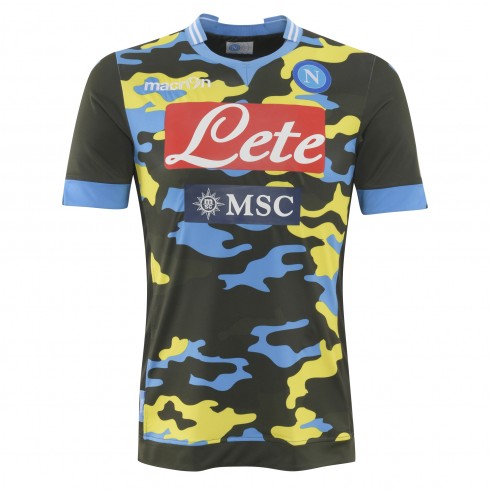
For whatever reason, Napoli’s camouflage kit was replaced earlier this year by an updated version that put more emphasis on the club’s colors. With the camouflage kit being so popular, one may think that the club thought that this one may move probably a few more Euros…
The template is much like the original away jersey, but the camouflage pattern has changed significantly by replacing the green tones with sky-blue and yellow. Due to this fact, we can barely make out the macron logo anymore. The new coloring also achieves that the sponsors are less in your face, almost secondary on this one.
The pattern is even more extreme on the back and the white names and numbers are hardly legible.
While the original camouflage jersey was a decent idea, this one is way to shrill and reminds us of many failed shirts from the 1990s. Maybe dropping the yellow in favor of another green tone could have helped this one. The worst is for sure the camouflaging of names and numbers on the back.
My rating: 2/10 stars.
How do you rate this shirt?


Pingback: SSC Napoli (Third 2013/14) | My Soccer Universe
Pingback: SSC Napoli (Away 2014/15) | My Soccer Universe