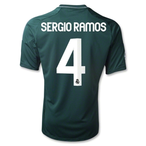
Another away jersey and I am going to have “fun” with this one. Real Madrid is one of those teams that do not have a well-established away jersey, although it is consistently dark. Some have been purple (fits the color scheme), some have been dark blue, some have been black. Most of them were “defensible” choices since their accents often complemented nicely the corresponding home shirt (which was and has always been white with accents). This season, Adidas graced Real Madrid with two Away jerseys – one for La Liga and one for the Champions League. Now, why would you do that? Only commercial reasons, nothing else. I really dislike the practice of offering different jerseys for different competitions, so we are already getting off to a bad start … It does indeed get worse: the choice of the colors is simply abominal: dark green with silver accents. What has dark green to do with Real Madrid? It just does not make sense. Also, silver seems to be an odd choice. Did we end up runners-up so often lately that we have to use silver? Last season, Real used gold accents – a lot more appropriate.
Other than this very questionable choice, the jersey actually has a fine design and it would have been nice of Adidas to use this design for the home shirt – but no. So, Real Madrid was dealt indeed bad cards from a design point of view this year.
My rating 4/10 stars.
How do you rate this shirt?


Pingback: Real Madrid (UCL Away 2013/14) | My Soccer Universe
Pingback: SSC Napoli (Away 2013/14) | My Soccer Universe
Pingback: Real Madrid (UCL Away 2014/15) | My Soccer Universe
Pingback: Real Madrid (Away 2014/15) | My Soccer Universe