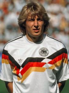
Well, what started out subtle soon turned into a brute application of the German flag. On the other side it was the most patriotic kit for Germany of all time (I am avoiding the term nationalistic on purpose) and showed that the nation grew more confident in being German. The kit was used over two tournaments (the last time that happened): first for EURO 1988 at home and then in their successful 1990 World Cup campaign, thus probably being the flashiest/most garish World Cup winning kits of all time – but also one of the most popular ones. For that reason it also ranks up there with the most iconic jerseys of all time. It was also the first jersey worn by a united German team giving it even more historical significance. So, let’s have a look:
At its core, this is a white jersey with white crew collar and Adidas’ shoulder stripes being applied in black. However, the stripes do not extend much past the shoulders as they are stopped by an extremely bold German flag pattern that starts on the upper arms and weaves itself asymmetrically across the chest, i.e. it reaches its low point on the right and is horizontal in the center, while being diagonal otherwise. Above the two breaking points in the pattern resides on the right the Adidas logo and on the left the mandatory black DFB-eagle. The spacing above the band for both logos is about the same, making the Adidas logo riding considerably lower than the eagle. In fact, the Adidas logo would be placed OK, but due to the bold band, there is no space for the eagle. I guess, if Adidas would have had the foresight to incorporate the eagle nicely within the band, the shirt could have been saved from some glaring asymmetry making it very odd to look at. Not that the band itself wasn’t odd enough.
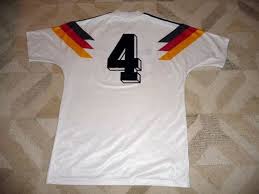
The back is actually OK – which is surprising given the front. However, the German flag band also extends past the shoulders on the back but doing so symmetrically and thus accenting the black number on the back, which again is applied in the great 3D font.
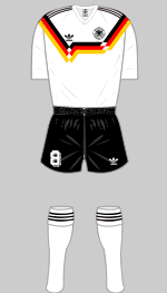
The kit was worn always with the usual black shorts and white socks and was used in both tournaments (1988 and 1990) for all but one match – the semi-final against England. In a way, this shirt is so iconic that it almost defies being rated – similar to the 1990 Cameroon shirt. But it is not the purpose of my blog to let bad designs – however iconic they may be – go unrated. To be clear, I do not mind the use of the German flag that much. I just find the execution seriously lacking. Especially the middle segment is bothering me quite some. Furthermore with the eagle being pushed out of position it just looks awkward. To me it looks like someone at Adidas got a new computer (they were rare these days) and went for the wildest design possible. Hence
My rating: 3/10 stars.
How do you rate this shirt?


Pingback: Germany (Home 1992-93) | My Soccer Universe
Pingback: Germany (Home 1998-99) | My Soccer Universe