Well, I was a bit too optimistic about ManU’s prospects when I wrote about their home jersey. Well, at least in the Champions League the team is rather unscathed and has a manageable opponent in Olympiacos. So, while the Premier League crown is well out of reach, the team is still alive in Europe. That should also give us a few more opportunities to see them play in their current away jersey, which also should feature among the more interesting ones this season:
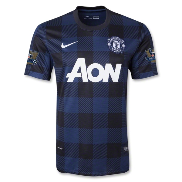
At first, I want to note that United returns to blue/black away jersey which it has done so in past seasons. However, none of the jerseys had such a striking design. It definitely is a continuation of last season’s awful home jersey (you know the one with the gingham pattern), but it may surprise you to say that I like this version a lot better. First of all, the pattern is much wider and second of all, due to the black and blue being rather similar in shade it is not as much in your face. The pattern is seemingly a tartan pattern trying to honor former coach Alex Ferguson. What sets the jersey actually apart are the white application of sponsor, swoosh and crest. Usually, I am not a fan of monochromatic team crests, but in this case it is the better solution.

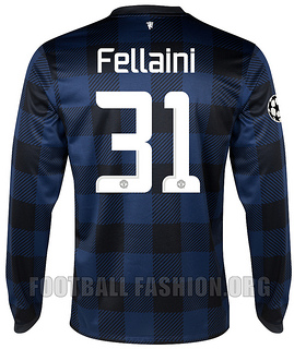
On the back of the jersey – below the round collar – we can find the now mandatory devil (in white). Names and numbers are applied in white on the same tartan pattern as on the front. In fact the tartan pattern is all over the jersey with the exception of the collar. While I like the Premier League font a lot, the one used in the Champions League is rather odd and angular looking. I think the Premier League does an outstanding job in mandating their font on all jerseys. It really looks simple and great. On the other side, I am tired of manufacturers coming up with ever more odd looking fonts for their latest marquee teams.
Concluding, this is a very interesting and bold jersey. Still, it does not look a lot like a soccer jersey. So while the execution of this one is miles ahead of last years home jersey, I still think this pattern is better kept for “regular” clothing such as flannel shirts.
My rating: 6/10 stars.
How do you rate this shirt?


You must be logged in to post a comment.