Bayer 04 Leverkusen (Home 2013/14, Away 2014/15)

I will leave the Chelsea third jersey for a later point and go on with the Champions League. Incidentally, it will again be an Adidas jersey and again an Adidas team is favored to exit at the first knockout stage. However, this is not the Leverkusen side that had no chance against Barcelona or PSG. No, the new look Leverkusen took the bull by its horns and etched out a slim 1-0 win over Spanish champions Atletico Madrid. So, it may well be that “Neverkusen” may advance for the first time since 2002 to the next round. And we all know where that journey took them 15 years ago. So, that tie promises to be an exciting one in Madrid.

leverkusen-2014-home

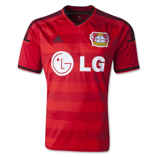
With the new home jersey, Bayer keeps up with a new tradition, by (a) relegating the previous home jersey to away jersey status and (b) switching back to red from black. I guess with a team that despite its age is still seen as a team with little soul and/or tradition you can do that. I still liked it better when both od the club’s colors were present. But then, if I had the choice, red is more like a Leverkusen shirt to me than black. Well, red it is for this season with a few black accents. The shirt may not have a color gradient, but features vertical bands in a slihtly darker red tone on the front. The collar is V-neck with a black outline which is also featured on the sleeve trims, the three stripes and the arm patches. Curiously, the Adidas logo is also black while the sponsor is white, which is also a predominant color around the crest.

leverkusen-2014-home-kiessling

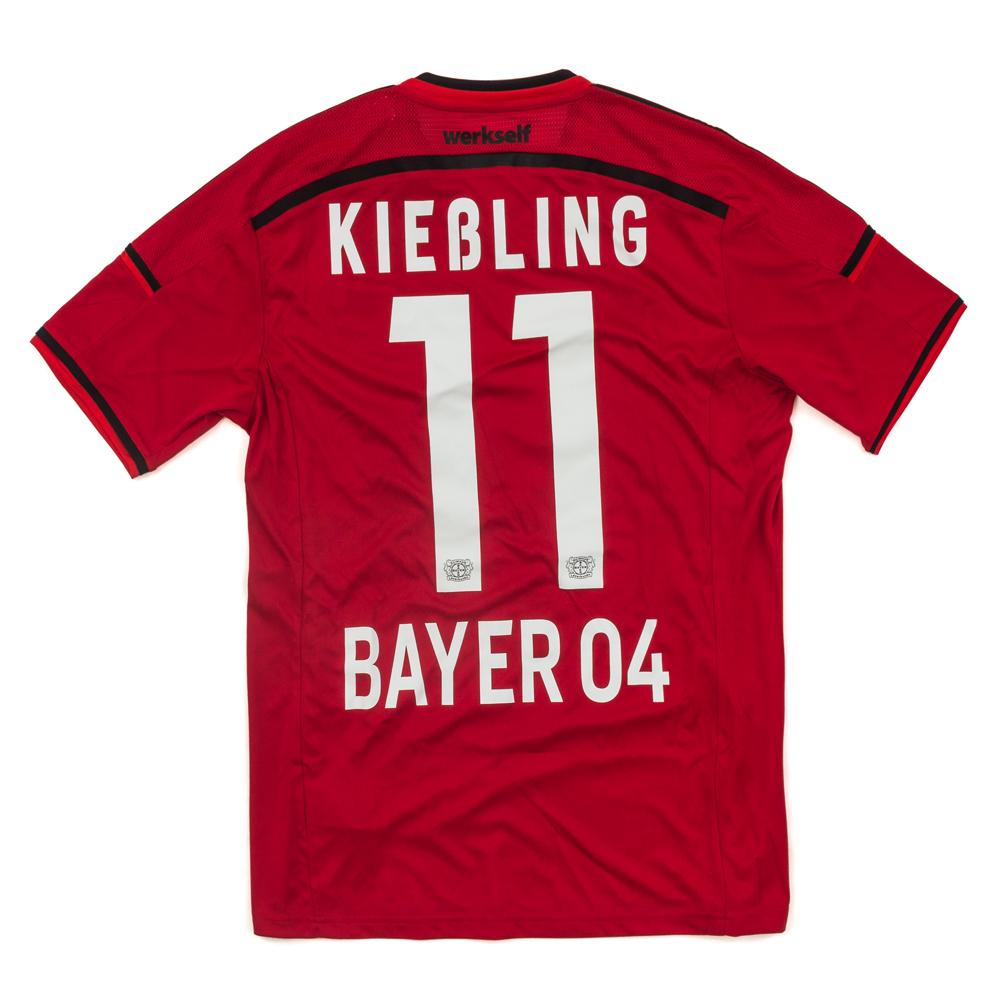
The back continues the black/white dichotomy as an accent color with all “design” elements being black, while the applications, names and numbers are in white. The black arc runs just below a “Werkself” wordmark referring to the popular nickname of the team. The font used on the back is very legible and bold. Once again a simple font prevails.

This jersey is an improvement over last season, but it still needs me wanting in terms of pizzazz. The striping pattern would look better as red/black version, while the black outlines on the collar are a tad too thin. I understand it is part of the template, but still a bolder outline on the collar would have looked better. Of course, the black Adidas logo should have been white. Overall, the shirt neither disappoints nor excites me – a trademark of Leverkusen jerseys.

My rating: 7/10 stars.

How do you rate this shirt?

Bayer 04 Leverkusen (Home 2012/13, Away 2013/14)

This is quite an odd two-for-one post and in a way a radical idea. The current Bayer Leverkusen away jersey was last season’s home jersey! *head scratch* While we already have seen that away jerseys get demoted to third jerseys this is a new trend. It is surprising in the sense, that a home jersey generally embodies a club’s colors, while the away jersey should just be a (often non-standard) contrast to that jersey. In any case, Leverkusen has been toying with red and black jerseys over the past few years, so it is maybe not that surprising, after all. Let’s have a look:

leverkusen-2012-homeleverkusen-2013-away

To the left, we have the 2012/13 home jersey, to the left the current away jersey. They are the same except for the sponsor. The jersey is probably one of the best Leverkusen jersey in years. It is a red jersey with black pinstripes, a black V-neck collar and the three shoulder stripes also in black. The sleeves do not have pinstripes (slightly regrettable), but there is a thin black stripe towards the end. Adidas logo on the right and the club’s crest are well placed as is the sponsor. I generally don’t like if a sponsor is applied in a box like in the 12/13 home jersey, but not only does it in this case fit with the color scheme, the box also extends from pinstripe to pinstripe and therefore does not look awkward. The current sponsor is a bit more in your face, but also fits well on the jersey.

Screen Shot 2014-03-14 at 10.11.49 AM

The back is like the front with white names and numbers in a very legible and nice font. Just below the collar is also a small “Werkself” imprint.

The jersey, is quite nice looking although for some reason it does not give me the same excitement as other red/black jerseys. It is probably due to the fact that Leverkusen – despite being a quite successful team of late – does leave me somewhat emotionless.

My rating: 8/10 stars.

How do you rate this shirt?

Bayer 04 Leverkusen (Home 2013/14, Away 2014/15)

For more than two decades Bayer Leverkusen is one of Germany’s most consistent clubs thanks to the financial muscle that pharma giant Bayer provides. This is much to the dismay of rivals 1.FC Köln who do have a much larger fan-base in the area and Germany in general (given that Cologne is the fourth largest city in Germany). But the club also has the dubious honors of being a strong team that cannot clinch the title. And despite one German Cup and one UEFA Cup win, the team has been invariably called Vizekusen or Neverkusen. The highlight in that regard was surely the 2001/02 season when the team finished as runner-up in the Bundesliga, the German Cup and the Champions League (in addition many players from that squad also came in second at the 2002 World Cup).

leverkusen-2013-home

While the Werkself has traditionally played in red jerseys with black accents, this has been reversed lately and this season the team plays in all-black. Although there is a red round collar and red piping around the arms (looks strange to say the least) it seems that white is at least as prominent since the three Adidas stripes as well as the Adidas logo are all applied in white. Also, while logo and sponsors are well placed, the pink color of the main sponsor provides maybe too much additional color.

Screen Shot 2014-02-07 at 3.20.52 PM

On the back the shirt remains plain with names and numbers applied in white. The font used is a typical bold sans-serif Adidas font – very legible and no frills.

To me this shirt displays too little red to be an appropriate Leverkusen jersey. While the all-black jersey is not a bad idea in itself, I wish that the three stripes were also red to give the team more identity instead of fiddling with the club’s colors. Frankly, the red piping on the front is weird and otherwise the jersey feels like the Werkself does to many fans – ambivalent. For that reason, no high score here.

My rating: 5/10 stars.

How do you rate this shirt?