AC Fiorentina (Third 2014/15)

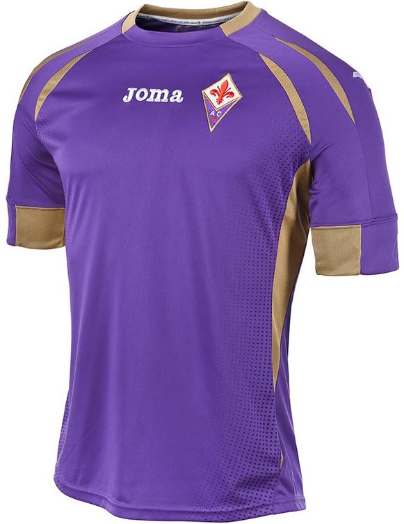
As is the custom now, every team needs to have a third jersey. And while some (few) teams really may have a need for them, most of it is just a marketing foil. Given the clear contrast between the home and away jerseys, it is not quite clear that Fiorentina is in an absolute need for a third jersey. And then, the color choice could be red (as it is featured in the crest), but instead we get sort of the (almost) standard choice:

fiorentina-2014-third

A black jersey! The accent colors are gold and (of course) purple, with the former being a bit too dominant for my liking. At least, Joma opted for a cleaner design here and the accents are only present on the golden crew neck with a purple front, the purple sleeve trims with the golden outline and the golden sides. Other than that, the jersey is pretty plain. All the supplier logos are applied in white.

fiorentina-2014-third-aquilani

However, it is the back that kind of betrays the purple legacy since it is not featured there! Below the (golden) collar is a golden Fiorentina wordmark and also the white names and numbers have a golden outline.

I think switching purple and gold would have done wonders. I even would go as far as leaving gold out entirely in exchange for white. Still, except for the two-colored accents, I like the simplicity of this on. It is still better than the home jersey.

My rating: 6/10 stars.

How do you rate this shirt?

AC Fiorentina (Away 2014/15)

The much anticipated Italian Europa League final was not to be. So, we will look at quite a few Italian shirts now. Fiorentina was quite an equal opponent when playing in Sevilla, but if they just had converted their chances. From there on, it was always an uphill battle and Sevilla was ruthless. At this moment it may seem too little of consolation, but it is very likely that we will see Fiorentina playing in the Europa League next year, as well.

fiorentina-2014-away

The Fiorentina away jersey this year comes in the classic white with purple accents. It is an almost exact reversal of the home jersey, only that gold is replaced by purple and purple by white. The design is very much the same. However, this way we can see a slight purple color gradient towards the sides which was hardly visible on the home jersey (where it was just a lighter shade of purple).

fiorentina-2014-away-vargas

The back keeps the simplicity of the front. I really like the font used for the purple names and numbers. Actually, upon closer inspection, the pure white/purple is broken by the subtle Fiorentina wordmark just below the collar. But, that does not derail this jersey.

I like this one much better than the home jersey. Sure, the design is a bit odd with the shoulder slivers and also the two-color wide sleeve trims are something one has to get used to, but overall this jersey makes sense.

My rating: 7/10 stars.

How do you rate this shirt?

AC Fiorentina (Home 2014/15)

Fiorentina is part of a recent revival of calcio in UEFA tournaments. Their run to the semifinal of the Europa League inluded impressive wins over Tottenham and Roma while also edging out Dynamo Kiev. However, defending champions Sevilla very much took advantage of the offensive play the Italians applied while playing in Spain. Despite numerous chances, Forentina faces a huge uphill battle after a 3-0 loss. On the other hand, Firoentina’s Serie A form is well enough that another qualification for next year’s Europa League is in the cards with the Champions League possibly out of reach. Still, they are worth a look thanks to their attractive style of play:

fiorentina-2014-home

Well, we woudl expect Fiorentina to play in a purple shirt and this is what we get. Joma supplied a purple shirt with golden accents. However, it is the application of the latter that make things look a bit odd: First of all, the crew neck collar is framed in gold ex ept for the front. On the shoulders two more or less parallel golden slivers on each side give the shirt some structure while larger slivers run down the underarms. To top it off, the large sleeve cuffs are half purple and orange. At least the crest is well placed, but given the lack of a sponsor or any titles from the last season, the supplier’s logo on the center is a bit off.

fiorentina-2014-home-gomez

On the back, gold seizes to be the prominent accent as names and numbers are applied in a simple, but effective sans serif-font with golden outlines. Also, we can see the two white Joma logos on the sleeves a bit better.

In principle the shirt is simple enough and I do not mind the golden accents except for the fact that Fiorentina has not won a thing lately (see similar posts on Chelsea, Bayern and Milan). If the collar was all in one color, and the sleeves a but more subtle, I could look also past the slivers on the shoulders. In a way, this shirt is trying too much without achieving a lot. If I was malicious, I would say it fits the club, but I won’t go there. I guess the best part is the missing sponsor, which gives it a clean look, but also points at potential financial woes. 😦

My rating: 5/10 stars.

How do you rate this shirt?