
On we go with the history of France shirts and now we also get into the portion where I will dish out the first grades. However, for this period lots of research on my part was required and so it took a while to get here. As you will see, I am still a bit shaky about the first couple of Adidas kits for France but starting in 1977 or so, we get consistency and that’s where I am planning to start with rating the shirts. So, let’s get to it:
When Adidas took over it was in a way the beginning of a rebuild. 1958 apart, the French national team had never made a big dent on the international. stage. And since those glory days France only qualified in 1966 for the World Cup where the adventure already ended in the group stage. We were still a good decade away from calling France a true European power house. Every successful team usually starts off at a low point. However, the beginning of the Adidas era was not a low point considering the super interesting shirt that got issued:


On a first glance maybe not too surprising as the blue shirt got the three stripe treatment, but with one gap being red – thus displaying the French flag in an iconic and really, really sneaky way. But what surprised me is the fact that the three stripes were also added to the sides – something I had not expected from a pre-2016 Adidas shirt. My bad! Given the plain look of the collar, this is actually a very nice overall combination. Also, the numbering style on the shirt is unique and modern for its time. I would love it, if that one was brought back!
However, most Adidas shirts thereafter were a little simpler as the stripes on the side quickly got dropped and most “excitement” came from the different collars. Another innovation featured in 1973 and was dropped soon thereafter:
1973
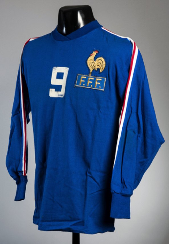
Yes, there is a number on the front in what is otherwise a quite simple, yet beautiful shirt. I am not entirely sold on the blue fold-over crew neck, but if Adidas had stuck with or sometimes brought back that style, I would not have complained in any way. As I said, the number on the front was quickly dropped and in 1974 (no picture as of now) a white crew neck was introduced. This marked the first time that the collar on a France was solely white. By 1976 it was replaced with a stylish white shirt collar. During that period we are also treated for the first time with the numbering font which became synonymous with France shirts: Made to resemble the three stripes, the outer stripes are joined at the end of each “stroke” making a truly iconic Adidas font.


I love the shirt collar, but on the other side it was not very representative of the time period. Also, the team in this period was everything but successful: the team finished last in its qualification group (behind the USSR and Ireland) for the 1974 World Cup and the form did not look better for the 1976 European championship where the team also failed in qualification (behind Belgium and the GDR). However, by 1977 there was light at the end of the tunnel: the team won its qualifying group ahead of Bulgaria and Ireland and managed to qualify for a World Cup for the first time since 1966. Late in that campaign a young player named Michel Platini made his debut and the days of France as an afterthought were about to be over. The shirt used during that campaign returned to a simple blue crew neck. Also note how the cockerel crest was quite consistent over these years.
Now, the shirt used in 1978 did not introduce any particularly new style – it was just the 1977 shirt with a white collar and was only worn in their 2-1 defeat to hosts Argentina which eliminated France already at the group stage despite showing some early promise that more was in store.


In many ways this is somewhat the gold standard for Adidas France kits. Never again were they so simple yet so iconic. While I like the white crew-neck, the fold-over on the front is not quite to my liking. The white sleeve cuffs add some personality and I absolutely love the almost oversized cockerel crest. Yes, the one used up until the 1960s was probably a better overall look, but this golden stylized version is what most of us grew up with and therefore it looks iconic. And the three white stripes with the red inset give the jersey enough character and also add the almost necessary touch of red. There doesn’t need to be loads of red – just a little is enough to establish this as a France shirt. And this one is a wonderful, wonderful shirt deserving only high marks:
My rating: 9/10 stars
That particular jersey should also have been worn in their final (and meaningless) group game against Hungary, but the kit crew messed up and brought white jerseys as did Hungary. So after a mad scramble for replacement kits (the blue kits were too far away back in Buenos Aires) the green-white striped kits of local team Club Atlético Kimberley were used making for surely the most unusual France kit of all time:


Of course it is all super mismatched and awkward looking, but should be mentioned here as France was the home team. Also, the jersey was clearly not made by Adidas. This was also probably the last time that a team at the World Cup was forced into a replacement kit (Argentina in 1986 elected to get different jerseys ahead of their clash with England in 1986). Due to its extraordinary status, I also will not hand out any rating here.
This look was more or less kept up until 1980. During that period the French team did not yet live up to its World Cup promise as Czechoslovakia beat them to a spot at EURO 1980 – necessary learning steps as we would see. In 1980 we also saw the first real modification of the look of the French team as the plain blue was dropped in favor of a pinstripe look. A look that was about to become iconic thanks to France’s performance at the 1982 World Cup. However, as with the previous more plain look there were subtle differences over time. It all started out with this kit in 1980:

All the hallmarks of this look are already there: a blue shirt with alternating pinstripes in white and red. Of course the red ones are little less visible hence the overall look emphasizes more on the white ones which do have quite a nice distance between them. Also, the intention was that the centered pinstripe is white, but seemingly it not always worked out that way. Up close the pattern gets quite busy once you factor in the red – honestly, too busy for my liking. The collar is blue with the same pinstriping present (it does look a bit odd) and a white triangle insert on the front. Of course, the three white stripes with a red inset are also present – by now they are quasi-mandatory. White sleeve cuffs complete the look. And yes, the number font also has not changed and it is a pity that it eventually had to as this one of the best Adidas fonts.
Now, for the 1982 World Cup in France there were only minor modifications to this look and they all concerned the collar:


The white inset was removed and the collar was now in white with a French flag border. And it was in these shirts that France dazzled the crowds and made it all the way to the semifinals where they could not hold on to a 3-1 in overtime against probably the most hated West Germany team of all time. Everyone outside of Germany wanted to see the French join Italy for the final, but a late equalizer and a loss in the penalty shoot-out put an end to French hopes. But the 3-3 against the Germans is widely regarded as one of the best games at a World Cup and were it not for Schumacher’s vile tackle on Battiston, the public might have been more forgiving to the Germans.
Back to the shirt: as I said before this is such an iconic look, but to be honest the inclusion of the red stripes make this one almost too busy while they are not really visible at a distance. Two more things, I think could have been done better: the front of the collar also contains the pinstripes but angled from the overall pattern. It looks to weird. And the trefoil logo rides too high.
Still this one is super iconic, but as it is so similar to the versions prior and after, I will hold off my judgement for now.
Side note: it is really hard to get a non-match picture of this shirt at the moment. Google spits out mostly replicas or the non-1982 World Cup versions. The modern-day replicas look quite well, but either the striping is off, the trefoil logo is missing or the collar is also white on the front. Small differences, but they all do not make the 1982 shirt …
Now, after the World Cup, France did not have to play a qualification tournament as they were already qualified for EURO 1984 in their home country. Still, for the friendlies used in the run-up to that tournament, a third style of the pinstripe jersey was issued:


In many ways this is the simplest version as the shirt collar is replaced by a somewhat thick V-neck. Also, note that now the red pinstripe is centered which actually looks smart given the white collar.
All in all, these shirts are very similar, but the pick is after all the World Cup version. I really want to like the shirt collar with the triangle inset, but the blue collar just looks to weird and the 1983 V-neck is a bit too plain. The French flag on the 1982 collar just puts this over the top and I rate it slightly above the others, but not enough to dish out separate grades.
In a way it is really hard to rate this one as it is one of the most iconic French kits that was even voted as the best of all time. However, I have to disagree here. The red pinstripes are the feature holding me back from reaching for a really high grade as they are providing too little contrast against the blue background (something that works perfectly on the white away jerseys). But the close-ups are just a tad too busy and the way the pinstriping pattern is worked into the collar from 1980-82 is just lazy and weird. On the other hand, pinstriping frequently works well and the white ones really break up the jersey nicely. I am really going back and forth on this one, but in the end too many good images are associated with this France jersey:
My rating: 8/10 stars.
How would you rate these shirts?


You must be logged in to post a comment.