Olympiacos is a club in a similar position as for instance the Old Firm clubs prior to Rangers bankruptcy: too good for their league, but also-rans in Europe. At least they did perform quite well in this year’s group stage and denied Benfica the opportunity to play the Champions League final in their own stadium (which was a long shot anyway). In any way, the Greek giants now have to show their worth when playing Manchester United. Regardless of the outcome, one thing is certain: their jersey was one of the most interesting this season.

Puma continues to issue different looking jerseys and unlike the 2012/13 UCL jersey of Dortmund, they delivered a nice looking striped jersey for Olympiacos in their well-known club colors. At least that what a first look seems to suggest. The “devil” is of course in the details since there are some golden accents all over the jersey. First off, unlike Milan, these are well deserved given that Olympiacos is practically winning the Greek Superleague every year since 1997 (few acceptions apply). I really like the golden pinstripes within the red stripes that are totally off-center. Similarly, the golden pinstripe at the sleeve trims looks quite nice. But I surely could have done without the golden slivers on the sides of the front – they make the jersey less classic. The white V-neck with the red-white insert looks interesting, but I’d rather have the colors reversed.

Starting late October, Olympiacos started to support UNICEF’s 100% vaccination campaign. Consequently, the old sponsor was swapped out in favor of displaying the UNICEF logo. As laudable as this is, I wish the logo was also applied in red instead of the blue that UNICEF usually uses. After all, they changed colors for the Barca-shirt as well.
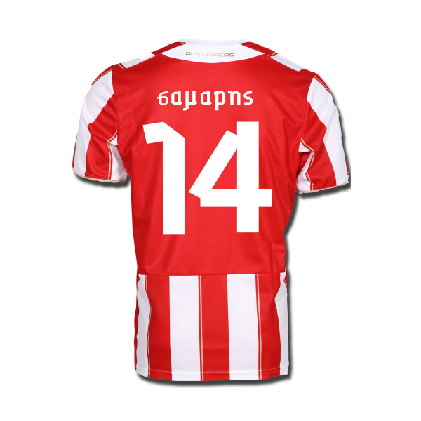
The back is rather simple with a big red shield for names and numbers in that awful Puma font. The rest is just a repeat of the striped pattern. Also, take note that the sleeves are striped – seemingly a rarity these days.
Overall, I like this jersey although it could have been improved. I especially think that the white collar gives the top an empty feeling. As with any striped shirt, I also slightly bemoan the fact that the stripes on the front are broken to accommodate the sponsor who at least is also applied in red on a white field. Still, I like this one
My rating: 8/10 stars.
How do you rate this shirt?

Pingback: Olympiacos FC (Away 2013/14) | My Soccer Universe
Pingback: Borussia Dortmund (Home 2013/14) | My Soccer Universe
Pingback: Uruguay (Away 2014) | My Soccer Universe