
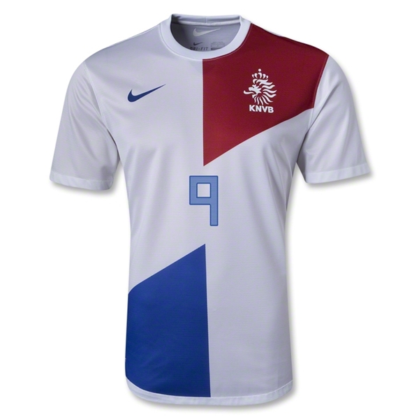
Come 2013, Nike decided it is time for a different away jersey. Although, the term away jersey is quite inaccurate since Holland so far has only worn it at home against Italy and Romania (don’t get me started on that choice). It was a return to the white jersey with red and blue accents or in other words trying to incorporate the Dutch flag onto the jersey. This has been very successfully done in 2006 and somewhat less so in 2010. Both times the shirt was worn with blue shorts. This time around we have an all-white outfit.
The 2013 design takes the 2012 home jersey and converts it into white. The top trapezoid is in red, the bottom one in (royal) blue (given the latest French jerseys, I thought Nike has completely forgotten about that color). Given that the Dutch flag is red-white-blue, this is a nice touch. While red gets the better exposure since it houses the crest, blue is a bit more prominent, with the swoosh and the nicely centered number also being blue.
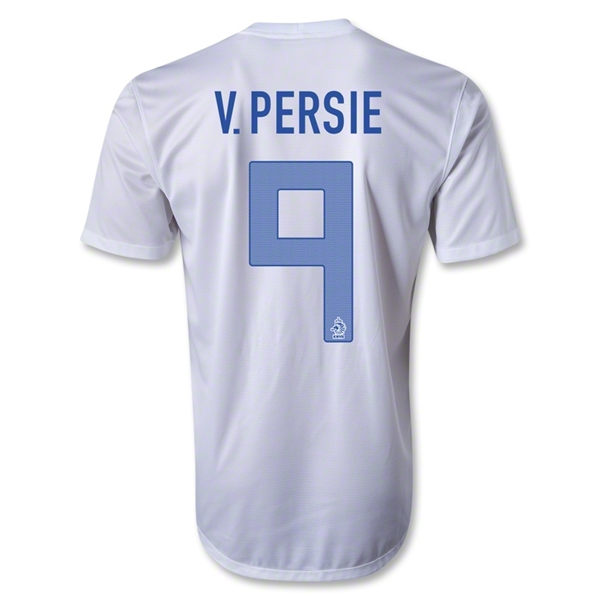
The back is plain white with name and number being applied in blue. The font for the number indeed looks most awkward for 6, 7, and 9 (as shown below).
Colorwise, this is a great jersey, but it is not quite as good as the 2006 away jersey (yes, the one from the Battle of Nuremberg). Actually with the two trapezoids not in any way overlapping it actually looks odd. I understand that consistency with the home shirt was the aim, but it doesn’t lend itself well to this three color design – I am sorry. While it has no effect on my rating, I do wish that we see a return to white with orange accents sometime soon. If you want, you can even throw in a little bit of blue. Having said that, I generally liked the colors of the Dutch flag being displayed on a white jersey.
My rating: 7/10 stars.
How do you rate this shirt?

You must be logged in to post a comment.