In wake of today’s monster clash between Manchester United and Real Madrid, let’s have a look at ManU‘s current home jersey. Together with Barca and Real, ManU is probably the most well-known soccer club in the world. I guess it is for this reason that Nike desperately wanted to become their kit supplier. Furthermore, ManU is always guaranteed a very unique design. As always, these range from great to blunder and I think this year’s edition falls into the latter category.
Manchester United’s uniform is very traditional: red shirt, white pants, black socks. So, you would think there is not much room to wiggle here. At first glance, this year’s jersey does exactly that. A (darkish) red jersey with a black V-neck. The crest appropriately put on the left side of the chest and to keep with the club’s colors Sponsor and manufacturer are kept in white. So far, so good. What really bothers me is the annoying gingham pattern on the shirt. Without it, I would give this jersey high marks, but I just cannot look past it. I understand it is a tribute to Manchester’s cotton mills and I do acknowledge that any such reference should be lauded and appreciated. However, it not only gives the shirt a slightly darker tint than the traditional red it makes it look too angular and … let’s just say, I hate it.
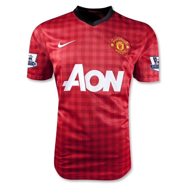
The backside is plain if we overlook that *@#$@%@ pattern and there is a little black devil just beneath the collar. I already mentioned, that I do like the Premier League’s numbering and lettering style.

As mentioned above, without the gingham pattern, I would give probably high marks. But this is definitely one for the categories “good idea, bad execution” and “What were they thinking?”.
My rating: 4/10 stars.
How do you rate this shirt?

Pingback: Spain (Home 2013) | Soccer Jersey World
Pingback: Manchester United (Away 2013/14) | My Soccer Universe