
So, I am still holding out on a few jerseys that have already been released, but I don’t have all the information in nice visual form yet. But that gives us also plenty of space to look at qualified teams, where we can review their previous look. And thanks to switching suppliers and a quite successful women’s EURO campaign, there is plenty to write about:
Well, I like to talk about Croatias and (to lesser degree) Serbia as being flaky teams. But one of these usually does qualify and the other not. But Denmark truly is a yo-yo team, but with a pattern of late: not qualified in ’06 and ’08, qualified in ’10 and ’12, not qualified in ’14 and ’16 and now again a successful qualification. Given the size of the country, it is quite a proud track record. Well, this post covers the the period from failing to qualify for France 2016 due to a playoff loss to eternal rivals Sweden up to a highly successful qualifying campaign ending in an impressive playoff win over Ireland. And there is a supplier switch in addition, so let’s get right to it:


Well, the Denmark home jersey was the last to be produced by Adidas after an almost 12 year period as supplier. And obviously, if Denmark was to qualify for EURO 2016, they should be given a memorable final shirt. Well, predating the retro wave starting in 2017, the designers looked for inspiration in 1986 and tried to somewhat emulate the iconic half-half look of the team that dazzled 30 years earlier in Mexico. Well, it is a very tame interpretation using two shades of red with a white crew neck collar and sleeve cuffs. The three stripes in white are of course on the sides.
But there is one nice touch here: having the darker red on the proper left makes the crest pop out much better. It is also a nice touch that the lighter red is the base on the back, although why not use the half-half not on the back? Well, that and the somewhat tame execution are the only drawbacks. The font used was also quite solid and fits well with the shirt. As I said, this could have surely been more exciting, but overall it is solid and much better than the previous iteration.
My rating: 7/10 stars.
Now, the away jersey was unfortunately a different story:


Well, inverting the colors was not an Adidas thing anymore and after the successful blue look in 2014, why not try again something new? So, we get a white/grey pajama with black sleeves (white cuffs!) and a black V-neck. And here the three side stripes in black really are to the detriment of the jersey as they are perpendicular to the grey hoops and it just does not match. And then, to really create a disjoint look add the two logos in red, but keep the numbers black. Awful!
My rating: 2/10 stars.
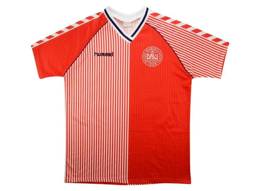
Well, right after EURO 2016 Denmark switched back to their iconic initial supplier, Hummel, who is after all a Danish company. And right off the bat Hummel made sure we are reminded of what we had been missing for 12 years looking at an Adidas Denmark jersey:


a simple red jersey with the iconic white chevrons on the sleeves a white crew-neck, sleeve cuffs and shirt tail. The neck gets a little wider cutout on the front, but looks all fine. In addition, we get Viking style lettering and a Viking shadow pattern on the front. Well, not any Viking, but Ogier the Dane whose statue is said to wake up and protect the country! Also, some Nordic patterns adorn the area above the crest giving the front a shield like look. Brilliant! Well, the lettering might be a little hard to read at times, but it is never illegible like some instances of the new Adidas font.
This is not a whacky, but rather simple and effective design of the Denmark shirt. It does not reach back to the glory days of the 1980s and early 1990s, but more to the late 1990s and 2000s. I guess it was important, to come out with a clean, yet bold look. And this is surely achieved. If anyone needed reminding that a Denmark shirt can only be made by a Danish company of the name Hummel, this is it! Classic!
My rating 9/10 stars.
Well, away from home Denmark wears white and again, Hummel is reminding the “invaded” nation about the nationality of their invaders:


Well, this also looks quite great: it is a white jersey with red chevrons on the shoulders, red sleeve cuffs and shirt tail. And then, the proper left gets a red strikeout with the Danish cross. And quite nicely, the crest is at the crossing point. The crew neck is white and only red where the strikeout comes in. Usually, I do not like this look, but here it really makes sense. Also note the font here is a lot simpler. Overall, this is also a wonderful and bold look that thanks to the performance in Dublin will not soon be forgotten. To me, this is also a modern classic.
My rating 9/10 stars.
I also want to display the women’s jerseys issued for the Danish team and worn at the successful EURO 2017 campaign:


The home jersey which gets a slightly different collar treatment but otherwise looks very much the same. Not sure if the Viking is present on there, but I would believe so, at first. So, very much the same rating.
My rating: 9/10 stars.
The away jersey differs a little bit more, especially with the bold two-color sleeve cuffs and by moving the strikeout to the lower proper right. It still is a great accent and probably is quite appropriate for a women’s team. But watching Denmark play the Netherlands in the final, it was not as visible as the cross on the men’s jersey. Also, the collar looks a bit odd as there is no obvious reason for having the crew neck not red all around.
Still, it is a great look, but just a tad below the men’s version. And not only do I love the Hummer comeback, but also that they deliver distinct versions for the women’s and the men’s team.
My rating: 8/10 stars.
How would you rate these shirts?

You must be logged in to post a comment.